Pauline Boudry / Renate Lorenz –You Ask Me to Not Give Up Up Upexhibition poster and flyer
View source
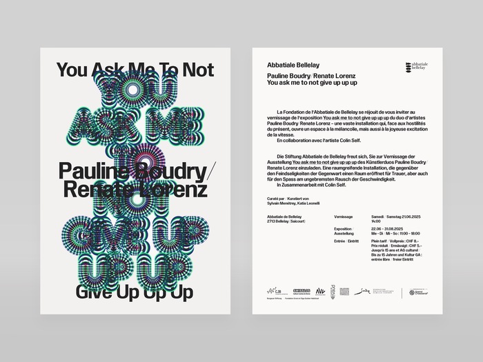
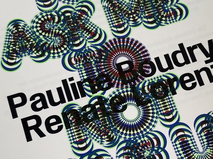

In a Baroque church in the canton of Jura, the artistic duoBoudry/Lorenzhas created a rollercoaster that also serves as a sound piece voiced byColin Self. The visual communication gives a feeling of psychedelia in reference to the sculpture. The geometry of the kaleidoscope could be a nod to the structure of the luna park ride, or the echo of Self’s lament in the space. Making full use of the variable capacities ofPurple Haze, the design uses several weights and instances overlaid on top of each other, and printed in a restricted set of spot colours, creating additional tones as a result of the transparency of the inks. The supporting typeface is an early version ofDisplay Grotesk, designed byChi-Long Trieuand set to be released withDinamo.When things go down, hopefully they go up straight after.
This typography communicates psychedelic rebellion with ecclesiastical gravitas—Purple Haze's variable letterforms create kaleidoscopic movement that mirrors the sonic sculpture's disorienting beauty, while Display Grotesk's rational structure grounds the chaos with institutional authority. The layered transparency effects transform static type into kinetic experience, embodying the exhibition's fusion of sacred space and experimental sound art.
Purple Haze's dynamic form model with open apertures and expressive modulation perfectly captures the psychedelic sound piece's fluid energy, while its variable capabilities allow literal sonic visualization through weight and width shifts. Display Grotesk provides rational counterpoint—its closed apertures and vertical stress echo ecclesiastical typography traditions while maintaining contemporary accessibility. The structural contrast between Purple Haze's expressive dynamism and Display Grotesk's institutional authority creates the perfect tension for art challenging sacred spaces.
This pairing deliberately contrasts form models—Purple Haze's dynamic, open character against Display Grotesk's rational restraint—creating productive tension rather than harmony. Following Kupferschmid's framework, this risky pairing works because both fonts share contemporary proportions and similar x-heights, providing enough structural DNA to cohere while their contrasting apertures and stress patterns create the psychedelic/institutional dialogue the exhibition demands. The variable layering amplifies this contrast into kinetic experience.