Case Studies
50 entries analysed
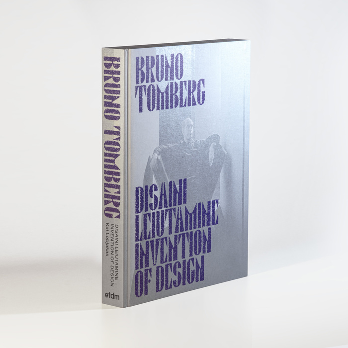
Bruno Tomberg. Disaini leiutamine / Invention of Designexhibition and book
This typography system communicates biographical reverence through material nostalgia—the custom Bruno 100 carries geometric modernist DNA filtered through craft memory, while its fuzzy texture treatment suggests the patina of time and tactile engagement. The pairing creates scholarly intimacy, balancing archival authority with the warm imperfection of handmade processes, perfectly embodying the intersection of Estonian design history and contemporary museum scholarship.
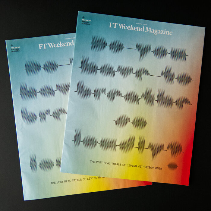
FT Weekend Magazine, 11 Oct 2025, “The Very Real Trials of Living with Misophonia”
This typography system creates clinical empathy through conceptual precision—the visual manifestation of sound disturbance itself becomes the communicative tool. Sonic Waves' waveform-derived letterforms carry genuine scientific authenticity while maintaining editorial sophistication, transforming a medical condition into accessible visual narrative. The pairing creates intellectual intimacy rather than sensational drama, letting readers approach a sensitive topic through typographic metaphor.
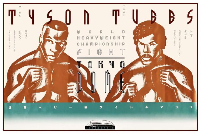
Tyson vs. Tubbs poster
This typography system channels industrial-futurist spectacle through aggressive geometric construction and monumental weight distribution. The custom fonts embody heavyweight authority via ultra-bold proportions and architectural solidity, while their geometric form model creates technological precision that transforms boxing into a space-age spectacle. The bilingual execution demonstrates how rational geometry can transcend cultural boundaries while maintaining brutal impact.
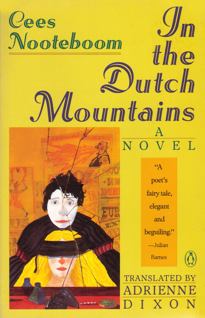
In the Dutch Mountainsby Cees Nooteboom
Adastra's inclined inline construction with swash capitals creates a theatrical, old-world literary elegance that perfectly captures the fantastical yet melancholic spirit of Nooteboom's nested narrative. The dynamic form model—with its open apertures and diagonal stress—combined with the decorative inline treatment suggests both the whimsy of circus illusionists and the gravitas of European literary tradition, bridging entertainment and high culture in a way that mirrors the novel's story-within-a-story structure.
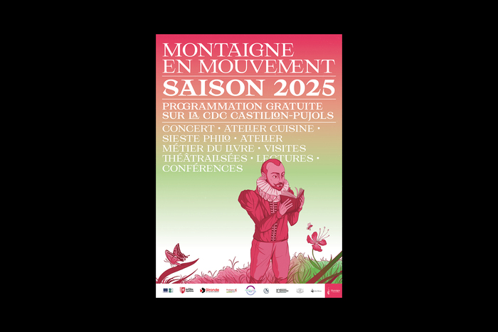
Montaigne en Mouvement saison 2025
Hyperion's nested glyphs and discretionary ligatures create a scholarly playfulness that perfectly captures Montaigne's humanist philosophy—intellectual rigor without academic stuffiness. The typeface's dynamic form model, with its open apertures and calligraphic underpinnings, evokes the flowing movement of philosophical discourse while maintaining the gravitas needed for a literary heritage festival. This is typography that thinks while it breathes, mirroring the contemplative yet vital spirit of philosophy in the garden.
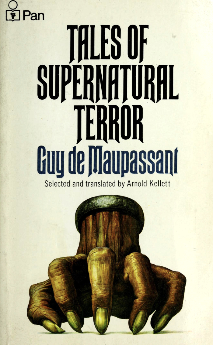
Tales of Supernatural Terrorby Guy de Maupassant, Pan
Rubens creates a suffocating, claustrophobic tension through its ultra-condensed proportions and sharp diagonal terminals that literally echo the fingernails depicted in Kirby's cover art. The typeface's rational form model—with closed apertures and vertical stress—combined with its extreme compression generates an unsettling, constricted energy that mirrors the psychological horror of Maupassant's supernatural tales. This isn't merely "creepy" typography; it's letterforms that physically embody the sensation of being trapped.
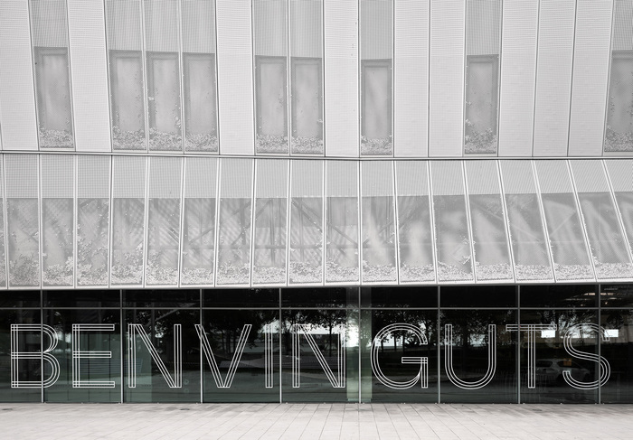
Mondiacult 2025
Milling's geometric form model with its rounded corners and soft terminals creates an institutional warmth that balances UNESCO's global authority with approachable accessibility. The typeface's circular construction echoes the protective, enveloping quality of the physical mattresses, while its systematic letterforms maintain the credibility needed for multilingual diplomatic communication across diverse cultural contexts.
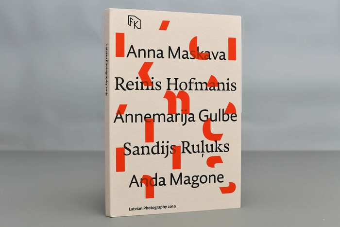
Latvian Photography 2019
This typography system embodies intellectual rigor with experimental structure, reflecting the avant-garde nature of contemporary Latvian photography. The combination of Djurek's rational forms with their precise optical sizing creates a scholarly authority that's disrupted by the book's deconstructed horizontal division, suggesting both archival permanence and cutting-edge cultural intervention.
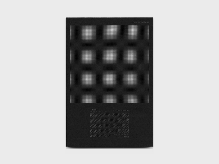
Quand vient la nuitby Fabrice Catérini
This typography embodies nocturnal metamorphosis—the transformation from ordered daylight consciousness into the fragmented, multi-layered experience of night. Yorick's deconstructed letterforms on the cover mirror the photographer's journey through darkness, where text becomes visual texture rather than linear narrative. Exposure's rational clarity in the central text section provides a moment of lucid reflection within the visual chaos, like finding coherent thought in the midst of nighttime reverie.
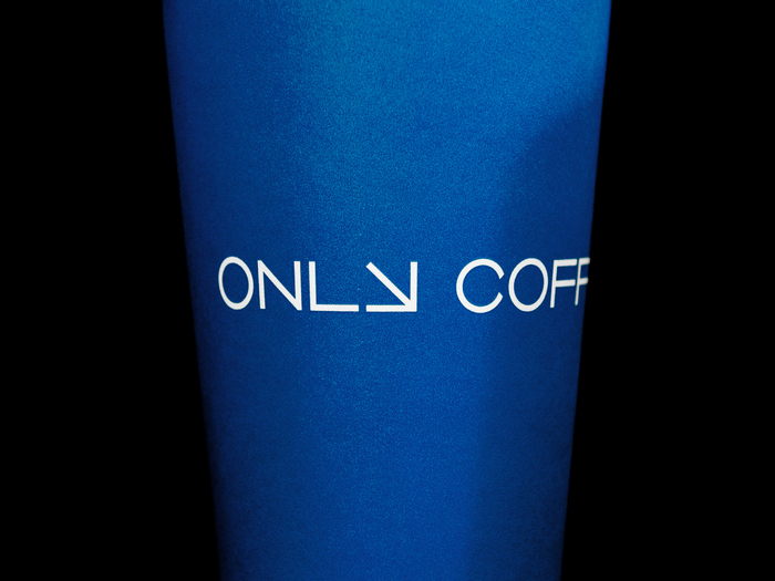
Only Coffee Project
FK Grotesk communicates a systematic-yet-energetic rationality that perfectly mirrors Only Coffee Project's "mathematical approach to brewing." The rational form model with its closed apertures and vertical stress creates analytical precision, while the geometric clarity and extended weight range allows for dynamic visual flow states. This typography embodies focused intensity — not scattered creativity but laser-focused obsession channeled through clean, calculated forms.
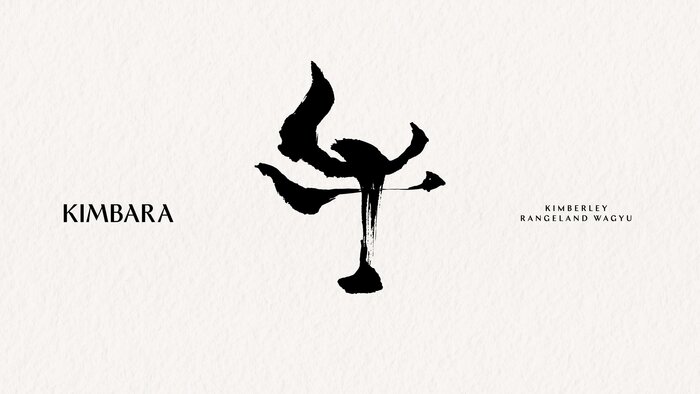
Kimbara
The typography articulates a sophisticated collision of Japanese precision and Australian ruggedness through deliberate structural contrast. Ergon's rational form model—with its closed apertures and vertical stress—anchors the wordmark in contemporary authority, while Chap's dynamic forms echo the commissioned calligraphy's gestural energy. This creates a brand voice that speaks fluent luxury but with territorial confidence, balancing refinement with an unmistakable sense of place.
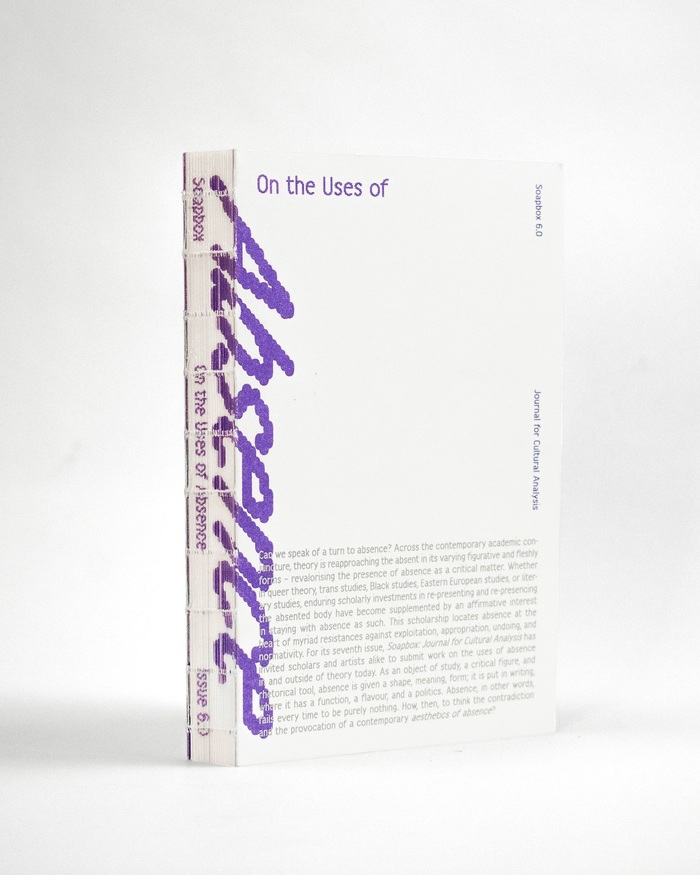
Soapboxissue 6.0, “On the Uses of Absence”
This typography system embodies intellectual provocation through structural contradiction—the rational authority of Adriane Text's high-contrast forms creates academic gravitas, while Harber's dynamic apertures and Modulo's geometric construction introduce deliberate instability. The bouncing baselines and rotated elements literalize the journal's exploration of "absence," creating a visual rhetoric where typographic displacement becomes conceptual content.
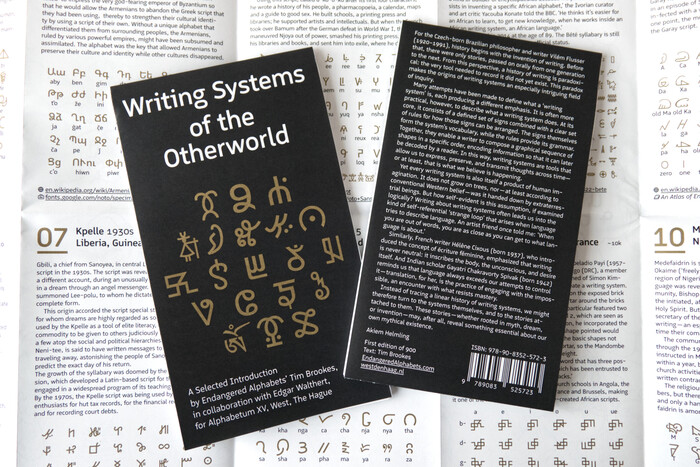
Writing Systems of the Otherworld
This typography system embodies scholarly inclusivity and systematic documentation, creating an authoritative yet accessible academic voice. Logical's humanist warmth tempers its technical precision, while the Noto family's pan-Unicode coverage demonstrates methodical comprehensiveness. The rational form model of both systems—with their vertical stress and measured apertures—establishes credible institutional authority while remaining approachable enough for public education about endangered writing systems.
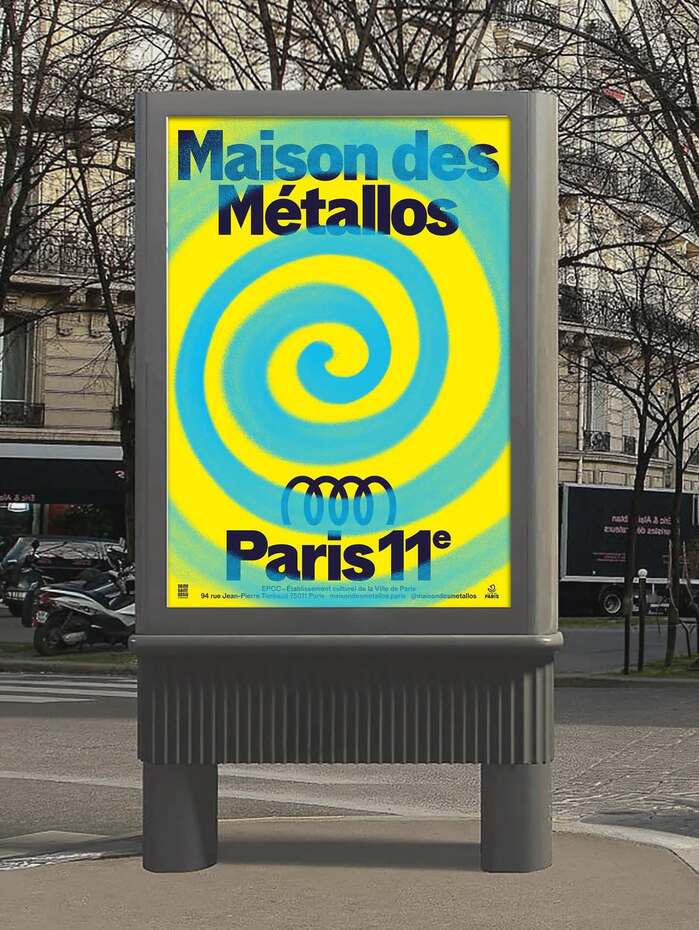
Maison des Métallos
This pairing communicates insurgent intellectualism — the sophisticated rebellion of avant-garde Parisian culture. Modale Antique's high-contrast forms and diagonal stress carry dynamic warmth, suggesting institutional gravitas that hasn't calcified into bureaucracy. The monospace companion creates deliberate friction, injecting experimental edge into classical authority through its rigid digital geometry.

Pauline Boudry / Renate Lorenz –You Ask Me to Not Give Up Up Upexhibition poster and flyer
This typography communicates psychedelic rebellion with ecclesiastical gravitas—Purple Haze's variable letterforms create kaleidoscopic movement that mirrors the sonic sculpture's disorienting beauty, while Display Grotesk's rational structure grounds the chaos with institutional authority. The layered transparency effects transform static type into kinetic experience, embodying the exhibition's fusion of sacred space and experimental sound art.
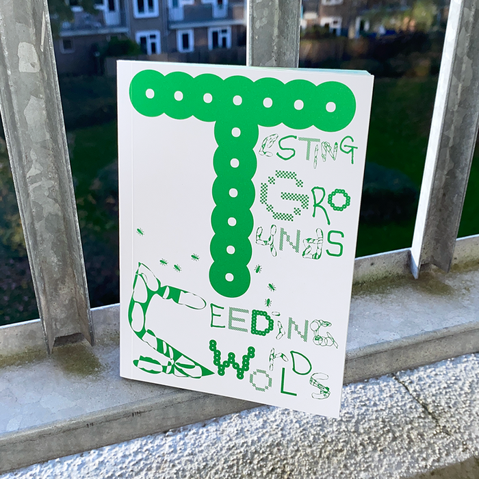
Testing Grounds / Seeding Worlds
This typography creates an experimental-scholarly ecosystem that mirrors the organic complexity of a garden laboratory. The deliberate multiplicity of foundries and styles—from Velvetyne's activist roots to notyourtype's experimental forms—generates a living typographic biodiversity that refuses traditional academic hierarchy. Rather than seeking typographic monoculture, this system embraces productive chaos, where each font contributes its own formal DNA to create a contemplative yet disruptive intellectual environment.
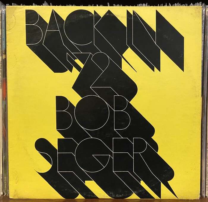
Bob Seger –Back in ’72album art
The ultra-thin Futura Fineline creates a paradoxical brand energy of sophisticated restraint with underground edge. Its geometric skeleton maintains the rational precision of constructed letterforms, but the hairline weight transforms this into something almost fragile yet defiant—like a whispered rebellion. The theatrical black shadow adds analog warmth to the cold geometry, creating a duality between studio precision and street authenticity that perfectly captures Seger's position between mainstream craft and roots rebellion.
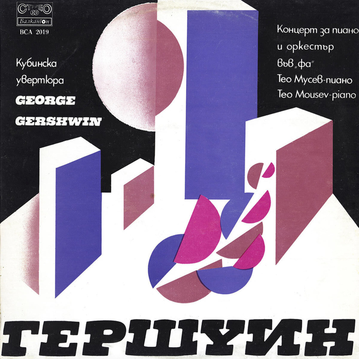
Teo Moussev & Bulgarian National Radio Symphony Orchestra – Gershwin:Cuban Overture,Concerto in F for Piano and Orchestraalbum art
Black Bull's inclined slab serif capitals create a theatrical, cinematic energy that bridges European sophistication with American jazz boldness. The high-contrast strokes and decorative highlight treatment suggest prestige and cultural gravitas, while the italic stance adds forward momentum that mirrors Gershwin's rhythmic dynamism. This isn't corporate authority but rather artistic proclamation—typography as marquee signage for high culture.
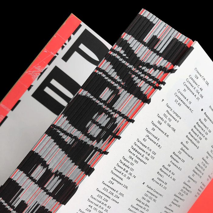
Russkiye v Afrike
The pairing creates a compelling dialectic between experimental disruption and systematic clarity—perfectly embodying the book's exploration of Soviet attempts to understand African culture. CSTM Xprmntl 02's dynamic form model with open apertures and unconventional character construction suggests cultural boundary-crossing and intellectual experimentation, while Geometria's rational geometric precision references Soviet design ideology and systematic thinking.
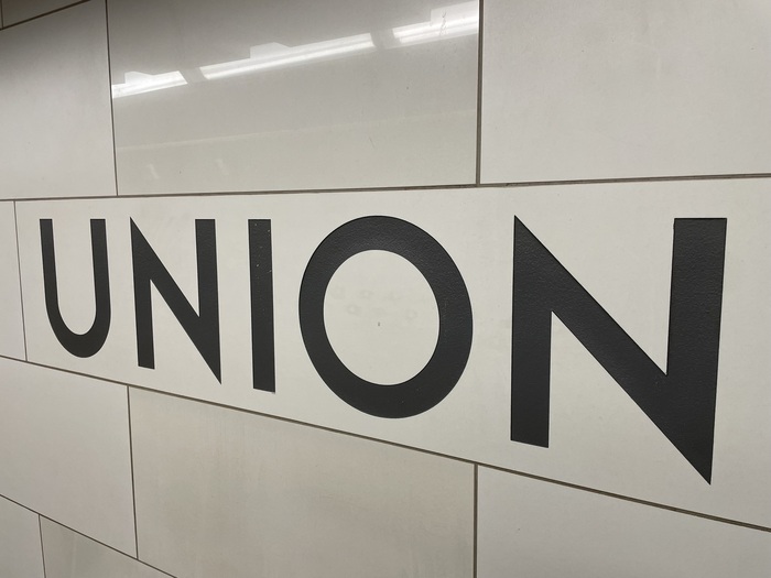
Toronto Subway station signs
Toronto Station embodies civic permanence through its geometric construction and monumental capitals. The wide letterforms with generous spacing create institutional authority without coldness—the geometric model's systematic clarity conveys public trust and navigational certainty. The sandblasted execution in tiles transforms individual letters into architectural elements, making typography inseparable from urban infrastructure and creating a distinctly Canadian modernist voice that feels both progressive and enduring.
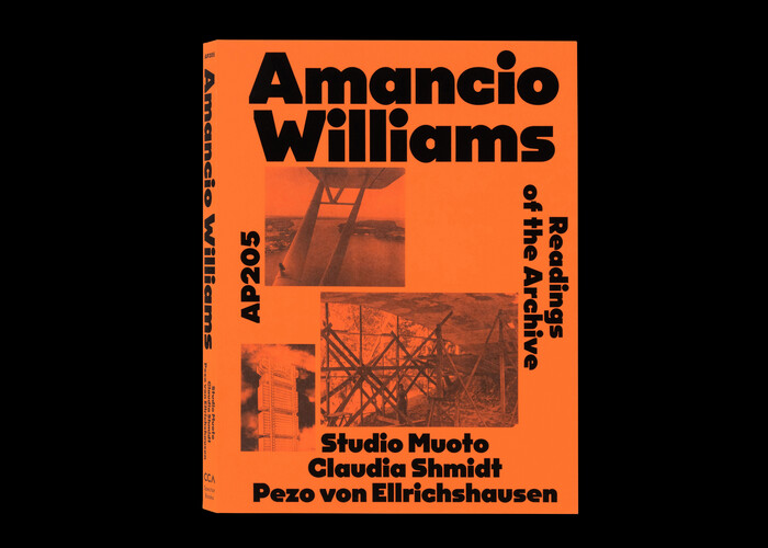
Amancio Williams – Readings of the Archive
This typography system communicates intellectual rigor with contemporary accessibility—the kind of scholarly authority that doesn't intimidate. OPS And Ever's rational form model, with its closed apertures and vertical stress, establishes editorial credibility, while its proportional refinement of the monospace DNA softens the technocratic edge into something more humanistic and approachable for architectural discourse.

Mitome
This typography system channels scientific precision through humanistic warmth—Hauss delivers sharp, rational authority with its clean geometric construction and high contrast, while Raum's organic cellular forms soften the clinical edge with biomorphic curves that literally evoke mitochondrial structures. Together they create a brand voice that's simultaneously cutting-edge and approachable, positioning complex biotech research as accessible wellness innovation.
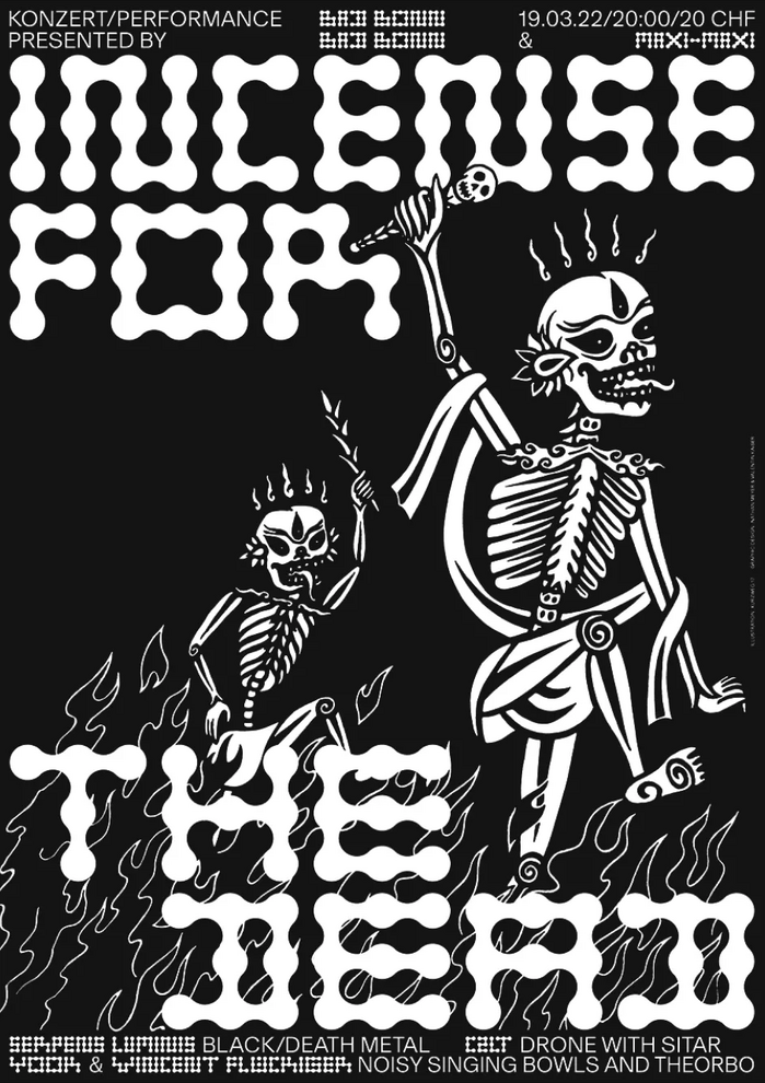
Incense for the Dead concert poster
This typography creates an anti-establishment cultural energy that subverts heavy metal clichés through deliberate restraint. Basel Grotesk's rational form model with its closed apertures and vertical stress provides editorial authority that legitimizes the underground event, while Metaballs' constructed geometric forms echo the skeletal motifs through modular, bone-like letterforms that feel both organic and systematically designed.
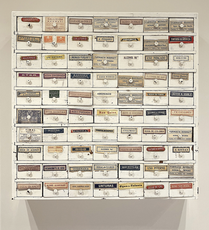
Farmàcia Bonmatí labels
This eclectic pharmaceutical label system embodies the vernacular authority of mid-20th century European pharmacy culture—a typography of trusted precision wrapped in artisanal warmth. The strategic mixing of geometric forms (Futura's constructed circles), rational grotesks (Venus's closed apertures), and dynamic serifs (the flowing stress of Tages-Antiqua) creates a visual language that speaks to both scientific rigor and human care, reflecting the neighborhood pharmacy's dual role as medical authority and community cornerstone.
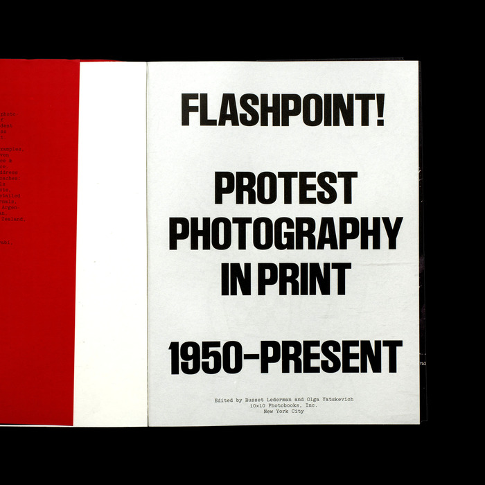
Flashpoint! Protest Photography in Print. 1950–Present
This typography system embodies activist-intellectual authority through the marriage of Swiss rationalist discipline with typewriter authenticity. LL Ruder Plakat's bold constructivist forms channel the geometric clarity of protest graphics, while LL Electa's monospaced character carries the urgency and democratic accessibility of underground publishing—evoking both the typewritten manifestos of resistance movements and the mechanical reproduction that democratized radical ideas.
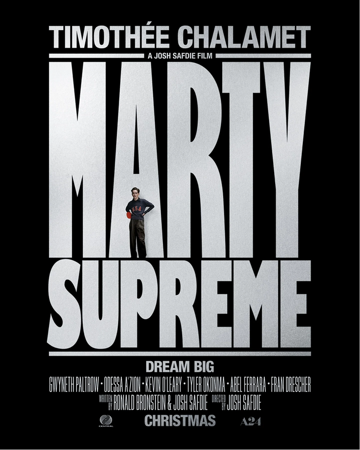
Marty Suprememovie logo and posters
This typography system channels raw athletic aggression filtered through 1970s American sports culture. The manipulated Gill Kayo creates a knockout punch of condensed mass—its ultrabold weight and custom letterform modifications (stretched proportions, optimized counters) generate the visual equivalent of a table tennis slam. The rational form model's tight apertures and vertical stress maintain editorial control while the extreme weight and compression deliver pure competitive intensity.
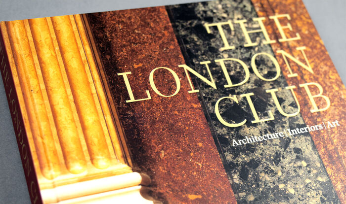
The London ClubbyAndrew Jones
Ravenscar embodies intellectual gravitas with refined British sensibility—a typeface that whispers authority rather than shouting it. Its likely rational form model with controlled apertures and vertical stress creates the scholarly weight appropriate for institutional histories, while maintaining enough warmth to invite sustained reading. The typography communicates the hushed reverence of a members' club library, where knowledge is preserved with quiet ceremony.
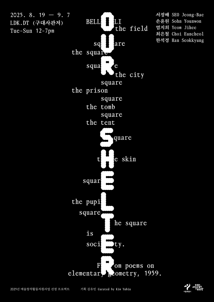
Our Shelterexhibition at LDK.DT
The typography creates a liminal, contemplative energy that mirrors the exhibition's threshold concept between life and death. OO Theran's geometric-rational form model with its constructed letterforms establishes architectural gravity, while the tight x-height and closed apertures create an inward, meditative quality. The pairing with Takt's more open, humanist proportions softens this severity, creating a duality that embodies the exhibition's exploration of shelter as both protection and boundary.

The Man Who Fell to Earthmovie posters
The typography creates an otherworldly alienation that perfectly captures Roeg's sci-fi vision—Busk's angular geometric forms with sharp, crystalline edges suggest technological coldness and inhuman precision, while its constructed letterforms echo 70s futurism without nostalgia. The pairing communicates alien intelligence: sophisticated yet unsettling, as if designed by a civilization that understands human communication but interprets it through fundamentally different optical logic.
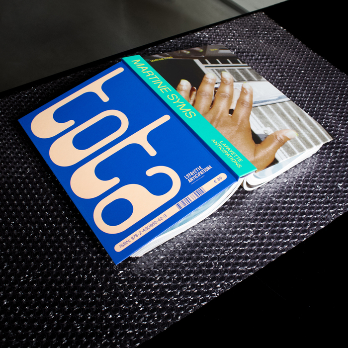
Martine Syms –Totalexhibition catalog
This pairing channels post-digital institutional critique with intimate accessibility. Clippy's deliberately vernacular forms—drawn from early computing's friendly interfaces—create warmth and cultural specificity, while Gerstner-Programm's systematic rationality provides scholarly gravitas. Together they embody the tension between personal narrative and institutional framework that defines contemporary art discourse, particularly around Black feminist practice.
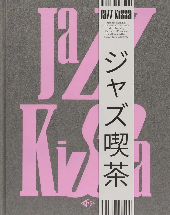
Jazz Kissa
WS Craft's biform letterforms create a deliberately unstable, syncopated rhythm that mirrors jazz's improvisational spirit—the alternating case heights generate visual polyrhythm on the page. Combined with Eiko's refined Japanese forms, this creates a cross-cultural dialogue between Western experimental typography and Eastern typographic precision, embodying the book's exploration of Japanese jazz café culture as both intimate and internationally connected.
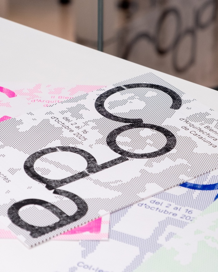
CODA – 2nd Young Architecture Biennal of Catalonia
CMM Coda's Normalized version embodies architectural afterlife—the rational structure of a geometric form model softened by dynamic apertures and subtle humanist warmth. Its constructed letterforms reference both digital precision and analog decay, perfectly capturing the manifesto's concept of "persistent, dense atmosphere" where architectural ruins become material for transformation rather than endings.
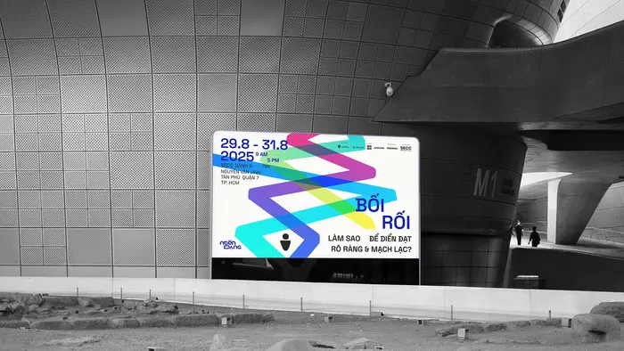
Ngôn Dạng campaign
The typography system communicates intellectual curiosity balanced with approachable warmth. The custom Ngôn Dạng Mono, built on geometric foundations with deliberate tension between straight and curved elements, creates a dynamic-rational hybrid that feels both systematic and human. This structural duality mirrors the campaign's core message of self-reflection and authentic expression, while the monospaced character spacing reinforces the methodical, educational nature of the communication style assessment.

“À table!” poster and T-shirt
This typography system embodies "earnest kitsch" through its commitment to authentic period maximalism rather than ironic pastiche. The Bookman Swash anchors the composition with its expansive, confident swashes that mirror the unabashed confidence of 1970s cookbook photography, while the supporting cast of ornamental and display faces creates the visual excess that defines the era. Rather than winking at its references, the typography maintains the sincere enthusiasm of its source material—cookbook designers who genuinely believed in the visual appeal of aspic-suspended vegetables.

A Magazine Curated By#28, Cecilie Bahnsen
This tri-font system creates an intimate yet intellectually rigorous editorial voice that balances contemporary design discourse with personal storytelling. OO Theran's monospaced DNA brings digital vernacular authenticity, while its distinctive circled alternates add playful punctuation. Mercure's rational proportions ground longer texts with scholarly authority, while Monument's geometric precision provides contemporary editorial backbone without coldness.
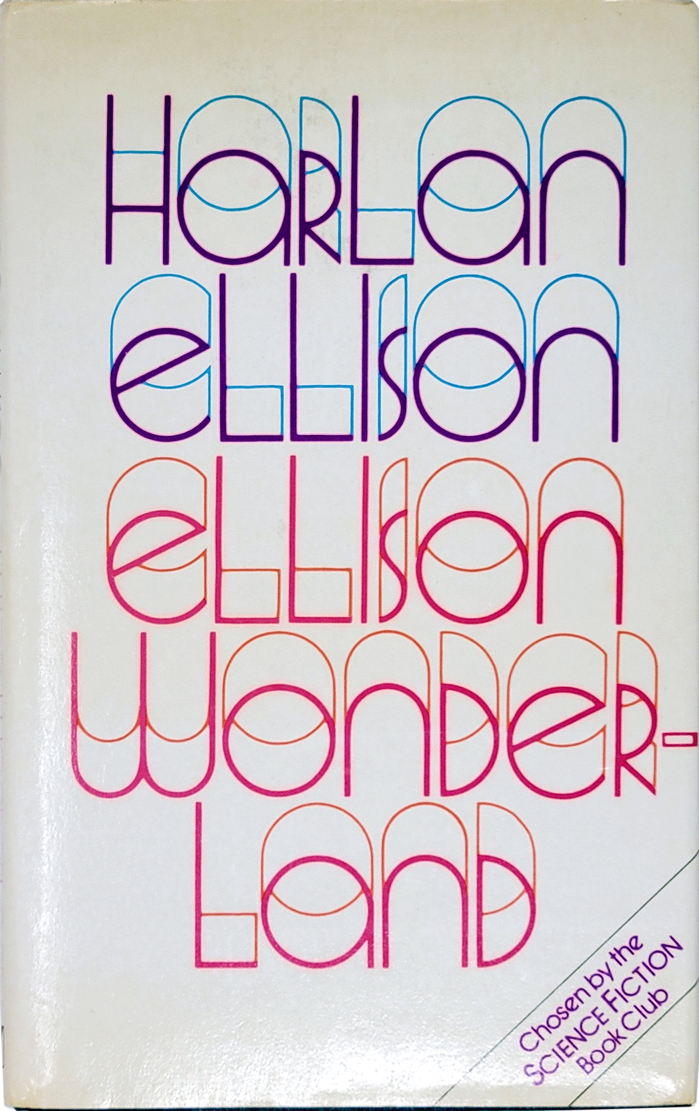
Ellison Wonderlandby Harlan Ellison,Millington
This typography system embodies experimental literary consciousness through dimensional letterforms that literally expand beyond traditional typographic boundaries. Quartermaine's unicase construction and open, dimensional quality creates a psychedelic authority — the letterforms appear to emerge from multiple planes of reality, perfectly capturing Ellison's mind-bending science fiction narratives. The chromatic separation of thick and thin strokes transforms static typography into kinetic visual experience, suggesting the fracturing of conventional perception.
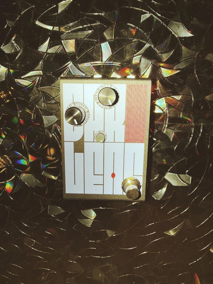
Darlene effects pedal
This typography communicates precision-meets-playfulness through extreme spatial efficiency and variable flexibility. The rational geometric construction of Fit creates technical credibility while its elastic width variations introduce a dynamic, almost performative quality that mirrors the pedal's compression function—literally squeezing type to its limits while maintaining legibility and impact.
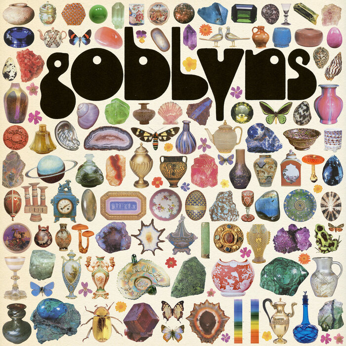
Goblyns –Three Sistersalbum art, tour poster and single cover
Hypnos delivers a distinctly analog, psychedelic authority through its bold geometric construction and extreme contrast ratios. The typeface channels 1970s counterculture sophistication—not throwback nostalgia, but the era's experimental rigor applied to letterforms. Its dynamic form model features open apertures and diagonal stress that create warmth within an otherwise systematic structure, perfectly embodying the band's position between underground credibility and refined artistic vision.
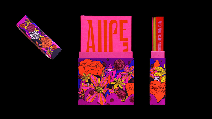
Alice’s Adventures Under Ground & In Wonderland,Jhambo Ink
This typography communicates whimsical literary authority with theatrical confidence. Le Murmure's dynamic form model—with its open apertures and organic construction—channels Alice's fantastical world through typographic play rather than literal illustration. The dramatic vertical extensions and intentional distortions create a sense of wonderland logic where normal rules bend, while Viksjø's rational, compressed forms provide grounding structure that keeps the fantasy anchored to readable narrative.
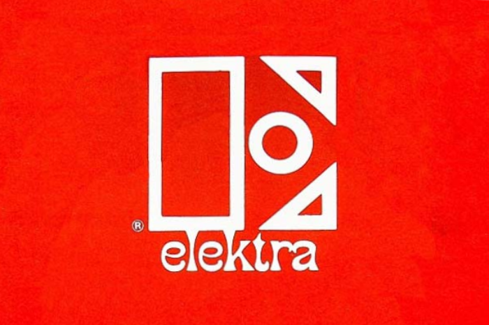
Elektra Records logo and record labels (1966–1983)
Elektra's typography system embodies counterculture authority—a paradoxical blend of underground credibility with institutional weight that defined the label's progressive rock and folk roster. The outlined stencil E creates bold geometric presence while Phanitalian's extreme flare terminals inject psychedelic energy, establishing a brand voice that's both rebellious and professionally serious. This typographic duality perfectly captured the late-60s moment when underground music was crossing into mainstream success.
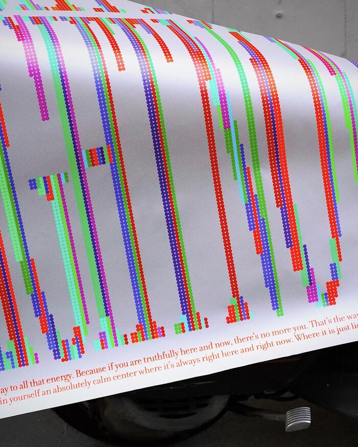
“Here, Now” poster
Filosofia's high-contrast Didone structure creates contemplative gravitas through its radical thick-thin modulation and sharp, unbracketed serifs. The typeface's vertical stress and closed apertures establish meditative authority, while its extreme contrast ratios demand slow, deliberate reading—perfectly embodying the poster's "pause and reflect" philosophy. When deconstructed into dots, Filosofia's classical proportions maintain their dignity even in fragmented form.
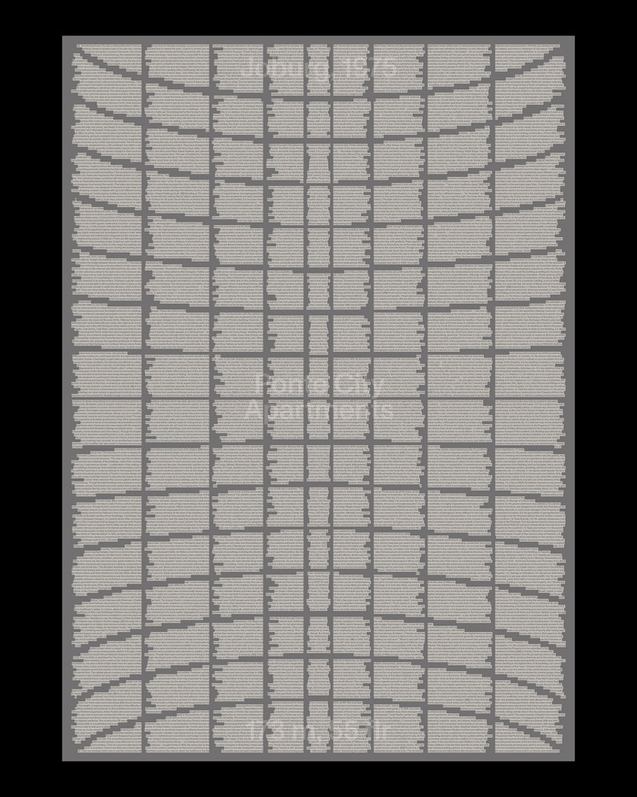
Ponte City Apartments poster
ABC Monument Grotesk embodies architectural brutalism translated to type—its rational form model with closed apertures and vertical stress creates monumental authority that mirrors Ponte City's concrete monumentality. The typeface's systematic construction and industrial precision capture the building's 1975 modernist ambition while its slightly condensed proportions and sturdy weight echo the tower's imposing cylindrical mass and raw materiality.
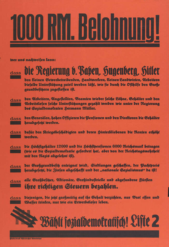
“1000 RM. Belohnung!” SPD election poster
This typography orchestrates a calculated tension between tradition and urgency, wielding cultural legitimacy as resistance strategy. The dominant Merian-Fraktur carries centuries of German typographic authority—its blackletter forms invoke institutional weight and cultural continuity—while the sans-serif headline cuts through with industrial precision. This isn't nostalgic traditionalism but weaponized heritage: using familiar letterforms to deliver radical democratic messaging against rising fascism.
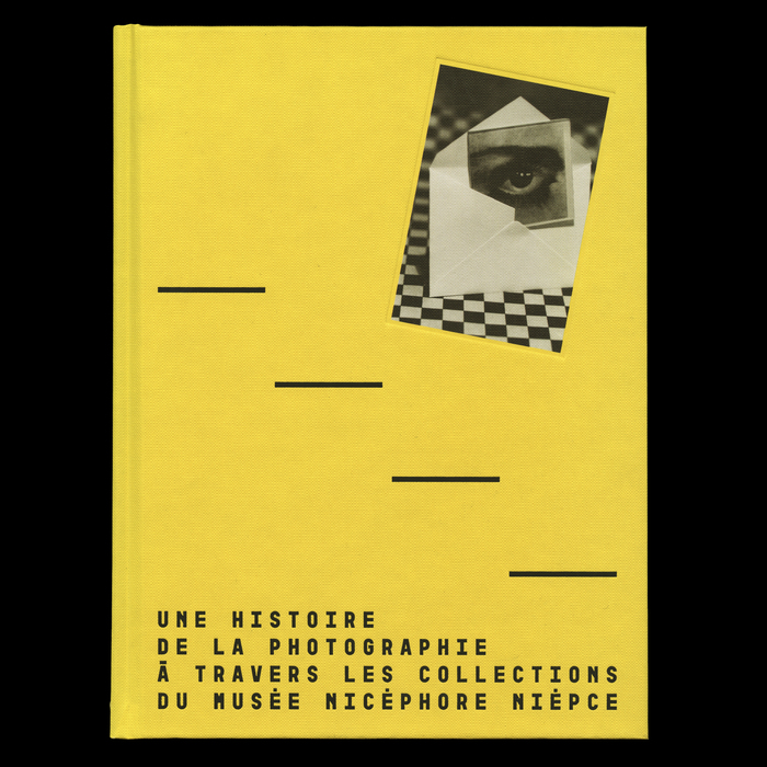
Une histoire de la photographie à travers les collections du musée Nicéphore Niépce
This typography system communicates scholarly authority with contemporary accessibility, bridging academic rigor and public engagement. Garaje's dynamic form model—with open apertures and subtle calligraphic warmth—prevents the publication from feeling austere, while Portada Text's rational structure provides editorial credibility. The combination creates an intellectual energy that feels approachable yet serious, perfectly suited for a museum publication that aims to make photography history both comprehensive and engaging.
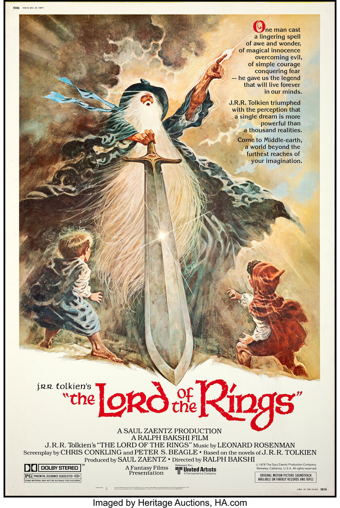
Lord of the Rings(1978) movie posters
This typography conjures mystical authority through calligraphic gravitas—the uncial forms evoke medieval manuscripts and ancient wisdom, while their robust, hand-carved quality suggests both magical power and earthbound craft. The lettering's biform character (mixing upper and lowercase proportions) creates an otherworldly formality that bridges the sacred and the fantastical, communicating that this Middle-earth is both mythic and tangible.
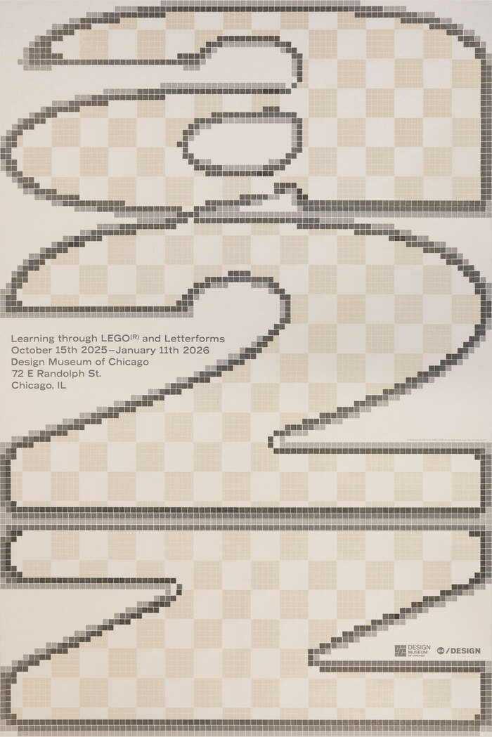
a–z: Learning through LEGO® and Letterformsposter
This typography system embodies playful-industrial precision, bridging the gap between childhood construction and adult craft mastery. The pixelated Univers creates a digital-meets-analog energy that's both nostalgic and forward-thinking, while Record Gothic's sturdy letterforms echo the modular, stackable logic of LEGO bricks themselves. The combination communicates educational innovation with serious design intent—turning play into pedagogy through systematic construction.
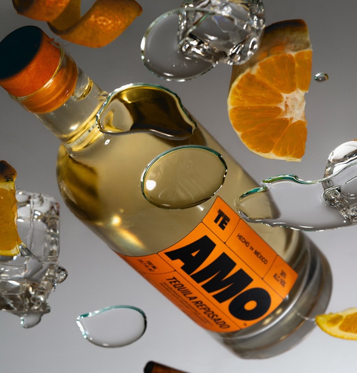
AMO Tequila
This typography system communicates industrial confidence with artisanal precision. The BN Dime Display's high-contrast geometric construction creates bold, architectural presence while its refined proportions prevent brutalism. Combined with Halyard's rational clarity and humanist warmth, it positions AMO as premium craft tequila that respects tradition while rejecting category clichés of ornamental excess.
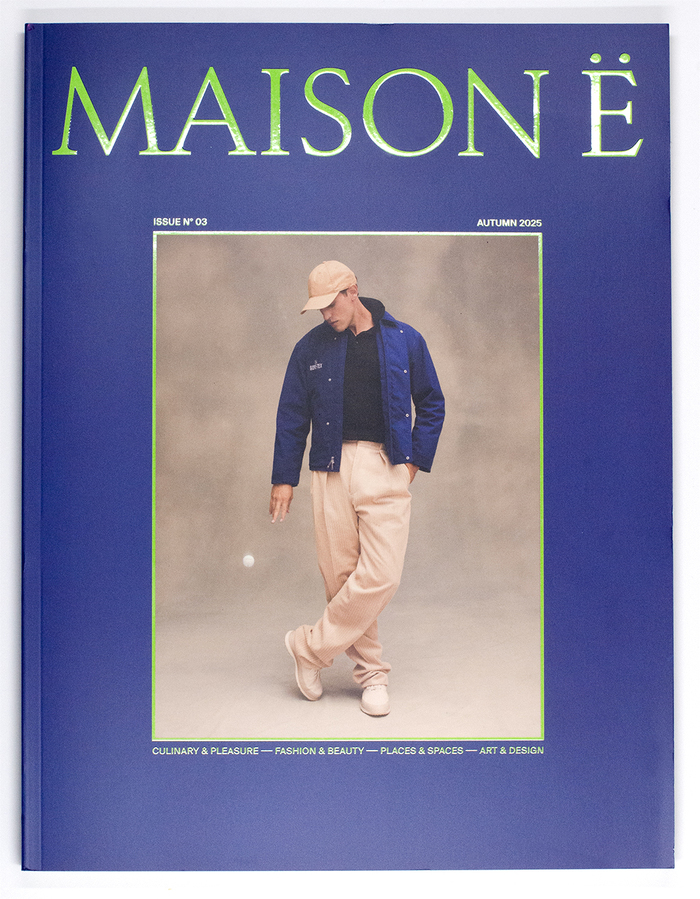
MAISON Ëmagazine
Rizoma's geometric construction and distinctive character forms create an intellectual-yet-playful editorial voice that signals curatorial confidence without academic stuffiness. The typeface's constructed letterforms and unconventional details communicate experimental sophistication, while the supporting cast of Chamberí's rational clarity and Suisse Int'l's swiss precision grounds the more expressive headline work in readable, authoritative text setting.
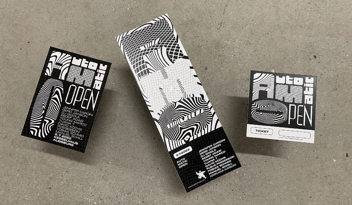
AUTO MATIC OPEN Festival 2022
This typography system channels authentic '90s rave energy through geometric brutalism and industrial precision. Forward's extreme geometric construction with straight sides creates an aggressive, machine-like presence, while Eurostile's subtler square curves add technological sophistication. Together they evoke the raw, underground techno scene—not nostalgic pastiche but genuine subcultural authenticity with contemporary refinement.
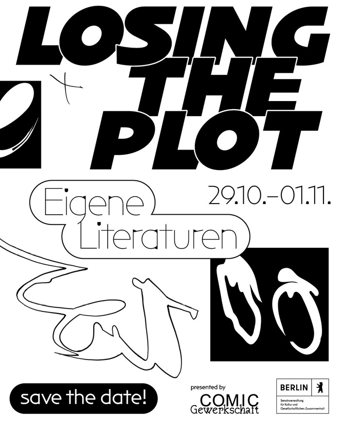
Losing the Plot Festival 2025
NaN Archy Off embodies creative authenticity through controlled imperfection—its deliberately irregular punctuation and stem-curve connections create a handmade warmth that elevates comic vernacular into professional discourse. The dynamic form model with open apertures and organic stress variations communicates artistic labor solidarity, suggesting both grassroots energy and elevated expertise without corporate polish.