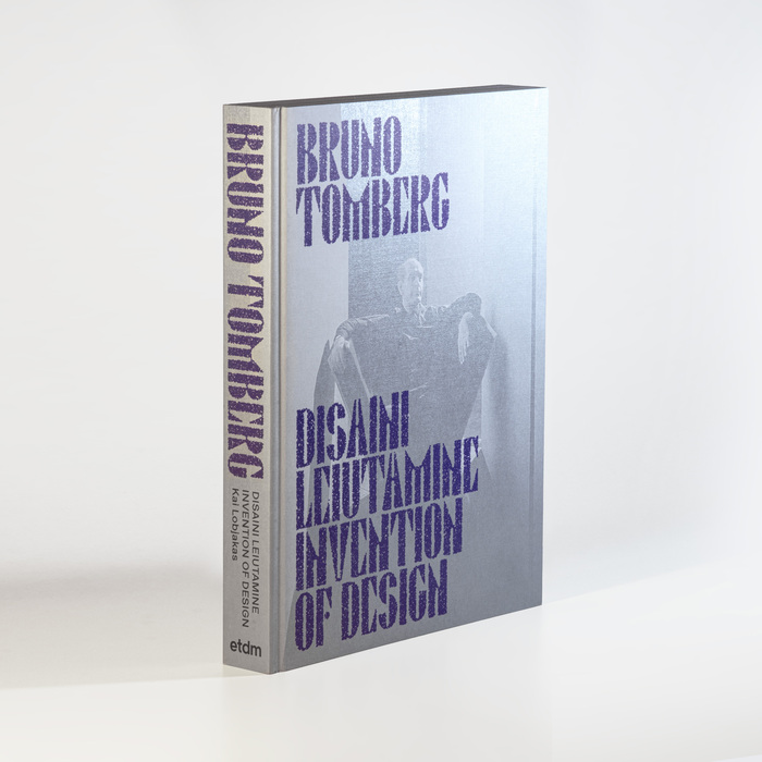
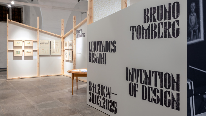
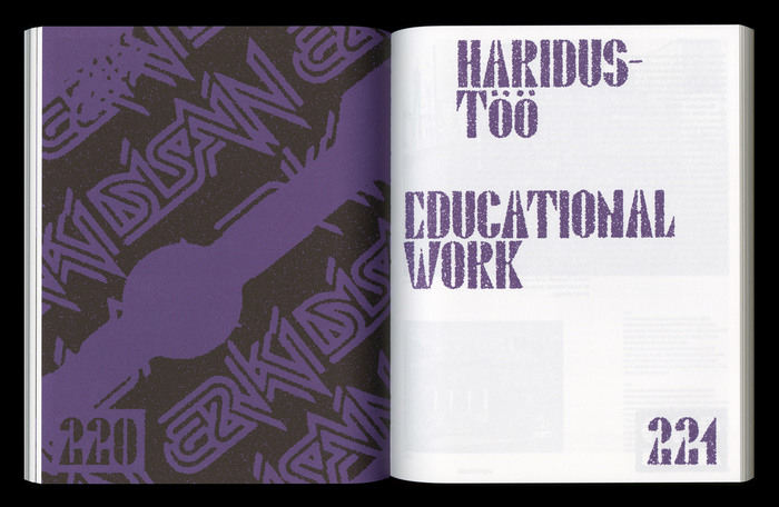
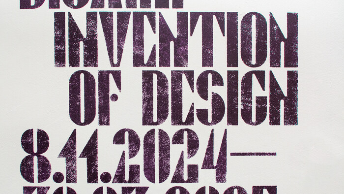
Bruno Tomberg. Disaini leiutamine / Invention of Designwas an extensive retrospective exhibition and monograph of Bruno Tomberg’s work at the Estonian Museum of Applied Art and Design in Tallinn, curated by Kai Lobjakas. The exhibition offered an overview of Tomberg’s nearly six-decade-long career, exploring for the first time in greater depth his roles as both designer and educator. It also brought a wealth of previously unknown and unexhibited materials to the public. Bruno Tomberg(1926–2021) was an interior architect, designer, artist and educator, recognised as a leading voice in Estonian design during its intense development from the early 1960s onward. Through his diverse creative, pedagogical and administrative activities, he embodies the story of Estonian applied art and design. For this occasion, the display typefaceBruno 100was created byTüpokompanii. The font is based on Tomberg’s poster designs from the 1970s, strongly reflecting his style as a product and interior designer where diagonal lines and rhombic shapes were frequent motifs throughout his career. A fuzzy texture was added to the type in the graphic design (byIndrek Sirkel), and exhibition wall texts were roll-painted over stencils to achieve a fabric-like surface to echo the materiality of Tomberg’s textile work and rug designs. The accompanying typeface isLadna. While Bruno 100 was custom-made for this project, it can be licensed to the public, so feel free to reach out toTüpokompaniiif you’d like to use it.
This typography system communicates biographical reverence through material nostalgia—the custom Bruno 100 carries geometric modernist DNA filtered through craft memory, while its fuzzy texture treatment suggests the patina of time and tactile engagement. The pairing creates scholarly intimacy, balancing archival authority with the warm imperfection of handmade processes, perfectly embodying the intersection of Estonian design history and contemporary museum scholarship.
Bruno 100's geometric form model—constructed from rhombic shapes and diagonal stress—directly translates Tomberg's design language into typographic form, creating unprecedented biographical authenticity. The high contrast and angular construction reference 1970s modernist poster traditions while the added texture softens the rational geometry into something more human and craft-oriented. Ladna provides rational counterpoint with its cleaner apertures and vertical stress, allowing Bruno 100's personality to dominate while maintaining scholarly readability for extended text.
This represents ideal custom-with-companion pairing: Bruno 100 carries the full personality load through its geometric form model and high contrast, while Ladna provides rational support with shared proportional DNA but opposite surface treatment. The pairing follows Kupferschmid's contrast-with-cohesion principle—different form models (geometric vs. rational) unified by similar x-height and weight relationships, creating hierarchy through character differentiation rather than size alone.