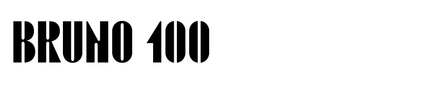
Bruno 100 exhibits a rational form model with closed apertures, vertical stress, and methodical construction that creates an authoritative, reserved presence on the page. The typeface displays minimal stroke contrast approaching uniformity, with squared-off terminals and closed counters that reinforce its systematic nature. Its proportions suggest a condensed character width optimized for efficient space usage, typical of contemporary grotesks designed for headline and display applications. This face belongs to the rational grotesk tradition but pushes toward geometric territory with its simplified letter forms and reduced humanist influence. The "100" designation indicates this is likely the lightest weight in a broader family system, though without additional weights or italics, its utility for complex typographic hierarchies remains constrained. Bruno 100 excels in display contexts where its clean rationality and space efficiency serve layouts demanding both presence and restraint, but its closed forms and likely narrow set width would compromise readability at text sizes.