Teo Moussev & Bulgarian National Radio Symphony Orchestra – Gershwin:Cuban Overture,Concerto in F for Piano and Orchestraalbum art
View source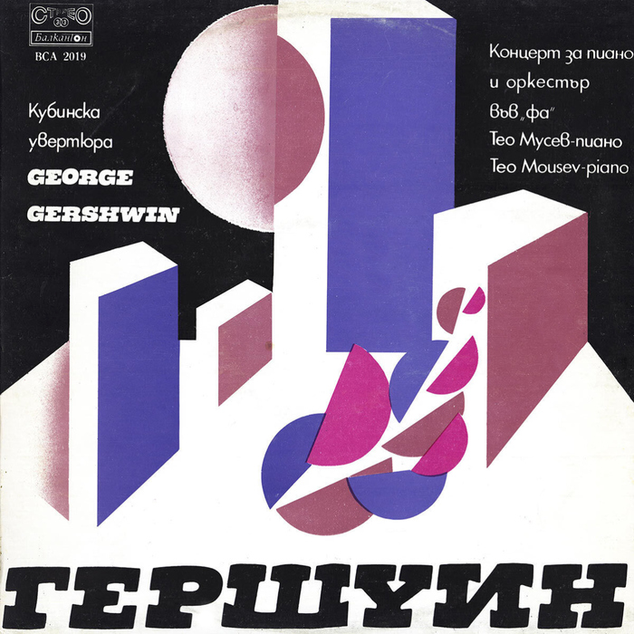


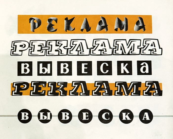
In 1977,Balkanton, Bulgaria’s state-owned record company, released an album with compositions byGeorge Gershwin, performed by pianist Teodor Moussev and theBulgarian National Radio Symphony Orchestraunder conductor Alexander Vladigerov. The composer’s name is shown in inclined caps from an extrabold slab serif. It’s not set in a typeface. Instead, the letterforms werereproduced from an alphabet sample. In her bookSchrift und Schreiben(Leipzig, 1972),Hildegard Korgershowed an “alphabet in the style of an italic Egyptienne” and two sets of decorative capitals derived from it – one with highlights and one with open letterforms – credited toVolker Küster, 1966. According toGünther Flake’sshort biography of Küster,Black Bullis the title of a design for an Egyptienne typeface in three styles, drawn as part of his diploma project atHGB Leipzigin the mid-1960s. Korger doesn’t mention the name “Black Bull”, but Ihave to assume that the samples in her book show Küster’s graduation project. Composite image showing letters from the “alphabet in the style of an italic Egyptienne” (top row) and two sets of decorative capitals derived from it (bottom row) byVolker Küster, 1966, from Hildegard Korger’sSchrift und Schreiben, VEB Fachbuchverlag Leipzig, 1972 (5th edition: 1982) Details from two Cyrillic adaptations of Küster’s all-caps highlight style, reproduced inШрифтfrom 1975(top) andДекоративные шрифтыfrom 1987 (bottom). The latter is credited toOleh Snarsky. Black Bullwas not produced as a proper typeface. It still got around, as Korger’s book was distributed abroad, including to “socialist brother countries” of the GDR, like Bulgaria and the USSR, where it inspired local designers. I’m aware of two Cyrillic adaptations of the all-caps highlight style that were reproduced in Soviet books, inШрифт(Leningrad, 1975)and inДекоративные шрифты(Minsk, 1987). The latter is credited toOleh Snarsky, a Ukrainian lettering artist who drew numerous alphabets for lettering manuals and alphabet source books, including original designs and Cyrillic adaptations of existing ones. Snarsky had previously shown sample words based on Küster’s alphabet in hisbookШрифты/Алфавиты для рекламных и декоративно-оформительских работ(Kyiv,1979). “РЕКЛАМА ВЫВЕСКА” – page 31 fromШрифты/Алфавиты для рекламных и декоративно-оформительских работ(“Typefaces/Alphabets for advertising and decorative design works”), Kyiv, second revised edition, 1979. Snarsky shows a Cyrillic version of Black Bull’s highlight style plus an original reversed variant. The lines at the top and bottom are based onRoger Excoffon’sCalypsoandVendôme. The boxed glyphs in the center are either from an unidentified source or represent an original design by Snarsky. The record cover features both Latin and Cyrillic letters based on Black Bull. Did the uncredited cover designer copy them from Korger’s book and invent matching Cyrillic themselves? Or did they get the inspiration from one of the Soviet books, and reverse-engineer the Latin? Chances are it was the former: theУin “ГЕРШУИН” matches Küster’s original LatinY, while both Soviet adaptations feature different, asymmetrical glyphs. Cover detail: the letters were applied individually – at least that’s what the unruly baseline and the disregard for theO’s overshoots suggest. Note that the firstGhas a thinner bar. Smaller text is set in a Cyrillic version ofFutura. Inevitably, Black Bull was made into a font eventually, at least in parts. Digital interpretations of the all-caps highlight style include Brad O. Nelson’s freebieThats Super(Brain Eaters Font Co., 2001) andBrocken(RMU, 2011). To my knowledge, neither is authorized by the original designer. Volker Küster died on 15 November 2025 in Kleve, at the age of 84. Born in 1941 in Wernigerode, Küster trained as typesetter and studied in Berlin-Schöneweide and subsequently at the Leipzig Academy. There he became the assistant ofAlbert Kaprand started teaching himself. He worked for theTypoartfoundry and made himself a name as an award-winning book designer. In 1984, he left the GDR for West Germany. Küster started working forScangraphicin Hamburg, where he headed the type design studio and served in the role of Type Director from 1985 to 1989. HisToday Sans Serif, a groundbreaking humanist sans, was released in 1988. After many years of teaching, initially in Hamburg and then in Essen, he devoted himself to free artistic work including iron casting. Natascha Dell posted an obituary(in German) on the website of the Folkwang University of Arts in Essen. It includes quotes by former studentsStephan FiedlerandKarsten Luecke, praising Küster’s merits as an educator.Albert-Jan Pool– who started his career asKüster’sassistant at Scangraphic – shared memoriesincludingimages onInstagram,LinkedIn, andFacebook.
Black Bull's inclined slab serif capitals create a theatrical, cinematic energy that bridges European sophistication with American jazz boldness. The high-contrast strokes and decorative highlight treatment suggest prestige and cultural gravitas, while the italic stance adds forward momentum that mirrors Gershwin's rhythmic dynamism. This isn't corporate authority but rather artistic proclamation—typography as marquee signage for high culture.
Black Bull operates as a rational form model with its vertical stress and closed construction, but the italic stance and decorative highlight treatment inject dynamic energy typically associated with display lettering. The slab serifs provide weight and presence essential for album art hierarchy, while Futura's geometric clarity creates perfect contrast—sharing the rational backbone but stripping away ornamentation. This pairing balances cultural gravitas (the decorated serif) with modernist precision (the geometric sans), perfectly suited for presenting American jazz through a European classical lens.
This pairing follows Kupferschmid's successful contrast principle: different form models (rational slab vs. geometric sans) unified by shared structural clarity and vertical emphasis. Black Bull's rational construction—despite its italic stance—pairs harmoniously with Futura's geometric rationalism. The decorative highlights on the serif create surface contrast while both fonts maintain similar proportional logic and stroke clarity, achieving sophisticated hierarchy through ornamental differentiation rather than mere weight changes.