
Futura embodies pure geometric construction, built from circles, triangles, and straight lines with mathematical precision. Its perfectly circular 'o', simple single-story 'a', and minimal 't' crossbar reveal a rational design philosophy that prioritizes systematic logic over calligraphic warmth. The uniform stroke weight creates an even typographic color, while the relatively low x-height and generous character spacing give it an open, breathing quality on the page. Born from the Bauhaus tradition, Futura represents the modernist ideal of form following function, stripping away decorative elements to reveal essential letterforms. However, this geometric purity comes at a cost—the narrow apertures and mechanical construction can feel cold in extended reading, and the lack of subtle optical adjustments makes it less forgiving at small sizes. On the page, Futura projects authority through its unwavering consistency, making it a powerful voice for brands seeking to communicate precision, innovation, and timeless modernist values.
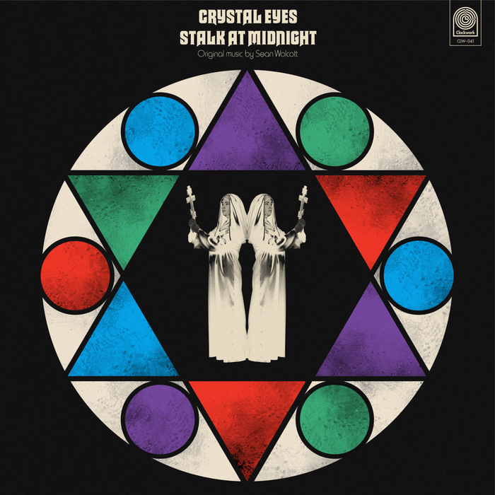
Sean Wolcott –Crystal Eyes Stalk at Midnightalbum art
This typography system channels the theatrical horror aesthetics of 1970s giallo films through deliberate typographic eclecticism. Macbeth's gothic letterforms paired with Harry's condensed grotesks create a cinematic tension between ecclesiastical gravitas and B-movie sensationalism. The rational verticality of Akzidenz-Grotesk Condensed grounds the system with editorial authority while allowing the display faces to perform their dramatic roles.
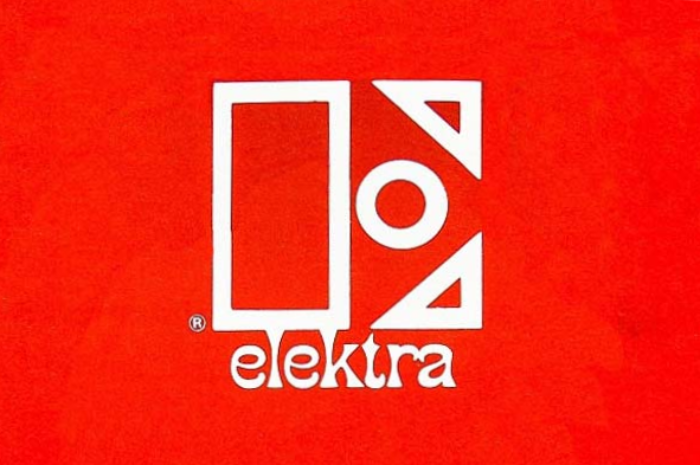
Elektra Records logo and record labels (1966–1983)
Elektra's typography system embodies counterculture authority—a paradoxical blend of underground credibility with institutional weight that defined the label's progressive rock and folk roster. The outlined stencil E creates bold geometric presence while Phanitalian's extreme flare terminals inject psychedelic energy, establishing a brand voice that's both rebellious and professionally serious. This typographic duality perfectly captured the late-60s moment when underground music was crossing into mainstream success.
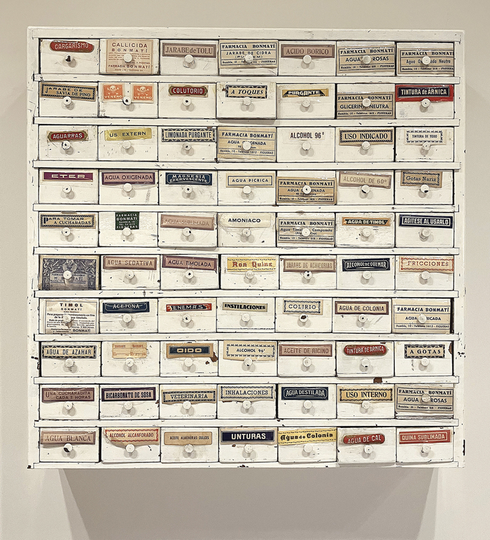
Farmàcia Bonmatí labels
This eclectic pharmaceutical label system embodies the vernacular authority of mid-20th century European pharmacy culture—a typography of trusted precision wrapped in artisanal warmth. The strategic mixing of geometric forms (Futura's constructed circles), rational grotesks (Venus's closed apertures), and dynamic serifs (the flowing stress of Tages-Antiqua) creates a visual language that speaks to both scientific rigor and human care, reflecting the neighborhood pharmacy's dual role as medical authority and community cornerstone.

The Avalanches –Wildfloweralbum art
This typographic ecosystem creates a kaleidoscopic, maximalist brand energy that mirrors electronic music's sampling culture through visual collage. Rather than cohesive brand voice, each track gets its own typographic personality—from the dynamic warmth of Brush Script to the geometric precision of Futura to the rational authority of ITC Franklin Gothic. The embroidered execution transforms digital fonts into tactile craft, creating unexpected intimacy within electronic music's typically cold aesthetic.