
ITC Franklin Gothic
ITC Franklin Gothic operates from a rational skeleton with closed apertures, vertical stress, and systematic construction that prioritizes order over warmth. Its medium contrast reveals subtle thick-thin variation in strokes, while maintaining the sturdy, workmanlike character of Morris Fuller Benton's 1902 original. The face displays characteristic neo-grotesque features: a double-story 'a', closed counters in letters like 'e' and 'c', and terminals cut on the perpendicular rather than angled. What distinguishes it from sterile modernist grotesques is its slightly condensed proportions and robust x-height, giving it more personality and better space efficiency than Helvetica. This is American industrial typography at its most confident—built for maximum legibility under harsh reproduction conditions, from newspaper headlines to signage. It excels in environments demanding authoritative clarity but can feel cold and impersonal when subtlety is required.
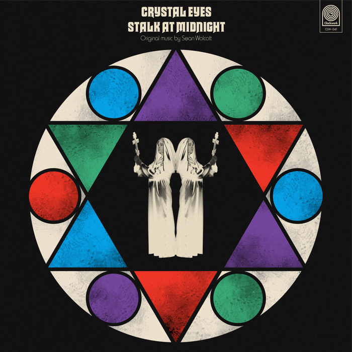
Sean Wolcott –Crystal Eyes Stalk at Midnightalbum art
This typography system channels the theatrical horror aesthetics of 1970s giallo films through deliberate typographic eclecticism. Macbeth's gothic letterforms paired with Harry's condensed grotesks create a cinematic tension between ecclesiastical gravitas and B-movie sensationalism. The rational verticality of Akzidenz-Grotesk Condensed grounds the system with editorial authority while allowing the display faces to perform their dramatic roles.

The Avalanches –Wildfloweralbum art
This typographic ecosystem creates a kaleidoscopic, maximalist brand energy that mirrors electronic music's sampling culture through visual collage. Rather than cohesive brand voice, each track gets its own typographic personality—from the dynamic warmth of Brush Script to the geometric precision of Futura to the rational authority of ITC Franklin Gothic. The embroidered execution transforms digital fonts into tactile craft, creating unexpected intimacy within electronic music's typically cold aesthetic.