
Neue Helvetica carries the rational DNA of its predecessor—closed apertures, vertical stress, and the methodical construction logic that made Helvetica a corporate standard. The stroke contrast remains minimal, creating that characteristic even typographic color, while terminals are cut cleanly horizontal or vertical with surgical precision. Counters in letters like 'a' and 'e' are notably closed compared to humanist alternatives, and the x-height sits at that calculated midpoint between cap height and baseline that maximizes legibility without warmth. This is Helvetica's systematic refinement: Linotype's 1983 effort to rationalize the sprawling, inconsistent family that had grown organically since the 1950s. Where the original suffered from optical inconsistencies across weights, Neue Helvetica imposed mathematical rigor—each weight mathematically derived, each character redrawn for optical consistency. The result is typography's equivalent of institutional architecture: authoritative, neutral, and built to endure decades of heavy use. It excels in environments demanding clarity over personality, breaking down only when warmth or editorial voice becomes essential to the communication.
Sean Wolcott –Crystal Eyes Stalk at Midnightalbum art
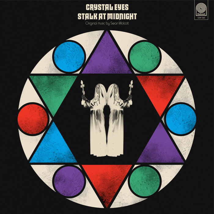
This typography system channels the theatrical horror aesthetics of 1970s giallo films through deliberate typographic eclecticism. Macbeth's gothic letterforms paired with Harry's condensed grotesks create a cinematic tension between ecclesiastical gravitas and B-movie sensationalism. The rational verticality of Akzidenz-Grotesk Condensed grounds the system with editorial authority while allowing the display faces to perform their dramatic roles.

Mille Cent Jours leaflet
This typography system embodies experimental-institutional energy — the deliberate collision of bureaucratic utility (Courier's monospaced neutrality) with contemporary cultural dynamism (GroteskRemix's expressive display forms). The combination signals a program that operates within educational institutions but actively disrupts conventional academic communication, creating approachable authority that invites creative participation rather than demanding compliance.