
Eurostile is built on a geometric skeleton with distinctive rectangular foundations, where circular forms are squared off into rounded rectangles that give it an unmistakably technological character. The contrast is minimal, maintaining nearly uniform stroke weights throughout, while the axis of stress is purely vertical—creating that rational, orderly feeling typical of mid-century modernist sans serifs. Its defining features include dramatically wide proportions, open apertures that enhance legibility, terminals that are cut at precise angles rather than purely horizontal, and distinctive letterforms like the squared 'o' and 'e' that make it instantly recognizable. Eurostile belongs to the lineage of 1960s geometric sans serifs designed for the space age, following Noorda's original vision of creating a typeface that looked simultaneously futuristic and authoritative. However, its extreme width and distinctive character make it unsuitable for body text—the wide set creates awkward spacing and the strong personality overwhelms at text sizes. This is a face that excels when you need to communicate precision, technology, or institutional authority, bringing an unmistakable voice of systematic competence to any design.
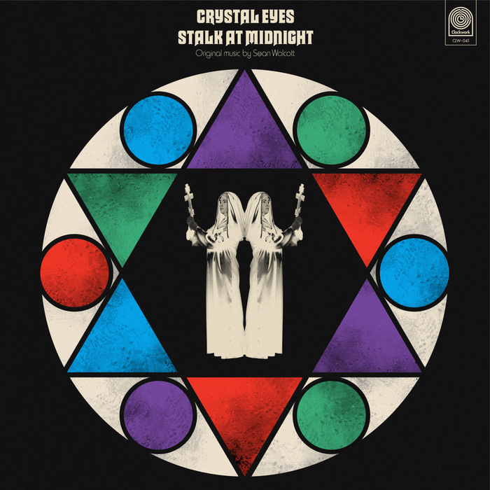
Sean Wolcott –Crystal Eyes Stalk at Midnightalbum art
This typography system channels the theatrical horror aesthetics of 1970s giallo films through deliberate typographic eclecticism. Macbeth's gothic letterforms paired with Harry's condensed grotesks create a cinematic tension between ecclesiastical gravitas and B-movie sensationalism. The rational verticality of Akzidenz-Grotesk Condensed grounds the system with editorial authority while allowing the display faces to perform their dramatic roles.
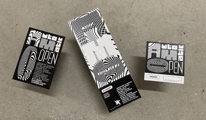
AUTO MATIC OPEN Festival 2022
This typography system channels authentic '90s rave energy through geometric brutalism and industrial precision. Forward's extreme geometric construction with straight sides creates an aggressive, machine-like presence, while Eurostile's subtler square curves add technological sophistication. Together they evoke the raw, underground techno scene—not nostalgic pastiche but genuine subcultural authenticity with contemporary refinement.