
Helvetica Condensed inherits the rational skeleton of its parent — closed apertures in 'a' and 'e', vertical stress axis, and systematic construction logic that prioritizes order over warmth. The condensed proportions compress the already tight letterspacing of neo-grotesque tradition, creating an intensely vertical rhythm that feels compressed and urgent. Its uniform stroke weight maintains the clinical neutrality of the Helvetica model, but the narrow set width fundamentally changes its character from authoritative reserve to space-conscious efficiency. This condensed variant belongs to the post-war Swiss rationalist tradition but pushes legibility to its limits in service of maximum information density. The face excels in environments where horizontal space is precious — newspaper headlines, poster hierarchies, and interface labels where brevity matters more than comfort. However, it breaks down quickly at text sizes where the compressed letter spacing and narrow counters create an oppressive, hard-to-scan texture that fatigues readers.
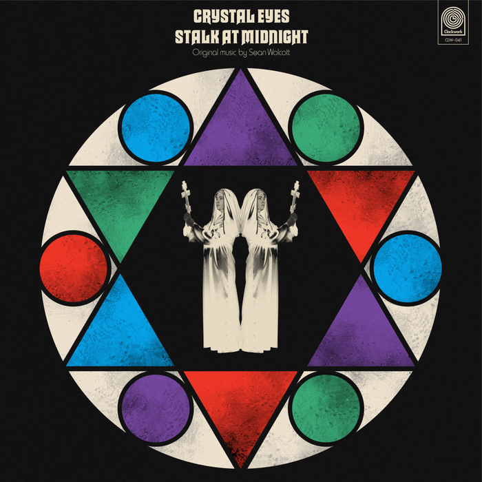
Sean Wolcott –Crystal Eyes Stalk at Midnightalbum art
This typography system channels the theatrical horror aesthetics of 1970s giallo films through deliberate typographic eclecticism. Macbeth's gothic letterforms paired with Harry's condensed grotesks create a cinematic tension between ecclesiastical gravitas and B-movie sensationalism. The rational verticality of Akzidenz-Grotesk Condensed grounds the system with editorial authority while allowing the display faces to perform their dramatic roles.
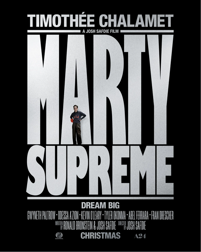
Marty Suprememovie logo and posters
This typography system channels raw athletic aggression filtered through 1970s American sports culture. The manipulated Gill Kayo creates a knockout punch of condensed mass—its ultrabold weight and custom letterform modifications (stretched proportions, optimized counters) generate the visual equivalent of a table tennis slam. The rational form model's tight apertures and vertical stress maintain editorial control while the extreme weight and compression deliver pure competitive intensity.