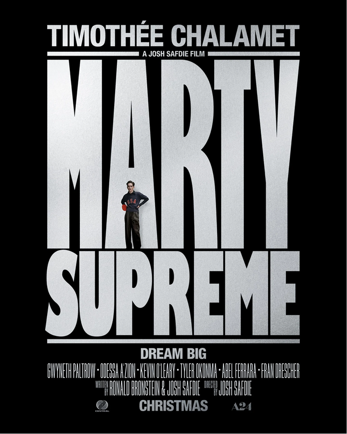
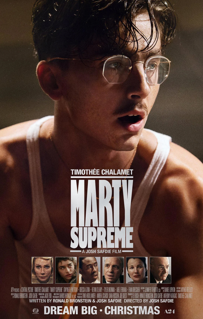
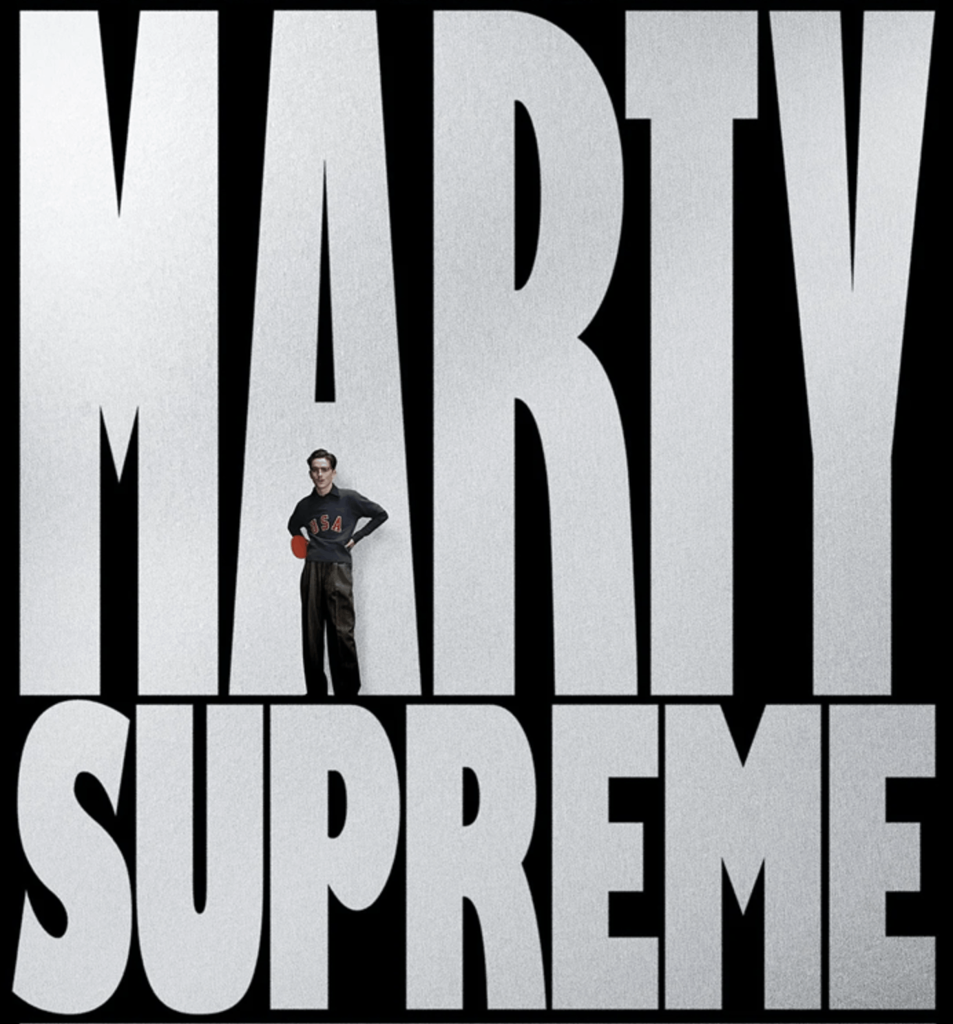
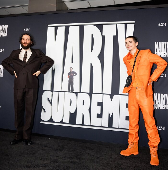
Marty Supremeis a 2025 Americansportscomedy-drama filmco-produced and directed byJosh Safdiefrom a screenplay he co-wrote withRonald Bronstein, loosely based on the life and career of Americantable tennisplayerMarty Reisman. Co-produced by and starringTimothée Chalamet, the film also featuresGwyneth Paltrow,Odessa A’zion,Kevin O’Leary,Tyler Okonma,Abel Ferrara, andFran Drescherin supporting roles. The main posters feature the title in a stretched and manipulated version ofGill Kayo Condensedand corresponding headers inNeue Helvetica Condensed, including its Heavy style. The billing block is set inBeeTwo. Eric Gill, the designer of Gill Sans, initially called the ultrabold style “Sans Double Elefans”. Released asKayo, derived from “K.O.” (i.e. knockout in boxing), it feels appropriate for the main movie title on the poster, as it is a very prominent typeface used in sports. The movie logo compared to a resetting in Gill Kayo Condensed with stretched letterforms. Various subsequent optimizations have been made, see for example the horizontals inTandE, the counters inAandY, or the bottom ofU. In the process, some glyphs likeRended up resemblingGill Sans Extra Condensed Bold. Timothée and Josh Safdie imitating the Marty Mauser pose at theMarty Supremeblack carpet in Los Angeles. hello friends For the last 18 months, Timothy Luke & I have been working on a top secret project together under the name Special Forces. We can now say that project is the visual identity, lead titles, and special production graphics for Marty Supreme. Full documentation v soon
This typography system channels raw athletic aggression filtered through 1970s American sports culture. The manipulated Gill Kayo creates a knockout punch of condensed mass—its ultrabold weight and custom letterform modifications (stretched proportions, optimized counters) generate the visual equivalent of a table tennis slam. The rational form model's tight apertures and vertical stress maintain editorial control while the extreme weight and compression deliver pure competitive intensity.
Gill Kayo's boxing-derived name ("K.O.") makes it structurally perfect for sports branding, while its rational form model with closed apertures and vertical stress provides the authority needed for cinematic marketing. The custom stretching and counter optimizations (notably in A, Y, T, E) push the letterforms beyond their original parameters, creating a bespoke athletic identity. Helvetica Condensed maintains the rational DNA while providing functional hierarchy, and Bee's compact forms handle legal text without competing with the hero typography.
This is a masterclass in rational form model consistency across multiple weights and styles. Gill Kayo Condensed and Helvetica Condensed share the same closed-aperture, vertical-stress DNA, creating seamless hierarchy through weight and proportion rather than structural contrast. The custom modifications to Kayo maintain its rational skeleton while pushing athletic aggression to the limit—some letterforms even converge toward Gill Sans Extra Condensed Bold, showing how extreme manipulation can bridge different expressions within the same typographic family.