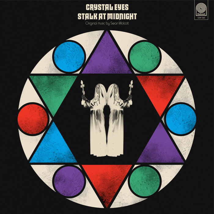
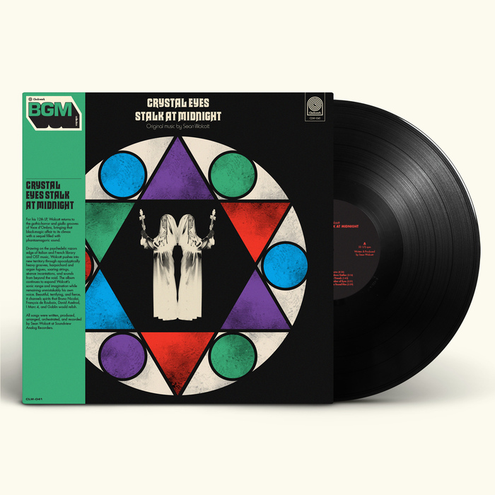
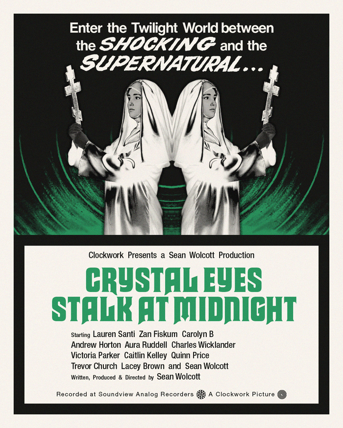
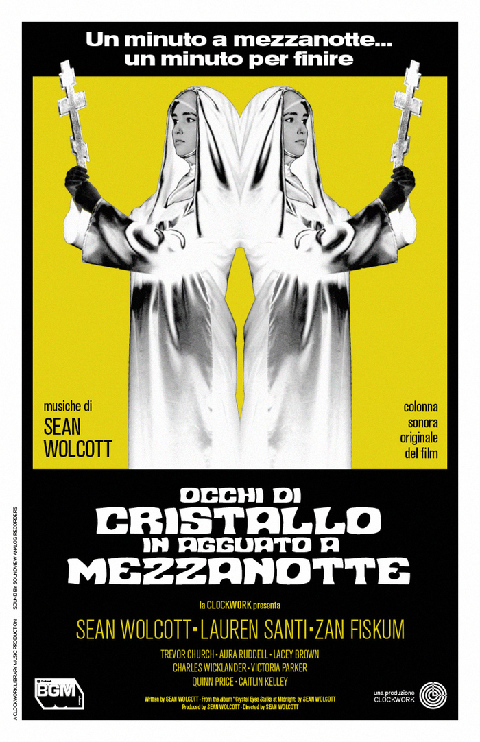
Album and promo art forSean Wolcott’s 12th album,Crystal Eyes Stalk at Midnight.Macbethis used as the primary display typeface, along withHarrysupporting.Futuracan be seen in theClockwork Recordslogo, andEurostilewas used for the BGM logo along with the catalogue number. For the promo posters, a variety of fonts were used includingNuevo Passion(a 2013 digitization of Mecanorma’sContest),Cooper Black, andITC Serif Gothic.Akzidenz-Grotesk Condensedis used for body copy throughout the cover and promo posters.
This typography system channels the theatrical horror aesthetics of 1970s giallo films through deliberate typographic eclecticism. Macbeth's gothic letterforms paired with Harry's condensed grotesks create a cinematic tension between ecclesiastical gravitas and B-movie sensationalism. The rational verticality of Akzidenz-Grotesk Condensed grounds the system with editorial authority while allowing the display faces to perform their dramatic roles.
The primary pairing leverages structural contrast effectively: Macbeth's dynamic blackletter forms (high contrast, decorative terminals) establish period authenticity and horror genre credibility, while Harry's rational condensed proportions provide contemporary readability without sacrificing atmospheric weight. Akzidenz-Grotesk Condensed serves as the rational anchor with its closed apertures and vertical stress, creating hierarchy through form model differentiation rather than mere scale changes. The supporting cast of geometric and rational grotesks maintains coherent optical density while allowing maximum expressive range.
This represents strategic typographic maximalism where multiple form models coexist through shared optical weight and contextual logic rather than traditional structural harmony. The blackletter Macbeth operates as pure display theater, while the rational grotesks (Harry, Akzidenz-Grotesk, Helvetica variants) share vertical proportions and closed apertures for functional cohesion. The geometric elements (Futura, Eurostile) inject modernist precision that bridges the medieval/contemporary tension, creating controlled chaos appropriate for horror soundtrack branding.