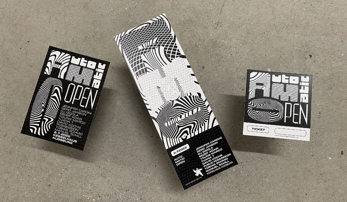
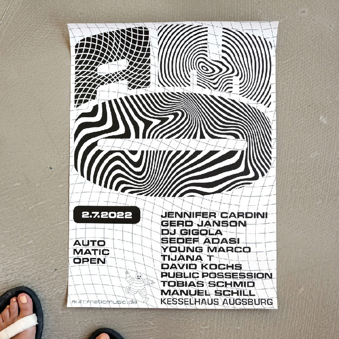
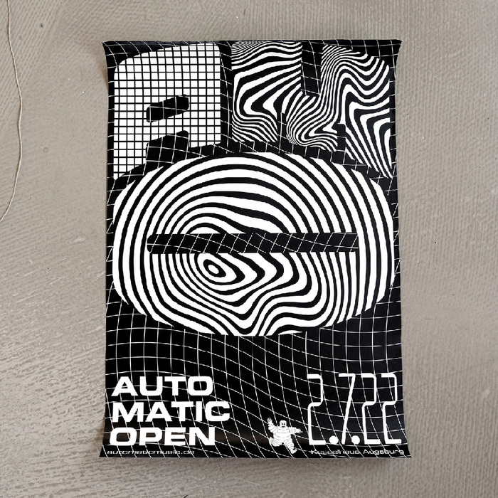
Since 2010, theAUTO MATIC OPENhas been an annual open air festival for electronic music in Augsburg, Germany. For the 2022 edition,MMW Studioscreated a black-and-white identity based on patterns and referencing gritty ’90s rave parties visuals. The b&w aesthetics is reminiscent of cheap photocopied flyers. The typographic choice reinforces the ’90s techno scene references withEurostileandForwardused in tandem, always in all cap. Both fonts share very square curves, even if Eurostile does it in a way subtler way than Forward with its straight sides. Forward is often used in a dazzling pattern-in/pattern-out way. MMW created a monogram used almost like a logo composed from the three initials, with theAand theMembracing the upper curve of the rotatedO. If you zoom in on the attendants’ wrists, you can see the custom wristbands featuring the fonts.
This typography system channels authentic '90s rave energy through geometric brutalism and industrial precision. Forward's extreme geometric construction with straight sides creates an aggressive, machine-like presence, while Eurostile's subtler square curves add technological sophistication. Together they evoke the raw, underground techno scene—not nostalgic pastiche but genuine subcultural authenticity with contemporary refinement.
Both fonts operate within the geometric form model but with crucial differences: Forward pushes geometric construction to its extreme with perfectly straight sides and aggressive corners, creating maximum impact in pattern applications. Eurostile shares the square curve DNA but maintains more optical refinement through subtle modulation. This pairing works because both fonts share the same geometric skeleton and technological character, allowing them to function as textural variations of the same voice rather than competing systems.
This is textbook contrast-with-cohesion pairing: both fonts share the geometric form model with square curves and technological character, but Forward amplifies the geometric brutalism while Eurostile provides readable sophistication. The shared structural DNA allows for seamless pattern-breaking effects where Forward can dissolve into graphics while Eurostile maintains legibility. The monogram treatment brilliantly exploits their geometric compatibility.