
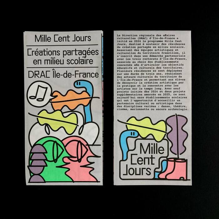
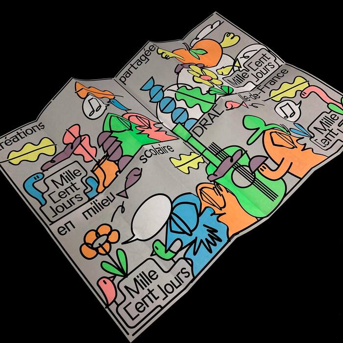

Mille Cent Jours(“One Thousand and One Hundred Days”) is an artistic residency program conducted over three years in schools across the Île-de-France region, aiming to make schools places for experimentation, creation, and encounters. Led by theDRAC Île-de-France(Regional Directorate of Cultural Affairs), it brings together artists, students, and teachers to transform schools into vibrant spaces for culture and civic engagement. The leaflet (pdf) was designed byAntonin FaurelusingGroteskRemixbyBenoît Bodhuinas display typeface. Text is set inCourierandNeue Helvetica. It was offset printed byMédia Graphic, Rennes, in black plus three colors.
This typography system embodies experimental-institutional energy — the deliberate collision of bureaucratic utility (Courier's monospaced neutrality) with contemporary cultural dynamism (GroteskRemix's expressive display forms). The combination signals a program that operates within educational institutions but actively disrupts conventional academic communication, creating approachable authority that invites creative participation rather than demanding compliance.
The three-font system creates semantic hierarchy through structural differentiation. GroteskRemix as display brings dynamic form model characteristics — open apertures and humanist warmth — while maintaining enough geometric clarity for institutional credibility. Courier provides rational monospaced reliability for body text, its typewriter origins suggesting democratic access and workshop mentality. Neue Helvetica bridges the gap with its rational vertical stress and closed apertures, offering neutral authority without the cold bureaucracy of standard institutional sans-serifs.
This is a deliberately eclectic pairing that works through controlled chaos rather than structural harmony. The fonts span different form models — dynamic (GroteskRemix), rational (Courier, Neue Helvetica) — creating productive tension that mirrors the project's mission of bringing artistic experimentation into structured educational environments. The shared utilitarian DNA across all three fonts (even GroteskRemix retains functional clarity) prevents the system from fragmenting, while their different historical contexts create conversational energy appropriate for cultural programming.