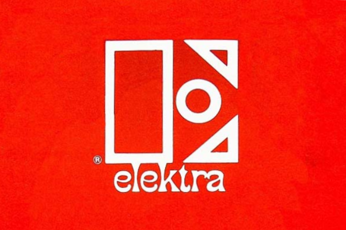
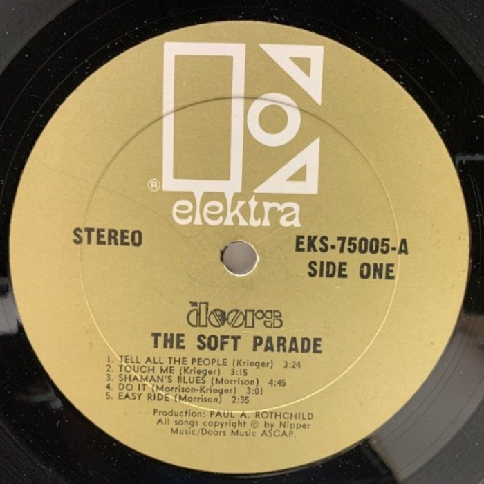

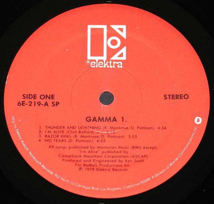
Close-up of Elektra’s 1966 logo, taken from the 1980 label design William S. Harveydesigned Elektra’s most recognizable logo in 1966. The label used this branding for 17 years before it adopted an overhauled identity (designed byMilton Glaser, type designer and master warlock of the graphic arts) in 1983.Reworkedvariationsof this iconic design were later used by the label after it was relaunched by Warner Music Group in 2009. The logo consists of an uppercaseE(based on outlinedBingo, a decorative stencil designed byJohn Albert Cavanaghfor his 1946 bookLetteringand adopted byPhoto-Lettering) directly above the word “elektra” (set inPhanitalian, a heavily flared decorative sans originating in the catalog ofVanderburgh Wells & Companyand offered in the 1960s byHeadlinersin its Morgan Press collection). Label for The Doors’ 1969 albumThe Soft Parade. This label design, as well as the logo, was first used in March of 1966 onPhil Ochs’In Concertlive album. Catalog number and disc side indicator, “STEREO,” and album title set inRailroad Gothic(ATF; 1906) [edit: or ratherGothic No. 13(Linotype), see comments]. Track list and credits set inVogue(bold; Intertype; 1930-1946). Band logo is a custom-made sort. Label forClear Light’s 1967 self-titled album(circa 1970–1973 reissue). This label design, which features a butterfly carrying theEby its stem (alongside a 7″ design featuring a caterpillar), was first used in August of 1970 onJosh White'sThe Best of…album. Band name set inFranklin Gothic(ATF; 1904–1913). Disc side indicator, catalog number and “STEREO” set inErbar-GroteskCondensed(Ludwig & Mayer; 1929). Track list and credits set inSpartan(ATF/Linotype; 1939), a copy ofFutura, here with its distinctive two-storya. Address info is set inTrade Gothic Extended(regular; Linotype; 1959). Label for Gamma’s 1979 self-titledGamma 1album. This label design, which is similar to the 1969–1970 design (only used on two LPs) but with a smaller logo, was first used in 1979 onNino Rota’s soundtrack albumfor the filmHurricane. Disc side indicator, catalog number, “STEREO” and band/album name set inFutura(bold; Bauer; 1927). Track list and credits also set in Futura (regular). Address info set inITC Avant Garde Gothic(regular; ITC; 1970).
Elektra's typography system embodies counterculture authority—a paradoxical blend of underground credibility with institutional weight that defined the label's progressive rock and folk roster. The outlined stencil E creates bold geometric presence while Phanitalian's extreme flare terminals inject psychedelic energy, establishing a brand voice that's both rebellious and professionally serious. This typographic duality perfectly captured the late-60s moment when underground music was crossing into mainstream success.
The pairing leverages geometric form models with dramatically different surface expressions: Bingo's outlined stencil construction provides rational, systematic geometry while Phanitalian's heavily flared sans adds dynamic warmth through its extreme stroke terminals. Both fonts share constructed, mid-century modernist DNA but express it through contrasting optical weights—the hollow E creating visual lightness against Phanitalian's dense, flared mass. This structural compatibility with surface contrast creates hierarchy that reads as both unified and energetically varied, perfect for a music brand needing both authority and creative flair.
This is a masterful example of contrast-with-cohesion: both primary fonts share geometric/constructed form models from the same mid-century period, but achieve dramatically different optical presence through contrasting treatments—outline versus solid, minimal versus heavily flared terminals. The system follows Kupferschmid's harmonious pairing principle (same form model, different surface expression) while the supporting cast of grotesks maintains the geometric thread throughout the extended identity system.