
ITC Avant Garde Gothic
ITC Avant Garde Gothic is built on a purely geometric skeleton with constructed circular letterforms and systematic proportions, embodying the rational modernist ideals of the 1970s. Its stroke weight is completely uniform with no contrast, creating the characteristic monotone color of geometric sans-serifs, while its letters are built from basic geometric shapes—perfect circles for 'o' and 'e', clean rectangles, and minimal, functional details. The face carries the DNA of Bauhaus typography with its reductive approach to letter construction, but ITC's interpretation adds a distinctly American flavor through its generous x-height and slightly more open apertures than European geometric predecessors like Futura. This is a display workhorse that excels in short bursts of text where its systematic geometry creates visual impact and brand consistency. However, its uniform stroke weight and tight letterfit make it unsuitable for extended reading, as the geometric perfection that makes it striking at large sizes creates monotonous typographic color and reduced legibility at text sizes. The lack of italics severely limits its typographic range, positioning it firmly as a display-only solution despite its clean, utilitarian appearance.
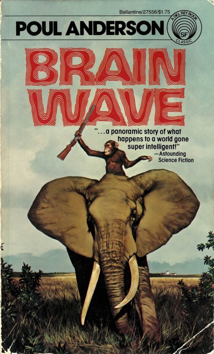
Brain Waveby Poul Anderson, Ballantine
Allen Riptide's psychedelic letterforms channel pure 1970s science fiction mysticism, with flowing curves and dimensional distortions that suggest mind-bending narrative content. The typeface's hypnotic qualities create an immediate genre signal—this is cerebral sci-fi that explores consciousness and perception. Paired with ITC Avant Garde Gothic's geometric precision, the system balances trippy experimentation with publishing credibility.
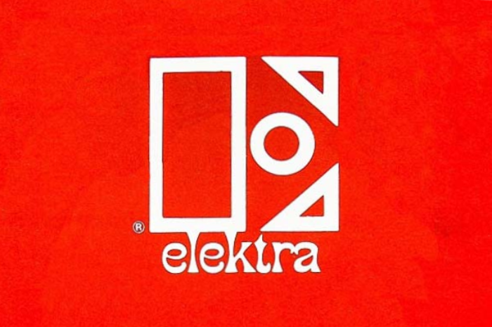
Elektra Records logo and record labels (1966–1983)
Elektra's typography system embodies counterculture authority—a paradoxical blend of underground credibility with institutional weight that defined the label's progressive rock and folk roster. The outlined stencil E creates bold geometric presence while Phanitalian's extreme flare terminals inject psychedelic energy, establishing a brand voice that's both rebellious and professionally serious. This typographic duality perfectly captured the late-60s moment when underground music was crossing into mainstream success.
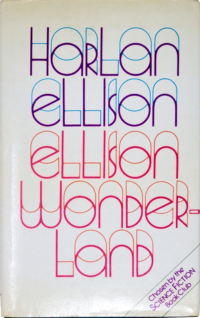
Ellison Wonderlandby Harlan Ellison,Millington
This typography system embodies experimental literary consciousness through dimensional letterforms that literally expand beyond traditional typographic boundaries. Quartermaine's unicase construction and open, dimensional quality creates a psychedelic authority — the letterforms appear to emerge from multiple planes of reality, perfectly capturing Ellison's mind-bending science fiction narratives. The chromatic separation of thick and thin strokes transforms static typography into kinetic visual experience, suggesting the fracturing of conventional perception.
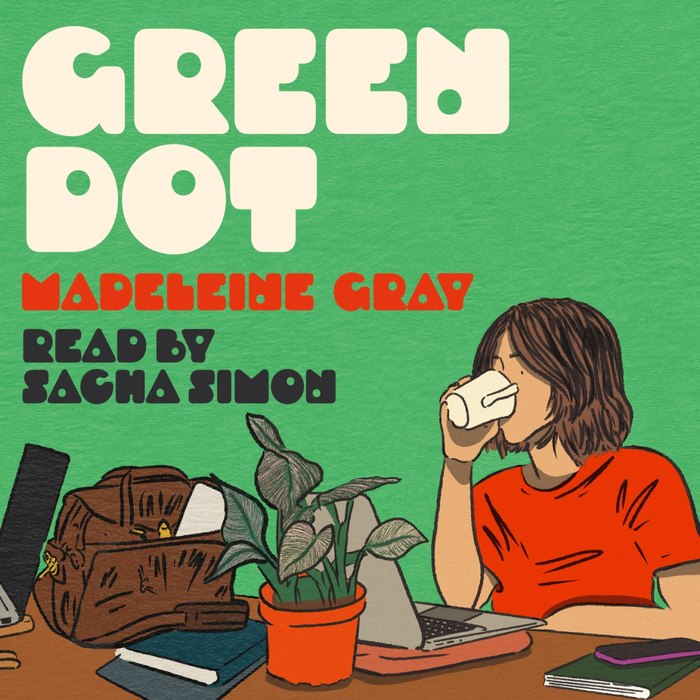
Green Dotby Madeleine Gray
Droog's geometric construction with its distinctive circular apertures creates a playful-digital energy that perfectly captures contemporary online culture. The typeface's systematic circular forms and technical precision communicate the algorithmic nature of digital presence (the "green dot" status indicator), while its unconventional counter replacements inject humor and personality—mirroring the novel's comedic take on modern office romance.