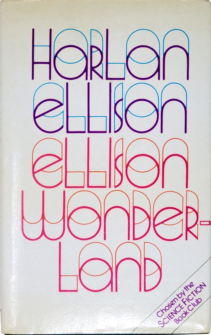

Ellison Wonderlandis a collection of short stories byHarlan Ellison(1934–2018). First published in the United States in 1962, this is the jacket for the first UK edition, issued byMillingtonin 1979. Instead of working with an illustrator, designerLorie Epsteinopted for a purely typographic approach featuringQuartermaine. She separated the thin and thick strokes ofStuart Longley’s open, dimensional unicase typeface and gave them different colors: blue and purple for the author’s name, and orange and pink for the title. The Science Fiction Book Club mention in the bottom right corner is set inITC Avant Garde Gothic, with its alternateeand faux small caps.
This typography system embodies experimental literary consciousness through dimensional letterforms that literally expand beyond traditional typographic boundaries. Quartermaine's unicase construction and open, dimensional quality creates a psychedelic authority — the letterforms appear to emerge from multiple planes of reality, perfectly capturing Ellison's mind-bending science fiction narratives. The chromatic separation of thick and thin strokes transforms static typography into kinetic visual experience, suggesting the fracturing of conventional perception.
Quartermaine's open, dimensional unicase structure operates as a geometric form model with dynamic properties — the constructed letterforms maintain systematic consistency while their separated stroke planes create perceptual depth and movement. The chromatic stroke separation exploits the typeface's inherent contrast structure, transforming weight variation into spatial dimension through color differentiation. ITC Avant Garde Gothic's geometric rationality provides necessary grounding contrast, its closed apertures and uniform stroke weight creating typographic stability against Quartermaine's experimental expansion.
This pairing creates deliberate tension across form models — Quartermaine's dimensional geometric construction contrasts sharply with ITC Avant Garde Gothic's flat, rational geometry. Rather than harmonic compatibility, Epstein leverages structural opposition: the primary typeface explodes typographic convention while the secondary typeface maintains it. This creates hierarchy through conceptual contrast rather than mere size differentiation, with the experimental display work elevated by its dialogue with conventional sans serif rationality.