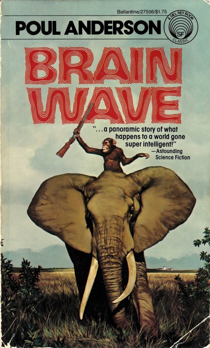
This is the front cover for Ballantine Books’ 1978 edition ofBrain Wave, a science fiction novel written byPoul Anderson. The artwork seen here is attributed to Michael Herring, and has been used for several other editions of this book. The main typeface used here is the hypnoticAllen Riptide, paired here withITC Avant Garde Gothicand its condensed counterpart.
Allen Riptide's psychedelic letterforms channel pure 1970s science fiction mysticism, with flowing curves and dimensional distortions that suggest mind-bending narrative content. The typeface's hypnotic qualities create an immediate genre signal—this is cerebral sci-fi that explores consciousness and perception. Paired with ITC Avant Garde Gothic's geometric precision, the system balances trippy experimentation with publishing credibility.
Allen Riptide operates as a dynamic form model with extreme decorative elaboration, its warped letterforms mimicking the brain wave distortions suggested by the title. The condensed and regular weights of ITC Avant Garde Gothic provide geometric counterpoint with their constructed circular forms and even stroke weights, grounding the psychedelic display type in readable, systematic hierarchy. This contrast between organic distortion and geometric control perfectly mirrors sci-fi's tension between human consciousness and technological precision.
This represents a bold cross-matrix pairing: dynamic decorative display against geometric rational sans serif. Rather than structural harmony, the combination works through deliberate tension—the warped consciousness of Allen Riptide anchored by Avant Garde's systematic geometry. The shared 1970s design DNA (both typefaces emerged from the decade's experimental spirit) creates cultural cohesion despite structural opposition, embodying the era's fascination with consciousness expansion within technological frameworks.