
Helvetica
Helvetica represents the pinnacle of rational construction in sans-serif design, built on a skeleton of vertical stress, closed apertures, and methodical geometry that prioritizes neutrality above all else. The contrast is rigorously suppressed to near-uniformity, creating an even typographic color that refuses to call attention to itself. Its closed counters in letters like 'a', 'e', and 's', combined with a relatively high x-height and tight letter spacing, generate the authoritative, anonymous voice that made it the corporate world's default choice. Helvetica belongs to the neo-grotesque tradition that emerged in 1950s Switzerland, refining earlier grotesques by eliminating their quirks and humanist traces in favor of pure systematic logic. While this rational perfection makes it exceptionally versatile and durable, it also renders it contextually flat—capable of competent service but incapable of warmth or personality. At small sizes, those closed apertures and tight spacing begin to clog, and without italic support, it cannot build proper typographic hierarchy for complex text work.
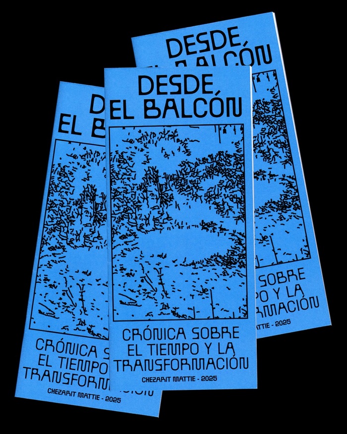
Desde el Balcónby Chezarit Mattie
BallPill's constructed geometric forms with their pill-shaped terminals create a clinical yet intimate energy—like viewing through a medical lens that softens rather than dissects. The typeface's rational structure grounds the poetic documentation practice, while its rounded terminals prevent the systematic observation from feeling cold or mechanical, suggesting the tender discipline of sustained attention.

Batman: The Animated Series, season 1 episode title cards
This typography system embodies cinematic noir-gothic energy filtered through animation's expressive possibilities. The eclectic font palette—ranging from Art Deco geometrics like Kabel to theatrical scripts like Commercial Script—creates a deliberately anachronistic 1940s atmosphere that feels both period-authentic and heightened for dramatic effect. The extensive variety allows each episode's title card to function as a mini-movie poster, with typographic choices that shift from menacing (Stencil, Compacta) to elegant (Goudy Oldstyle) to technologically sinister (LCD, Microgramma), all unified by their shared vintage provenance and cinematic application.
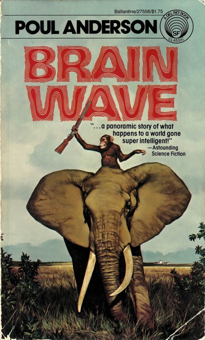
Brain Waveby Poul Anderson, Ballantine
Allen Riptide's psychedelic letterforms channel pure 1970s science fiction mysticism, with flowing curves and dimensional distortions that suggest mind-bending narrative content. The typeface's hypnotic qualities create an immediate genre signal—this is cerebral sci-fi that explores consciousness and perception. Paired with ITC Avant Garde Gothic's geometric precision, the system balances trippy experimentation with publishing credibility.
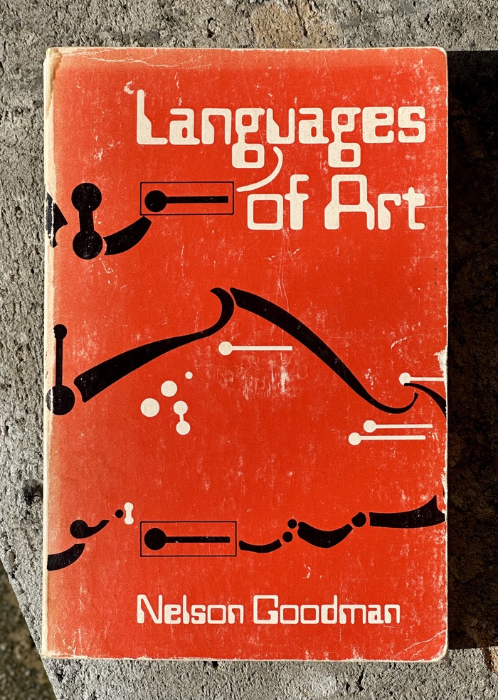
Languages of Artby Nelson Goodman
This typography system embodies mid-century intellectual sophistication through the tension between Bookman's warm, rational serif authority and Helvetica's geometric neutrality. Bookman's closed apertures and vertical stress create scholarly gravitas while its slightly condensed proportions suggest analytical precision. The contrast with Helvetica's constructed forms establishes a dialogue between humanist tradition and modernist objectivity—perfectly mirroring Goodman's analytical philosophy bridging classical aesthetics and contemporary theory.