
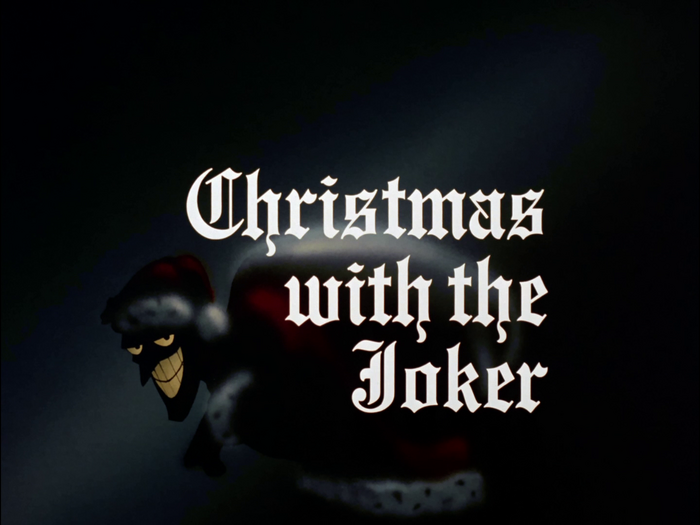
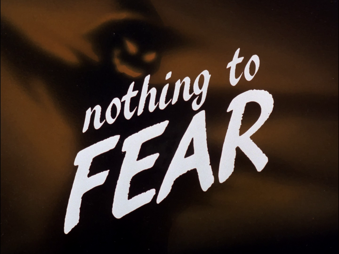
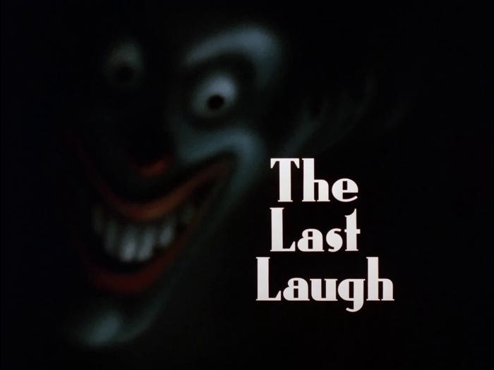
These imaginatively rendered title cards were a high point of eachBatmanepisode. While some (like “Harley’s Holiday” and “Time out of Joint”) were character portraits, most often the cards depicted an emotional impression of the given episode’s theme. According to Eric Radomski, who designed many of the cards, “Going with the overall retro-forties feel we were giving the show, we wanted to treat the episodes as mini-movies. The title cards allowed us to create great drama in a very subtle fashion. It was a process of trying to capture what the overall episode was, and not just show a scene or moment from it.” Most of the title cards ofBatman: The Animated Series’ first season (which first aired in 1992–1993) use fonts that were available fromLetraset.
This typography system embodies cinematic noir-gothic energy filtered through animation's expressive possibilities. The eclectic font palette—ranging from Art Deco geometrics like Kabel to theatrical scripts like Commercial Script—creates a deliberately anachronistic 1940s atmosphere that feels both period-authentic and heightened for dramatic effect. The extensive variety allows each episode's title card to function as a mini-movie poster, with typographic choices that shift from menacing (Stencil, Compacta) to elegant (Goudy Oldstyle) to technologically sinister (LCD, Microgramma), all unified by their shared vintage provenance and cinematic application.
The strategic use of Letraset's catalog exploits the foundry's strength in display fonts designed for phototypesetting drama. Fonts like ITC Benguiat (dynamic model with high contrast) provide gothic authority, while geometric options like Kabel and Microgramma offer rational precision for tech-themed episodes. The mix includes both serif workhorses (Goudy Oldstyle's dynamic warmth) and constructed display faces (Compacta's rational compression), allowing typographic voice to match each episode's emotional register. This approach treats typography as set design—each font choice establishes a micro-environment that primes viewers for the episode's tone before the story begins.
Rather than traditional font pairing, this system employs episodic typography—each title card functions as a standalone typographic moment within the series' broader aesthetic framework. The unifying principle is historical cohesion: all fonts share 1940s-1960s design DNA, creating visual consistency through temporal rather than structural logic. When multiple fonts appear on single cards, they follow contrast-through-era principles—pairing a geometric sans (Univers Ultra Condensed) with a period script (Mistral) works because both reference the same historical moment while offering maximum formal contrast.