
City follows a geometric form model with circular 'o' shapes, simplified letterforms, and systematic construction logic that prioritizes clarity over calligraphic warmth. The typeface exhibits minimal stroke contrast with uniform line weights throughout, creating an even typographic color that reads as orderly and neutral. Its apertures are moderately open—more accessible than pure geometric faces like Futura, but less inviting than humanist alternatives. The x-height sits in a balanced relationship to the cap height, neither overly tall nor condensed. City belongs to the tradition of mid-20th century geometric sans serifs but tempers the austere perfection of its ancestors with subtle practical refinements. Without italic support and likely limited weight options, this face functions best as a display or headline workhorse where its systematic clarity can establish visual hierarchy without the nuanced texture needed for extended reading.

Batman: The Animated Series, season 1 episode title cards
This typography system embodies cinematic noir-gothic energy filtered through animation's expressive possibilities. The eclectic font palette—ranging from Art Deco geometrics like Kabel to theatrical scripts like Commercial Script—creates a deliberately anachronistic 1940s atmosphere that feels both period-authentic and heightened for dramatic effect. The extensive variety allows each episode's title card to function as a mini-movie poster, with typographic choices that shift from menacing (Stencil, Compacta) to elegant (Goudy Oldstyle) to technologically sinister (LCD, Microgramma), all unified by their shared vintage provenance and cinematic application.
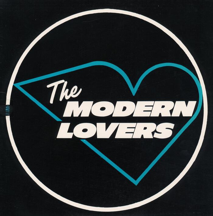
The Modern Lovers –The Modern Loversalbum art
This typography system channels the raw authenticity of mid-70s proto-punk through deliberate vernacular choices that feel discovered rather than designed. The combination of Filmotype Lucky's geometric neon-sign clarity with Kaufmann's continuous stroke mimicry creates an aesthetic of urban nocturnal romanticism—like love songs scrawled in light across a grimy cityscape. The overall energy is nostalgic-futurism: looking backward to mid-century commercial lettering while pointing toward punk's stripped-down future.