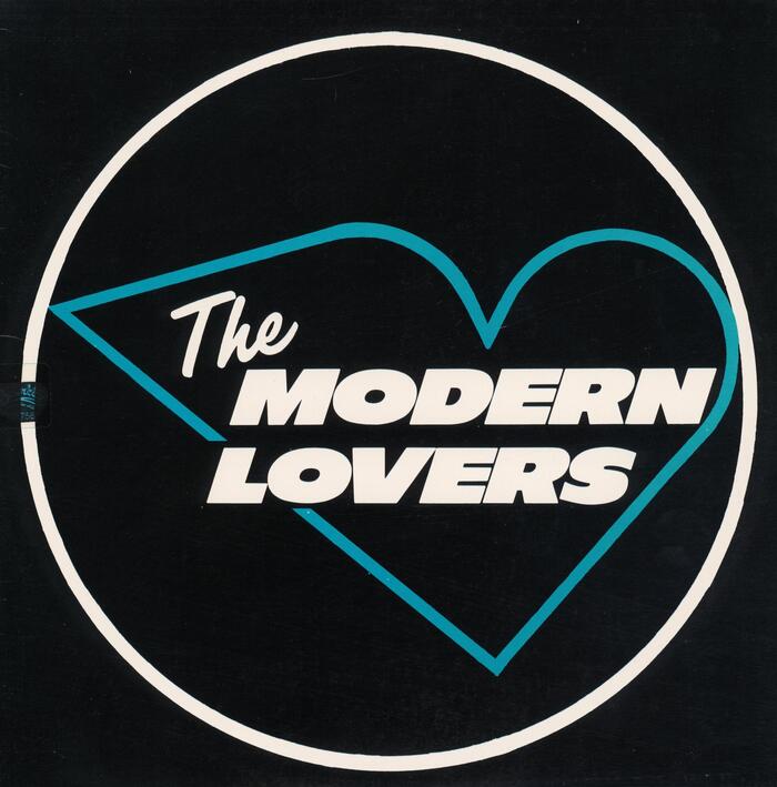

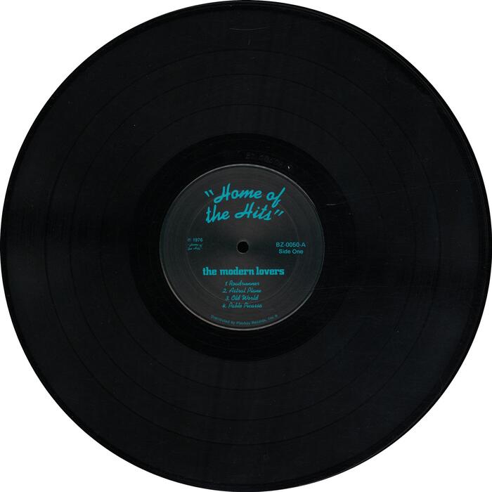
The 1976 release ofThe Modern Lovers, compiled from recordings made earlier in the decade, for an aborted LP for Warner Bros and other sources. The sleeve is a triumph of minimal design, adapting an aerodynamic heart logo that the band used on an early business card, rendering it in the stark, precise form of a neon sign glimpsed on a dark night. Filmotype Luckyis effortlessly evokes this mid-century aesthetic.Ebonywas enjoying a renaissance at the time (see alsoBlondie’s 1976 debut) – the emerging punk movement favouring clean, strong letterforms over the ornamentation of psychedelia and after. Further examples includeFranklin GothiconRamonesandGill SansExtra Bold on the “Neat Neat Neat” single sleeve, both likewise from 1976. (Jamie Reid’s “ransom note” style which would become a cliche of punk design developed independently). The neon motif is continued in the use ofKaufmann, with its continuous line representing neon tubing, for the LP credits, supported byGill Sans. The band logo that appears on the labels as well as on the flyer reproduced on the back in in all-lowercaseCityBold. Jim Blodgettis credited with “LP co-ordination”, which may or may not include the sleeve design. Back cover. The reproduced flyer for a gig at Gloucester High Auditorium additionally featuresFutura Black.
This typography system channels the raw authenticity of mid-70s proto-punk through deliberate vernacular choices that feel discovered rather than designed. The combination of Filmotype Lucky's geometric neon-sign clarity with Kaufmann's continuous stroke mimicry creates an aesthetic of urban nocturnal romanticism—like love songs scrawled in light across a grimy cityscape. The overall energy is nostalgic-futurism: looking backward to mid-century commercial lettering while pointing toward punk's stripped-down future.
The font selections operate on pure contextual logic rather than formal compatibility. Filmotype Lucky's geometric construction and even stroke weight directly reference neon signage manufacturing constraints—the rounded terminals and simplified letterforms echo how glass tubing bends. Kaufmann's script provides textural contrast while maintaining the neon metaphor through its unbroken stroke continuity, literally mimicking bent tube construction. City Bold's condensed rational forms ground the system in period-appropriate commercial typography, while Gill Sans provides clean hierarchy without disrupting the vernacular aesthetic.
This is anti-pairing in the best sense—fonts chosen for cultural resonance rather than structural harmony. The geometric Filmotype Lucky and rational City Bold span different form models but share mid-century commercial DNA. Kaufmann breaks all pairing rules as a decorative script, yet works because it continues the neon metaphor structurally through its continuous stroke. The system succeeds through shared cultural reference (urban signage, commercial lettering) rather than typographic compatibility—a perfect match for punk's anti-design ethos.