
Flash follows a geometric form model with constructed circular 'o' forms and systematic letter architecture built on mathematical principles rather than calligraphic heritage. The typeface exhibits uniform stroke weight with virtually no contrast, creating the clean, engineered aesthetic typical of geometric sans families. Its apertures appear moderately closed, and the vertical stress aligns with rational construction principles, though the underlying skeleton remains fundamentally geometric. The x-height sits at a moderate proportion to cap height, avoiding the extreme tall x-height that can compromise hierarchy in geometric faces. Flash belongs to the mid-century modernist tradition of constructed sans serifs, echoing the systematic approach of Futura and Avenir while maintaining its own character through specific terminal treatments and letterform proportions. As a geometric sans, it excels in branding contexts where clean authority is needed, but the lack of italic limits its versatility for complex editorial work where typographic emphasis and rhythm are crucial.

Batman: The Animated Series, season 1 episode title cards
This typography system embodies cinematic noir-gothic energy filtered through animation's expressive possibilities. The eclectic font palette—ranging from Art Deco geometrics like Kabel to theatrical scripts like Commercial Script—creates a deliberately anachronistic 1940s atmosphere that feels both period-authentic and heightened for dramatic effect. The extensive variety allows each episode's title card to function as a mini-movie poster, with typographic choices that shift from menacing (Stencil, Compacta) to elegant (Goudy Oldstyle) to technologically sinister (LCD, Microgramma), all unified by their shared vintage provenance and cinematic application.
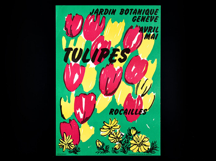
Tulipesposters,Jardin botanique Genève
This botanical poster series embodies an experimental institutional warmth—scientific rigor softened by playful typographic improvisation. The eclectic mix of display faces (Flash's dramatic high-contrast, Cooper Black's friendly rotundity, Desdemona's calligraphic flourishes) creates a handmade, workshop-like energy that mirrors the botanical illustration process itself. The typography feels alive and organic, with modified letterforms and rotated glyphs suggesting the same interpretive freedom the illustrators brought to their plant drawings.