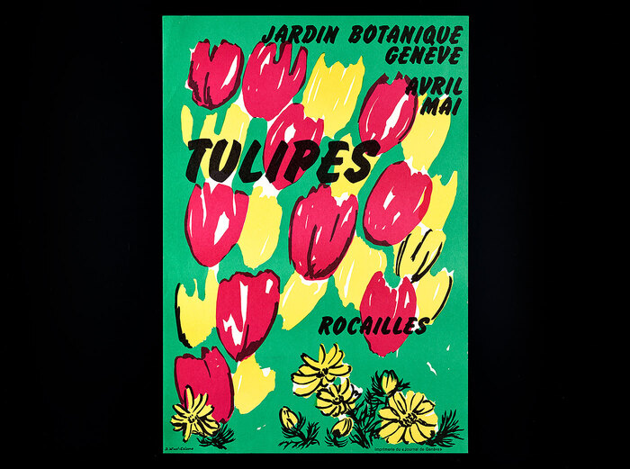
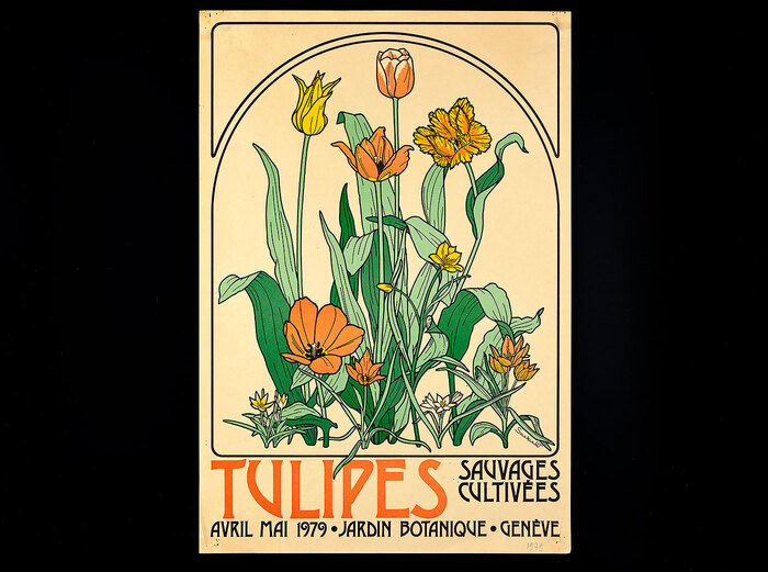
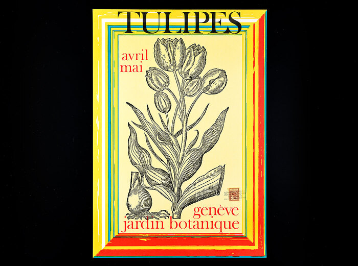
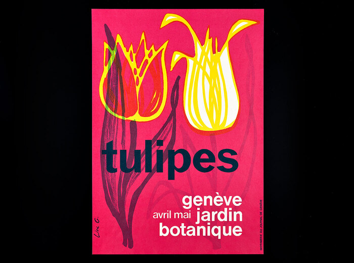
All-capsFlashfor the poster signed by D. Wust-Calame, printing: Imprimerie du «Journal de Genève» Drawing is a common practice in the field of botany to visually describe a plant. Allowing interpretation, even cheating, a drawer dare said, scientific illustration has didactical advantages over photography. From 1960, when Charles Baehni was director of the institution, and during more than 30 years, theBotanical Garden of Genevain Switzerland employed a dedicated team of women for the task. Their names appear vertically, often along the stem of each illustrated plant: Line Guibentif, Saskia Pernin-Wikström, Suzanne Van Hove, Danielle Wüst-Calame. Housed by the lake, on the first floor of the historical building called La Console, the “atelier de dessin et décoration” comprised a complementary team dedicated to decoration (advertising or graphic design nowadays). The series of posters entitled “Tulipes” announces most likely outdoor “exhibitions” of the tulip flower in bold colours with various typefaces leading to a striking effect. Showcased below, these posters symbolise the porosity of practices, the warmth as well as importance of drawing by hand, from that era. To conclude, when I was conducting my research for proper dates and names, working in this very institution as an in-house typographer, I spotted this remark in one article by Line Guibentif from 1984: “Made with simplicity and economy of means botanical illustration should be as easy to read as clearly typeset text.” (translated from French by the author). Acknowledgments: Samuel Anderegg, Pierre Boillat, Patrick Bungener, Martin Callmander, Sylvie Dunant, Mona Mahmoudian, Raoul Palese, Nathalie Rasolofo, Rodolphe Spichiger, Gisèle Visinand Letraset’sDesdemonafor a poster signed “SaskiaW”. Note that the9isan upside-down6. All-lowercaseMonotype GrotesqueandHelveticafor a poster signed “Line G.”, printing: Imprimerie du Journal de Genève Hand-rendered (?)Cooper Blackwith non-standard forms forU(inspired byITC Souvenir?) andP. “Rocailles” is shown in an unidentified wide slab serif.Volta fettwith a trimmedRleg and unbracketed serifs would come close [see also the comments]. This poster is signed “SaskiaW” and was printed by imprimeries populaires. Smaller text is inHelvetica. ZipperandHelveticafor a poster signed “SaskiaW”, printing: Imprimerie du «Journal de Genève» Artistikfor a poster signed “D. Wust-Calame”, printing: Imprimerie du Journal de Genève MoreHelvetica, includingstacked glyphsfor the months for a poster signed “D. Calame”, printing: Blanc-Wittwer SA (not part of the Tulipes series, provided here as a bonus for the eyes)
This botanical poster series embodies an experimental institutional warmth—scientific rigor softened by playful typographic improvisation. The eclectic mix of display faces (Flash's dramatic high-contrast, Cooper Black's friendly rotundity, Desdemona's calligraphic flourishes) creates a handmade, workshop-like energy that mirrors the botanical illustration process itself. The typography feels alive and organic, with modified letterforms and rotated glyphs suggesting the same interpretive freedom the illustrators brought to their plant drawings.
The font selections deliberately embrace typographic diversity to match the varied botanical subjects and different designer signatures. Flash and Desdemona represent dynamic form models with high contrast and open apertures, creating theatrical announcement energy. Cooper Black's geometric roundness provides friendly accessibility, while Monotype Grotesque and Helvetica ground the system with rational clarity for supporting text. The mix works because each display choice serves a specific poster's botanical subject—the typography becomes as varied and characterful as the plant specimens themselves.
Rather than systematic pairing, this represents a curated collection approach where each poster operates as its own typographic ecosystem. The unifying thread is Helvetica as the rational base text, providing institutional consistency across the varied display treatments. The different display faces—spanning dynamic (Flash, Desdemona), geometric (Cooper Black), and modified rational forms—create a family through their shared bold scale and confident application rather than structural compatibility. This mirrors botanical taxonomy: different species unified by shared environmental context.