
Zipper emerges from a geometric construction model with systematic letterforms built on circular and rectangular foundations, creating a rational, engineered aesthetic. The typeface exhibits uniform stroke width with no discernible contrast, maintaining consistent weight throughout all letterforms. Its apertures appear deliberately closed, reinforcing the rational skeleton with a serious, authoritative demeanor. The x-height sits moderately high relative to the cap height, though the geometric rigidity and closed counters limit its textual performance. This face belongs to the tradition of constructed geometric sans-serifs, following the modernist principle of form following mathematical logic rather than calligraphic heritage. Zipper's personality leans toward the systematic and technological, making it most effective in display contexts where its geometric precision can create impact without the burden of sustained reading. However, the lack of italics severely constrains its typographic utility, relegating it to accent and headline roles where single-weight impact is sufficient.

“À table!” poster and T-shirt
This typography system embodies "earnest kitsch" through its commitment to authentic period maximalism rather than ironic pastiche. The Bookman Swash anchors the composition with its expansive, confident swashes that mirror the unabashed confidence of 1970s cookbook photography, while the supporting cast of ornamental and display faces creates the visual excess that defines the era. Rather than winking at its references, the typography maintains the sincere enthusiasm of its source material—cookbook designers who genuinely believed in the visual appeal of aspic-suspended vegetables.
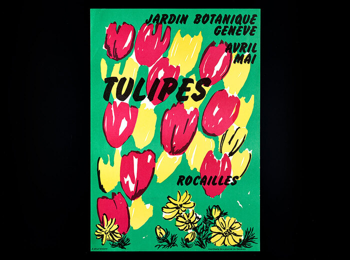
Tulipesposters,Jardin botanique Genève
This botanical poster series embodies an experimental institutional warmth—scientific rigor softened by playful typographic improvisation. The eclectic mix of display faces (Flash's dramatic high-contrast, Cooper Black's friendly rotundity, Desdemona's calligraphic flourishes) creates a handmade, workshop-like energy that mirrors the botanical illustration process itself. The typography feels alive and organic, with modified letterforms and rotated glyphs suggesting the same interpretive freedom the illustrators brought to their plant drawings.