
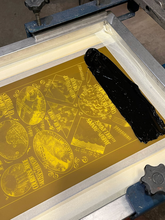
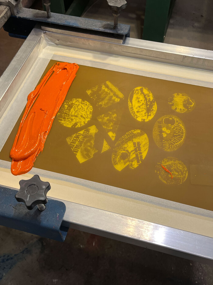
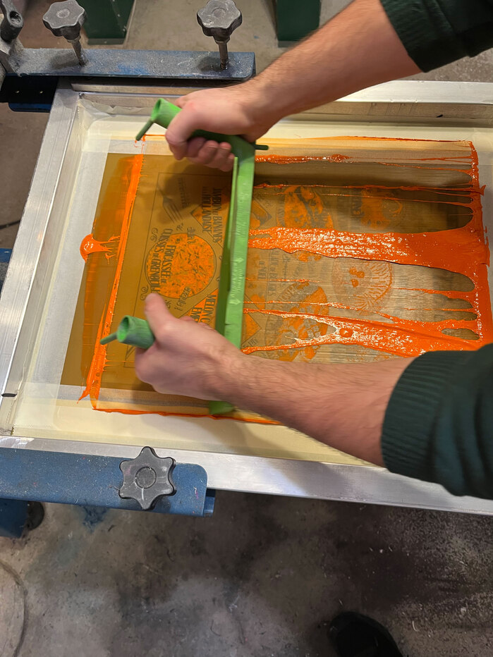
“À Table!” is a two-color screen-printed poster inspired by cookbook photography from the 1970s and 1980s. These images often depict unlikely and visually unappealing dishes, presented with complete seriousness. What makes them compelling is that they were never meant to be ironic. The poster brings together a selection of real recipes found in these cookbooks. Printed in black and orange using screen printing at Atelier Bambinoin Lyon, France. Paolo (the guy I made the posters with) printed two T-shirts with it. The typefaces in use areBookman Bold Italic Swash,ITC Bodoni Ornaments,Cesare,Interlope,Martian MonoandZipper.Bon appétit!
This typography system embodies "earnest kitsch" through its commitment to authentic period maximalism rather than ironic pastiche. The Bookman Swash anchors the composition with its expansive, confident swashes that mirror the unabashed confidence of 1970s cookbook photography, while the supporting cast of ornamental and display faces creates the visual excess that defines the era. Rather than winking at its references, the typography maintains the sincere enthusiasm of its source material—cookbook designers who genuinely believed in the visual appeal of aspic-suspended vegetables.
This eclectic font selection succeeds through what could be called "typographic archaeology"—each face represents a different stratum of 1970s-80s design vernacular. Bookman's rational form model provides structural authority while its swash variants add dynamic flourishes that soften the vertical stress. The ornamental faces (ITC Bodoni Ornaments, Zipper) operate as decorative punctuation rather than text, allowing for maximum visual density without sacrificing legibility. Martian Mono's inclusion creates temporal tension—its contemporary monospace forms ground the composition in the present while honoring the period's love of technological novelty.
Rather than following conventional pairing harmony, this system embraces deliberate cacophony as an authentic period gesture. The fonts share no structural DNA—Bookman's rational model clashes with Cesare's more dynamic forms, while the ornamentals exist purely as graphic elements. This apparent chaos actually demonstrates sophisticated restraint: each typeface is deployed for specific functional roles (headlines, body text, decoration) rather than mixing indiscriminately, creating controlled disorder that mirrors the visual logic of vintage cookbook layouts.