
Baskerville Old Face builds on the rational form model with vertical stress and moderately closed apertures, but tempers this with the refined contrast modulation that defines the transitional tradition. The letterforms exhibit medium-high stroke contrast with sharp, unbracketed serifs that create crisp horizontal emphasis, while the axis remains strictly vertical—a departure from the diagonal stress of old-style faces. Its distinguishing features include a generous x-height that aids legibility, ball terminals on letters like 'a' and 'c', and counters that are more closed than humanist designs but retain enough openness for text use. This face sits squarely in the Baskerville lineage, representing the 18th-century shift toward rationalized letterforms that would eventually lead to the Didones, but it retains enough warmth to avoid the stark perfection of Bodoni. In practice, it excels in editorial contexts where authority and refinement are paramount, though the crisp serif details and medium-high contrast make it less forgiving than old-style faces at very small sizes or poor reproduction conditions.
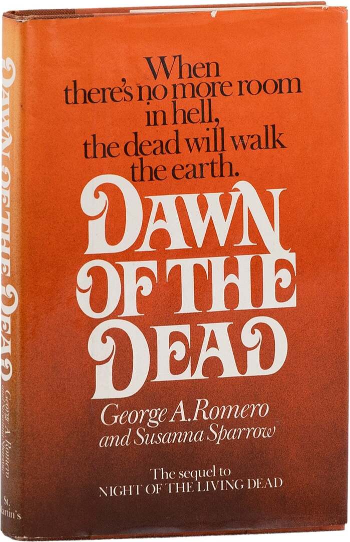
Dawn of the Deadby George A. Romero and Susanna Sparrow, St. Martin’s Press
This typography communicates sophisticated literary horror with aristocratic decay. The Baskerville Old Face provides editorial authority through its high-contrast transitional forms and vertical stress, establishing serious literary credentials, while Davison Art Nouveau introduces theatrical menace through its ornate, sinuous letterforms that suggest corruption creeping through classical refinement. The pairing creates a tension between respectability and decadence that perfectly captures zombie horror's subtext of civilization's veneer cracking.
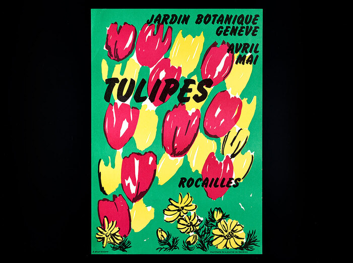
Tulipesposters,Jardin botanique Genève
This botanical poster series embodies an experimental institutional warmth—scientific rigor softened by playful typographic improvisation. The eclectic mix of display faces (Flash's dramatic high-contrast, Cooper Black's friendly rotundity, Desdemona's calligraphic flourishes) creates a handmade, workshop-like energy that mirrors the botanical illustration process itself. The typography feels alive and organic, with modified letterforms and rotated glyphs suggesting the same interpretive freedom the illustrators brought to their plant drawings.