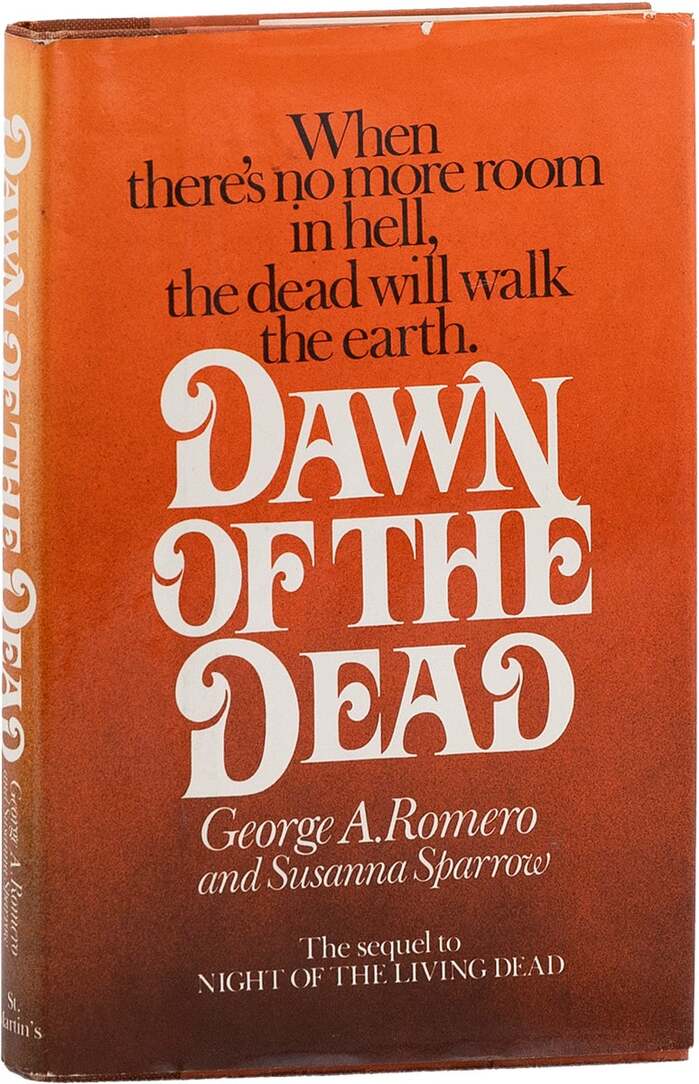
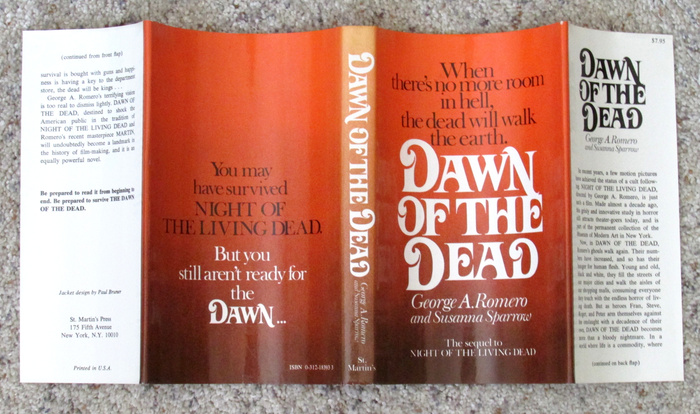

Thenovelizationof George A. Romero’s zombie horror classicDawn of the Dead– the sequel toNight of the Living Dead– was co-written by Susanna Sparrow and first published bySt. Martin’s Pressin 1978. Interestingly, jacket designerPaul BrunerusedDavison Art Nouveauwith the same alternates as on the covers of Frank Herbert’sDune, as extensively detailed inThe Mystery of the Dune Fonthere on Fonts In Use.
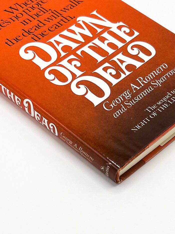
This typography communicates sophisticated literary horror with aristocratic decay. The Baskerville Old Face provides editorial authority through its high-contrast transitional forms and vertical stress, establishing serious literary credentials, while Davison Art Nouveau introduces theatrical menace through its ornate, sinuous letterforms that suggest corruption creeping through classical refinement. The pairing creates a tension between respectability and decadence that perfectly captures zombie horror's subtext of civilization's veneer cracking.
Baskerville Old Face anchors the design with its rational form model—closed apertures and vertical stress create the editorial gravitas essential for a literary adaptation of a cult film. Its high contrast and sharp serifs suggest both classical authority and potential violence. Davison Art Nouveau operates from a dynamic form model with flowing, organic stress that contrasts beautifully with Baskerville's rigidity. The Art Nouveau's decorative complexity and sinuous terminals evoke both elegance and decay, while its moderate x-height maintains readability at display sizes.
This pairing deliberately violates Kupferschmid's harmony principle by combining different form models (rational Baskerville vs. dynamic Art Nouveau), creating productive tension rather than safe cohesion. The contrast works because both fonts share sufficient gravitas and complexity to coexist—neither is neutral enough to disappear. The Art Nouveau's ornamental excess plays against Baskerville's restraint, suggesting the story's theme of civilization succumbing to primal horror. Times New Roman likely handles body text with appropriate editorial neutrality.