
Times New Roman
Times New Roman operates from a rational skeleton with vertical stress and moderately closed apertures, creating its characteristic authoritative presence on the page. The contrast is pronounced but controlled—thick verticals against crisp hairlines—with ball terminals and triangular serifs that maintain readability under demanding conditions. Commissioned by The Times of London in 1931, Stanley Morison's design represents the apex of newspaper typography: maximum character count per line without sacrificing legibility. Its compact proportions and sturdy construction make it nearly indestructible at small sizes, though this efficiency comes at the cost of warmth—the rational construction creates typographic color that reads as institutional rather than inviting. Times excels in environments demanding dense information and serious tone, but its ubiquity in academic and corporate contexts has made it feel generic despite its technical excellence.
Maison CFC
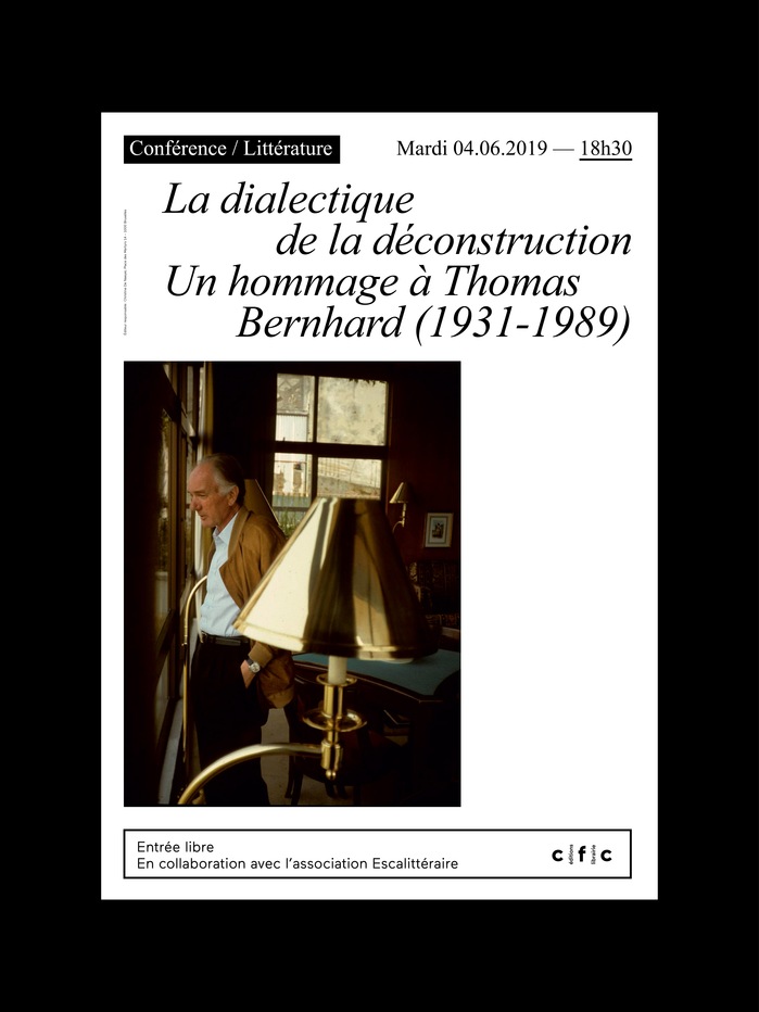
Times New Roman communicates scholarly gravitas with democratic accessibility—the paradox of an authoritative serif that remains utterly familiar. Its transitional form model carries moderate contrast and closed apertures, creating intellectual weight without pretension. For a Brussels bookstore, this choice signals literary seriousness rooted in everyday readability, positioning Maison CFC as a place where high culture meets neighborhood accessibility.
Dawn of the Deadby George A. Romero and Susanna Sparrow, St. Martin’s Press
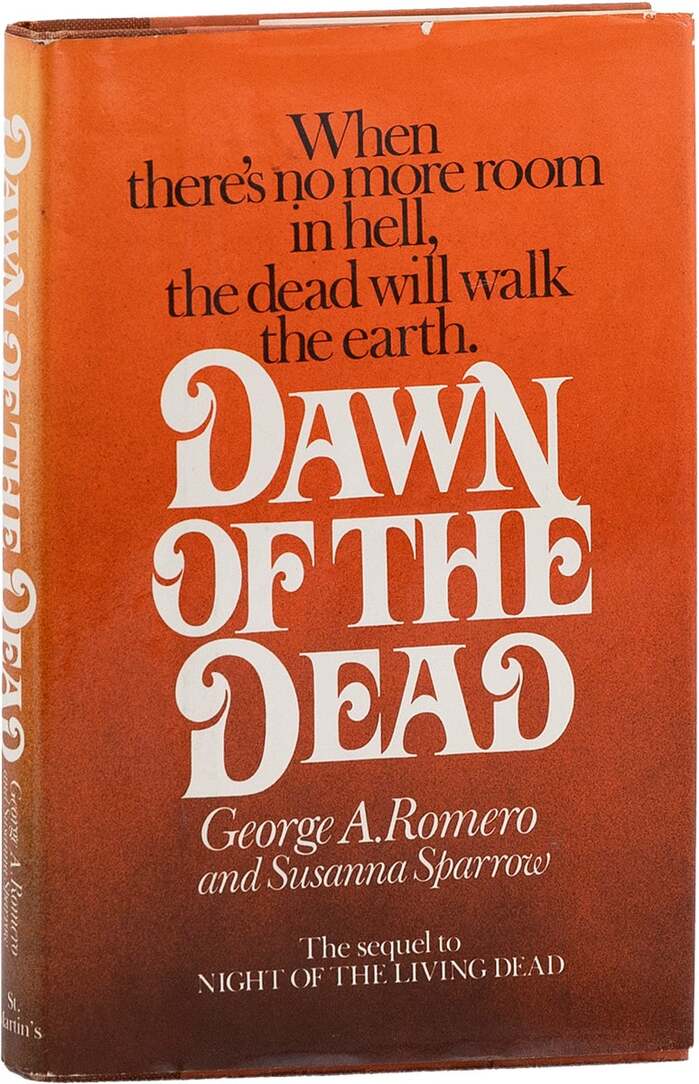
This typography communicates sophisticated literary horror with aristocratic decay. The Baskerville Old Face provides editorial authority through its high-contrast transitional forms and vertical stress, establishing serious literary credentials, while Davison Art Nouveau introduces theatrical menace through its ornate, sinuous letterforms that suggest corruption creeping through classical refinement. The pairing creates a tension between respectability and decadence that perfectly captures zombie horror's subtext of civilization's veneer cracking.
The unofficial IKEA Report
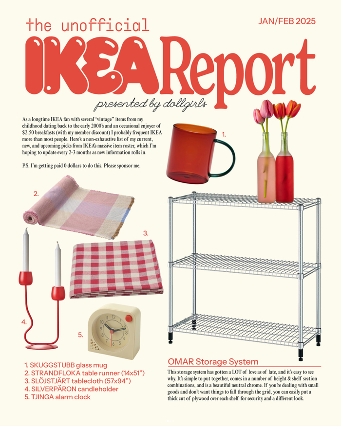
This typography system communicates playful editorial rebellion with democratic accessibility. The mix of high-contrast display faces (Recoleta's rational forms) with quirky script elements (League Script's dynamic flourishes) creates an irreverent magazine aesthetic that feels both sophisticated and approachable—perfectly mirroring IKEA's design philosophy of making good design accessible to everyone.