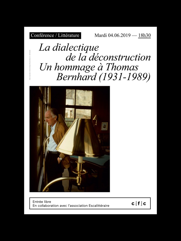
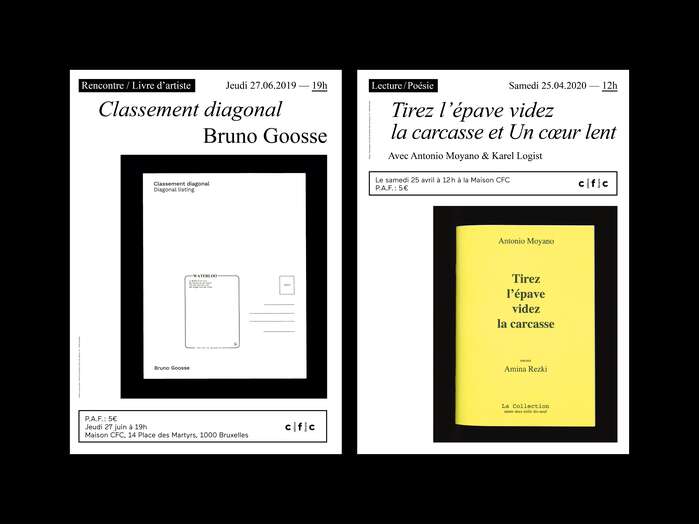
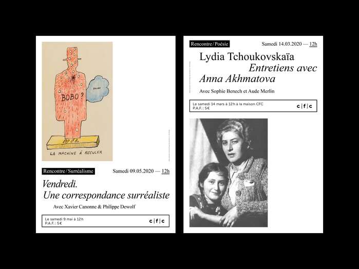
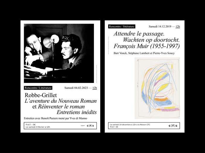
Visual identity of the quarterly booklet, the quarterly program posters and the posters for all events forMaison CFC, a bookstore in Brussels, Belgium.
Times New Roman communicates scholarly gravitas with democratic accessibility—the paradox of an authoritative serif that remains utterly familiar. Its transitional form model carries moderate contrast and closed apertures, creating intellectual weight without pretension. For a Brussels bookstore, this choice signals literary seriousness rooted in everyday readability, positioning Maison CFC as a place where high culture meets neighborhood accessibility.
Times New Roman's transitional structure—vertical stress axis, moderate contrast, and compact x-height—was engineered for newsprint legibility under harsh printing conditions, making it ideal for poster applications where readability at distance is crucial. The rational form model with its closed apertures and authoritative stance serves a bookstore's need to communicate literary credibility, while the font's ubiquity prevents it from feeling exclusionary. The heavy reliance on italics exploits Times' calligraphic DNA, adding textual emphasis and creating hierarchy without additional fonts.
This is a single-font system that creates internal contrast through weight and style variations within Times New Roman's comprehensive family. The pairing of roman and italic styles works because they share identical structural DNA while the italic maintains the transitional serif's calligraphic roots, creating emphasis through slope rather than weight change. This monotypographic approach reinforces the bookstore's focus on content over typographic spectacle, letting the text itself carry the visual interest.