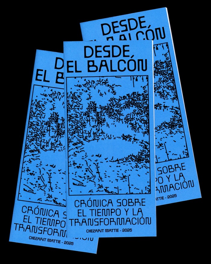
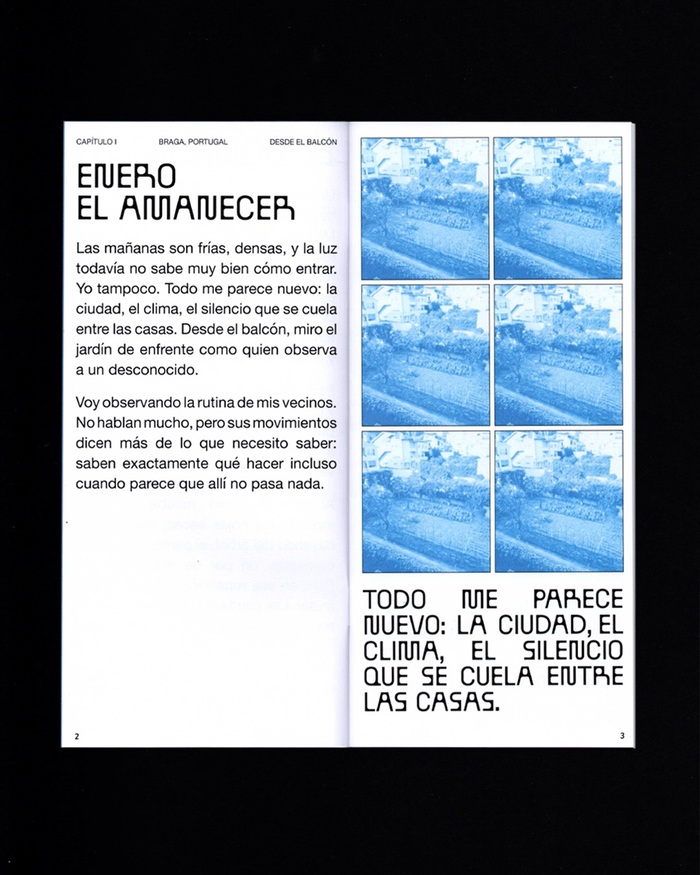
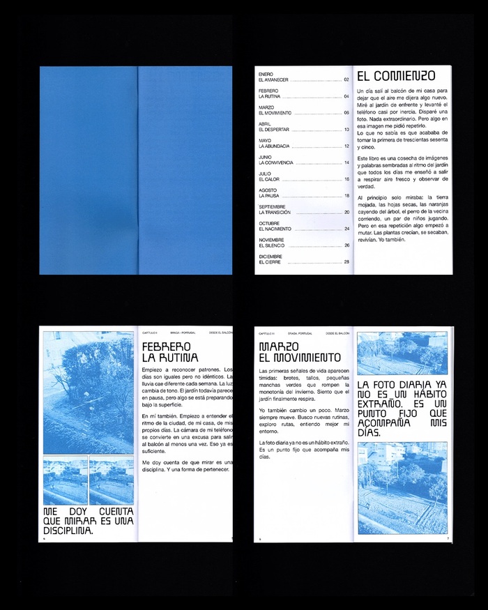
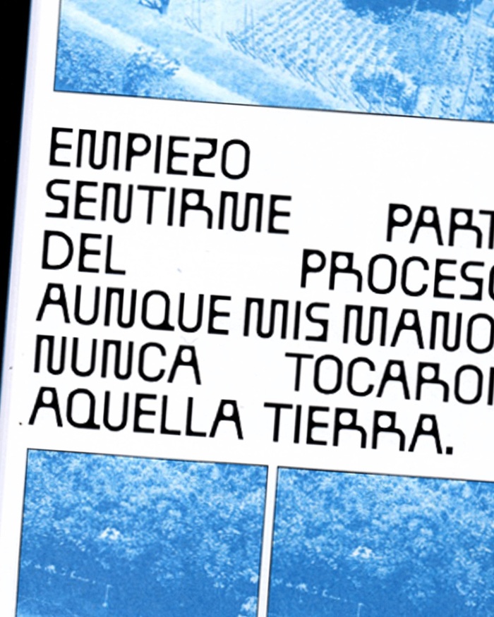
Description of the project by designerChezarit Mattie: I spent a year documenting the same spot from my balcony. One day I went out onto the balcony and took a picture of the garden across the street. There was something about that image that compelled me to repeat it. That image became a habit. The habit, a record. In those twelve months, I understood that looking is an almost poetic discipline; a sustained practice of attention and time, of understanding cycles, listening to intuition, and giving patience space to do its work. Headlines set inBallPillbyBenoît Bodhuin, paired withHelveticaor similar for text.
BallPill's constructed geometric forms with their pill-shaped terminals create a clinical yet intimate energy—like viewing through a medical lens that softens rather than dissects. The typeface's rational structure grounds the poetic documentation practice, while its rounded terminals prevent the systematic observation from feeling cold or mechanical, suggesting the tender discipline of sustained attention.
BallPill operates as a geometric form model with distinctive pill-shaped terminals that humanize its constructed rationality—perfect for a project balancing systematic documentation with poetic observation. The rounded terminals echo the organic forms being observed (gardens, cycles) while the geometric structure reinforces the disciplined, almost scientific nature of the year-long practice. Helvetica provides neutral, highly legible support that doesn't compete with the conceptual weight of the custom display choice.
This pairing follows the safe but effective model of distinctive display + neutral workhorse. BallPill's geometric construction shares DNA with Helvetica's rational structure, creating cohesion, while the pill terminals provide sufficient surface differentiation. The contrast works through specificity—BallPill carries all the conceptual load and personality, while Helvetica disappears into pure function for extended reading.