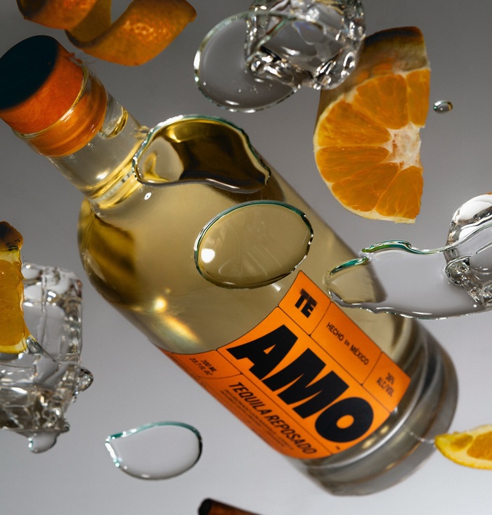
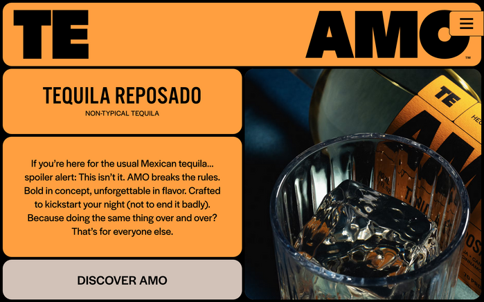
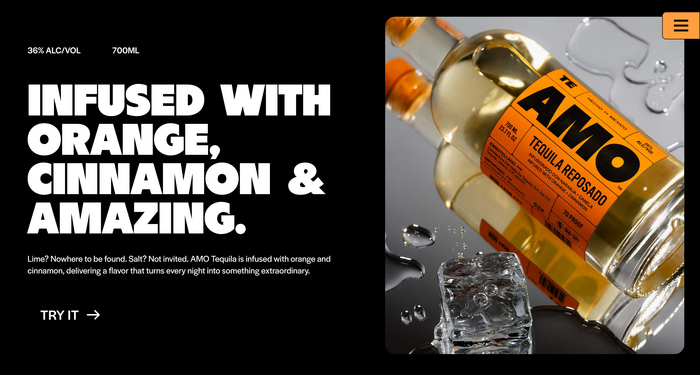
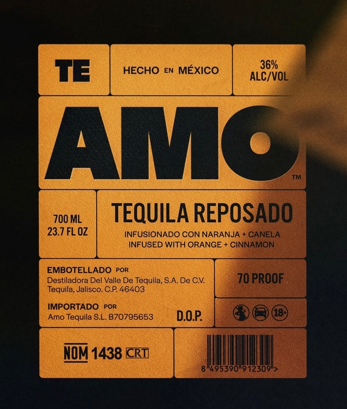
Brand design studioHello Comradecreated a type-centricidentityforAMO Tequila. In a category so often dressed in ornament, this feels like a clear, confident pour. While logo and headings are in all-capsBN Dime, supported byAlternate Gothic, all body copy usesHalyard Display.Darden Studio’s sans serif features for text on the bottle labels and the website alike. There’s something special about seeing Halyard carry a brand like AMO Tequila, bold, front and center, without distraction.
This typography system communicates industrial confidence with artisanal precision. The BN Dime Display's high-contrast geometric construction creates bold, architectural presence while its refined proportions prevent brutalism. Combined with Halyard's rational clarity and humanist warmth, it positions AMO as premium craft tequila that respects tradition while rejecting category clichés of ornamental excess.
BN Dime Display's geometric form model with extreme weight contrast creates commanding shelf presence essential for spirits packaging, while its refined proportions maintain premium positioning. Halyard Display bridges the rational-dynamic spectrum with closed apertures for authority but humanist terminals for approachability—perfect for body text that must work across bottles and digital. The pairing works because both fonts share vertical stress and similar x-height proportions, creating structural harmony despite surface contrast.
This is a masterclass in contrast-with-cohesion pairing. BN Dime's geometric-rational form model with extreme contrast pairs beautifully with Halyard's rational-humanist structure and moderate contrast—they share vertical proportions and closed apertures but differentiate through stroke weight and terminal treatment. The Alternate Gothic addition provides utilitarian support without disrupting the primary dialogue. All three fonts maintain structural DNA while serving distinct hierarchical roles.