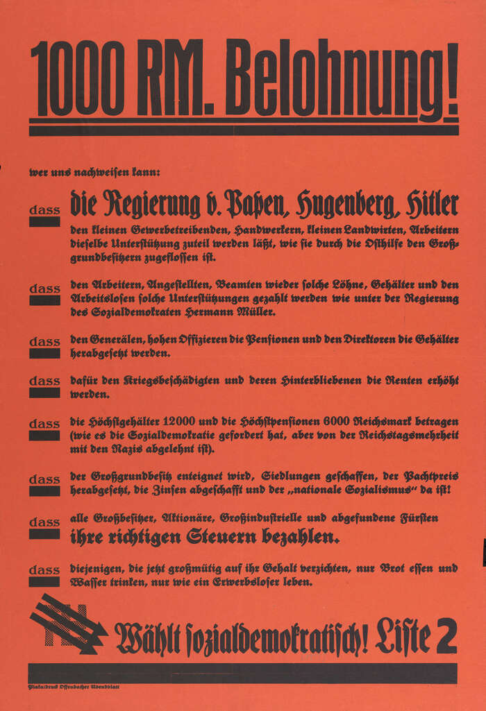


An election poster attackingthe government of Adolf Hitlerand promoting theSocial Democratic Party of Germany(SPD) in theMarch 1933 German federal election, the last election in Germany before the Nazi Party banned all other political parties. The headline (“Reward 1,000Reichsmark”) uses a version ofInserat-Grotesk schmal, possibly the schmalfett style ofPhönix-GroteskebyKrebs. The other typefaces are all by this Frankfurt/Main type foundry: the bulk of the text uses fetteMerian-Fraktur, though there are two lines in schmale fetteBrentano-Fraktur. The word “dass” at the beginning of each point is in halbfetteFederzug-Antiqua, and the numeral in “Liste 2” likely is fromFreihand-Groteske. The poster was printed by theOffenbacher Abendblatt, a party-owned newspaper founded in 1874 which had to cease publication shortly after when the National Socialists came to power.
This typography orchestrates a calculated tension between tradition and urgency, wielding cultural legitimacy as resistance strategy. The dominant Merian-Fraktur carries centuries of German typographic authority—its blackletter forms invoke institutional weight and cultural continuity—while the sans-serif headline cuts through with industrial precision. This isn't nostalgic traditionalism but weaponized heritage: using familiar letterforms to deliver radical democratic messaging against rising fascism.
The pairing exploits form model contrast for maximum political impact: the geometric sans-serif headline (Inserat-Grotesk's constructed forms, tight apertures, vertical stress) delivers modern urgency, while the blackletter body text (Merian-Fraktur's dynamic, calligraphic roots) provides cultural authenticity the target audience would trust. The rational precision of the sans commands attention while the traditional Fraktur legitimizes the message—a sophisticated strategy of using typographic familiarity to make radical anti-fascist content feel institutionally credible rather than foreign agitation.
This represents deliberate cross-matrix pairing for political effect: geometric sans (rational construction) paired with dynamic blackletter (calligraphic tradition) creates maximum contrast while maintaining hierarchical clarity. The foundry consistency (all Krebs types) provides subtle structural harmony beneath the surface tension—shared proportional relationships and similar x-heights prevent visual chaos. The multiple blackletter variants (Merian-Fraktur, Brentano-Fraktur) create textural variety within the traditional camp while the sans-serif punctuation maintains contemporary authority.