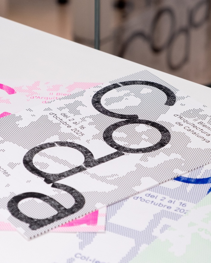
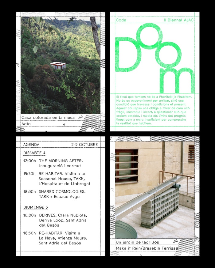
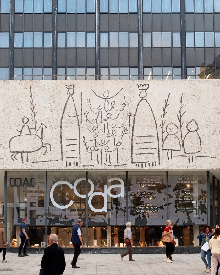

Graphic identity, website design and printed materials designed byLara Coromina ParcetforCODA, the 2nd Young Architecture Biennal of Catalonia, which took place atCol·legi d’Arquitectes de Catalunya (COAC)in Barcelona during October 2025. The design featuresComma Type’sCMM Codain itsNormalizedversion throughout. Referencing the musical figure of the coda – an independent ending that rewrites itself, that reiterates, that deforms under its own rules – we claim an ending not as closure, but as a threshold. A gesture that is articulated from inherited frameworks and transforms them into possibility. Following the manifesto’s call to “recognize failed, unfinished, or obsolete architectures as active parts of the landscape”, the graphic identity was built by gathering textures using frottage. This analogue technique, which consists of rubbing paper with a pencil directly against material surfaces, became the starting point for creating visual impressions of the surrounding environment: non-linear traces of architecture, marks of what is worn, unfinished, or already turning obsolete. From these traces, a visual system of overlapping textures, lines, patterns, and typography was developed, echoing the manifesto’s idea of a “persistent, dense atmosphere”. In this landscape, ruins are not endings but material to work with, and the biennial’s identity embraces the end (Coda) as a place of possibility, where what remains can be reactivated, layered, and transformed into something new. CODA was curated byNaiara Albizua&Carmen Salas(objet a) and organized byAJAC Agrupació de Joves Arquitectes de Catalunyaunder the direction ofDani MontesandGuillem Elvira. Website code byClara Layti. All photographs byNatalia Vaquero. Risograph printing byDo the Print.
CMM Coda's Normalized version embodies architectural afterlife—the rational structure of a geometric form model softened by dynamic apertures and subtle humanist warmth. Its constructed letterforms reference both digital precision and analog decay, perfectly capturing the manifesto's concept of "persistent, dense atmosphere" where architectural ruins become material for transformation rather than endings.
CMM Coda operates within a geometric form model but retains dynamic qualities through its open apertures and slightly varied stroke weights, creating systematic clarity without sterile coldness. The "Normalized" version's consistent optical weight and circular forms echo architectural blueprints and technical drawings, while its subtle contrast variations prevent the dead uniformity of pure geometric sans-serifs. This structural logic mirrors the project's conceptual framework—taking systematic architectural language and allowing for organic transformation through layering and texture.
As a single-font system, CMM Coda Normalized creates hierarchy through weight variation within its geometric framework rather than contrasting form models. The consistent circular forms and systematic proportions maintain visual cohesion across applications while the weight range (from light textures to bold headlines) provides sufficient contrast for complex information architecture. This approach mirrors the project's layering concept—one foundational structure that transforms through density and application rather than fundamental formal shifts.