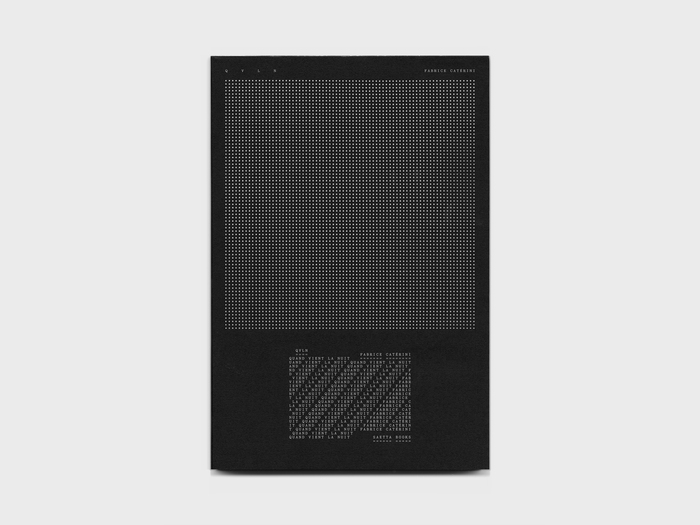
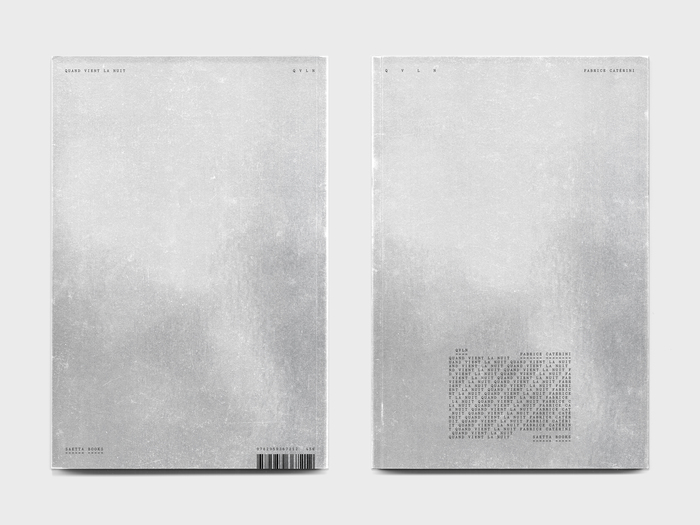
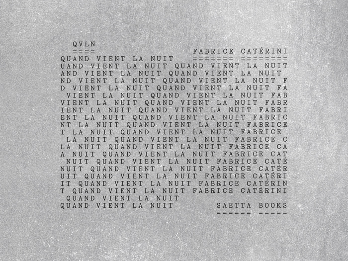
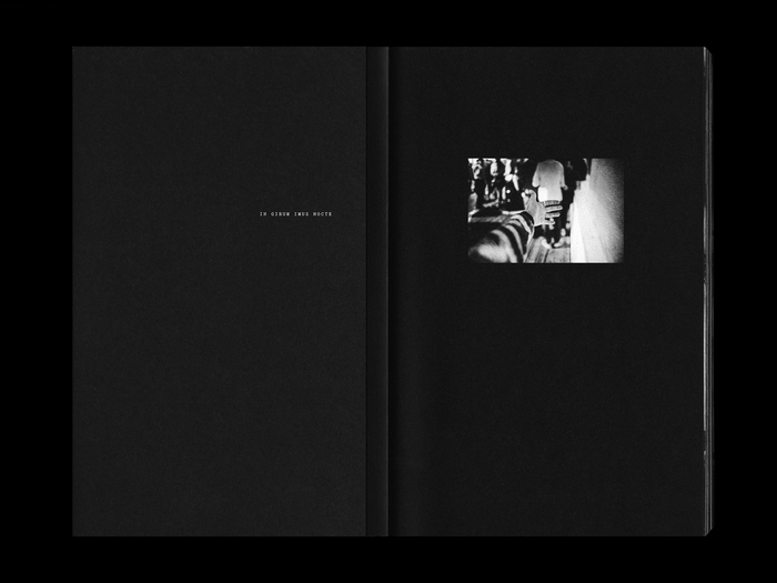
The story of this book begins where daylight ends: when night falls. It is the story of a headlong flight, far from the diurnal world and its harsh, singular, zenithal light. For as dusk descends, light sources multiply; celestial bodies and artificial glows transfigure space and time. Then he dives into these troubled waters, drawn in by the dark energy that runs through and transforms him. He does not know it yet, but he has embarked upon a journey that will last seven years. A voyage to the end of the night, no doubt, intense and initiatory, during which he will search for love in all the noises of the world, hunting for fragments of the real in the realm of dreams and masks. But the night, full of promise, always yields to dawn. And in the end, it is photography itself, the art of writing with light, that will allow him to emerge from the dark. Quand vient la nuitis the first monograph by French photographerFabrice Catérini. The book was published bySaetta Booksin November 2025 and designed byThéo Miller. The cover features a mirror lamination combined with a perforated black dust jacket, allowing light to pass through and creating subtle moiré effects and visual vibrations. Cover and jacket texts are set inYorickbyMatthieu Cortat(205TF), using a typographic treatment that plays with repetition, fragmentation, and text deconstruction. Printed on the inside flaps of the dust jacket, at the beginning and end of the book, is Guy Debord’s palindrome, borrowed from Virgil:In girum imus nocte et consumimur igni(“We go round and round in the night and are consumed by fire”). The interior of the book is dense, combining a large number of photographs with black pages that immerse the reader in the darkness and agitation of the nightlife scene. The photographic sequence is interrupted by a long central text (the only white pages in the book) set inExposurebyFederico Parra Barrios(205TF) in a sober and classic layout, designed to contrast with the visual tension and rhythm of the photographic sections. 168 pages, 200×300 mm, 102 duotone platesSection-sewn softcover, with mirror lamination and perforated dust jacketTexts in French and English, ISBN 978–2–9593672–1–2, November 2025
This typography embodies nocturnal metamorphosis—the transformation from ordered daylight consciousness into the fragmented, multi-layered experience of night. Yorick's deconstructed letterforms on the cover mirror the photographer's journey through darkness, where text becomes visual texture rather than linear narrative. Exposure's rational clarity in the central text section provides a moment of lucid reflection within the visual chaos, like finding coherent thought in the midst of nighttime reverie.
The pairing leverages structural opposition to mirror the book's thematic arc. Yorick's experimental forms—with their fragmented, deconstructed character—embody the disorientation of nighttime experience, where familiar structures break down into fragments and repetitions. Exposure's rational form model provides necessary counterpoint: its clean, systematic letterforms create breathing space and legibility anchor points within the dense photographic sequence. The monospaced character of Exposure reinforces the contemplative, typewriter-like quality of the central text, suggesting documentary precision amid subjective chaos.
This represents deliberate structural tension rather than harmonious pairing—Yorick's experimental, deconstructed forms against Exposure's rational, systematic clarity. The contrast mirrors the book's narrative movement between fragmented nighttime experience and moments of lucid reflection. Rather than sharing a form model for cohesion, the fonts occupy opposite poles: chaos versus order, fragmentation versus wholeness, creating typographic embodiment of the photographer's seven-year journey from darkness toward light.