
Exposure
Exposure is built on a pure geometric skeleton with circular 'o' forms, simple 't' crosses, and mathematically derived letter shapes that prioritize systematic construction over calligraphic warmth. The typeface exhibits uniform stroke weight throughout, creating a linear color that emphasizes its constructed nature rather than any human hand. Its most distinguishing feature is an extremely condensed width that compresses letters to their structural minimum while maintaining legibility through generous x-height proportions. The counters remain surprisingly open despite the narrow set width, suggesting careful attention to internal spacing relationships. This face belongs to the tradition of geometric display types like Futura Extra Bold Condensed but pushes compression further into experimental territory. In practical use, Exposure excels as a headline grabber where its compressed geometry creates maximum impact per horizontal inch, but its extreme proportions and single weight severely limit its versatility—it's a specialist tool for specific typographic problems rather than a workhorse family.
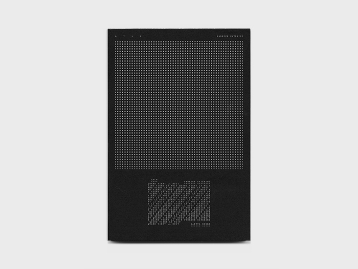
Quand vient la nuitby Fabrice Catérini
This typography embodies nocturnal metamorphosis—the transformation from ordered daylight consciousness into the fragmented, multi-layered experience of night. Yorick's deconstructed letterforms on the cover mirror the photographer's journey through darkness, where text becomes visual texture rather than linear narrative. Exposure's rational clarity in the central text section provides a moment of lucid reflection within the visual chaos, like finding coherent thought in the midst of nighttime reverie.
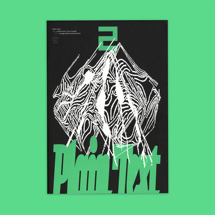
Plain Text2
This typography system embodies experimental-academic rigor with typographic anarchism. The Basically duo creates a sophisticated bilingual framework—the serif's high contrast and closed apertures establishing scholarly authority for English, while the sans maintains rational proportions for French text hierarchy. The explosion of display faces (Michaux, Disc, Jester, Ferro) creates controlled chaos that mirrors the publication's mission to explore "typographic imaginaries beyond strictly historical frameworks."
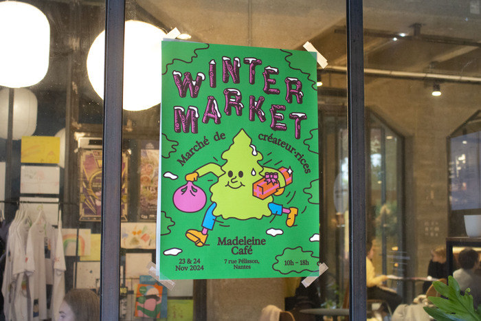
Winter Market at Madeleine Café
This typography pairing creates a distinctly French artisanal warmth, combining the rustic authority of wood-type display lettering with the intimate softness of contemporary blur effects. The Rustic No. 2 revival carries the dynamic form model of 19th-century wood type—open apertures, irregular stress, and chunky serifs that speak to craft traditions—while Exposure's deliberately unfocused edges add contemporary intimacy that prevents the wood type from feeling like vintage pastiche. Together they create a brand energy that's confidently handmade yet approachably modern.