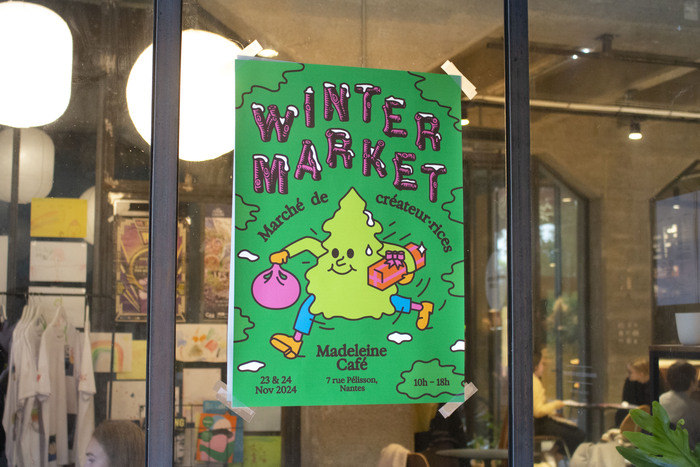
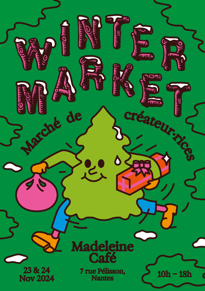
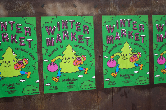
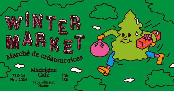
Here is a poster I did for a Christmas market gathering local designers that took place ina little coffee shop in Nantesin November 2024. I used Pinewood, a freebie digital interpretation ofRustic No. 2, both for the title and as an illustrative element, adding snow on top to make it fit to the rest of the composition. I paired it withExposure, chosen for the warm feeling of its blurry outlines.
This typography pairing creates a distinctly French artisanal warmth, combining the rustic authority of wood-type display lettering with the intimate softness of contemporary blur effects. The Rustic No. 2 revival carries the dynamic form model of 19th-century wood type—open apertures, irregular stress, and chunky serifs that speak to craft traditions—while Exposure's deliberately unfocused edges add contemporary intimacy that prevents the wood type from feeling like vintage pastiche. Together they create a brand energy that's confidently handmade yet approachably modern.
Rustic No. 2's dynamic form model, with its wide apertures and diagonal stress inherited from wood-type construction methods, perfectly captures the artisanal maker energy needed for a local craft market. Its chunky slab serifs and irregular proportions communicate authentic craftsmanship over corporate polish. Exposure's blurred terminals and soft contrast create textural warmth that complements the wood type's structural irregularities, while its rational underlying proportions maintain legibility for essential information. The pairing works because both fonts prioritize emotional resonance over clinical precision, matching the intimate café setting.
This pairing follows successful contrast-with-cohesion principles by combining fonts from different structural families that share emotional temperature. Rustic No. 2's dynamic, high-contrast display characteristics create hierarchy and craft authenticity, while Exposure's rational structure with soft treatment provides readable support text that doesn't compete. The blur effect in Exposure echoes the irregular, hand-carved quality of the wood type, creating visual harmony despite their different form models. Both fonts reject corporate perfection in favor of human touch, making them structurally compatible partners.