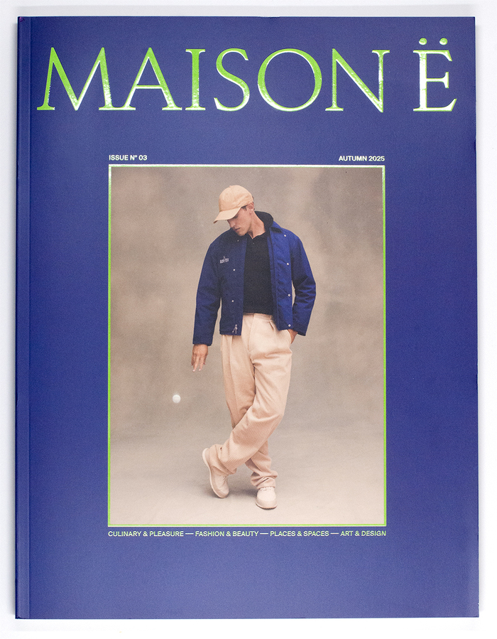
MAISON Ëis a contemporary magazine celebrating design, culture, and craftsmanship through carefully curated content. Positioned at the crossroads of design, architecture, fashion, and culture,MAISON Ëexplores spaces, objects, and ideas that shape a thoughtful way of life. With a timeless aesthetic, its visual identity is defined by the prominent use of theRizomatypeface, fromR-Typography, on the logotype and for the headlines. Text typefaces includeChamberí(Extratype) andSuisse Int’l(Swiss Typefaces), with some sprinkles ofDinamo’sABC Honeymoon.
Rizoma's geometric construction and distinctive character forms create an intellectual-yet-playful editorial voice that signals curatorial confidence without academic stuffiness. The typeface's constructed letterforms and unconventional details communicate experimental sophistication, while the supporting cast of Chamberí's rational clarity and Suisse Int'l's swiss precision grounds the more expressive headline work in readable, authoritative text setting.
Rizoma serves as the primary brand voice with its geometric form model featuring constructed letterforms, moderate contrast, and distinctive character details that separate it from generic geometric sans. Chamberí provides rational counterpoint with its closed apertures and vertical stress, offering editorial authority for body text, while Suisse Int'l's neutral rationality ensures maximum readability across digital platforms. ABC Honeymoon's dynamic flourishes add seasonal texture without overwhelming the systematic approach.
This is a masterclass in strategic typographic mixing across form models: geometric (Rizoma) for brand personality, rational (Chamberí, Suisse Int'l) for editorial credibility, and dynamic (ABC Honeymoon) for accent moments. Rather than following safe same-model pairing rules, the system creates sophisticated tension through deliberate contrast while maintaining cohesion through shared European modernist DNA and consistent optical sizing across the hierarchy.