
Suisse Int’l
Suisse Int'l follows the rational form model with closed apertures, vertical stress axis, and systematically constructed letterforms that prioritize order over warmth. Its stroke contrast is minimal, maintaining the even typographic color expected of neo-grotesque sans-serifs, while its apertures in letters like 'e', 'a', and 'c' are notably closed, creating a reserved, authoritative presence on the page. The typeface belongs to the Swiss International Style tradition but with contemporary refinements — cleaner terminals, slightly more open counters than classic Helvetica, and subtly humanized proportions that prevent complete mechanical coldness. Its moderate x-height and sturdy construction make it a reliable workhorse for both digital interfaces and editorial applications, though the lack of italics severely limits its hierarchical potential. Suisse Int'l excels in corporate communications and digital products where clarity and neutrality are paramount, but its rational skeleton and closed forms can feel impersonal in contexts requiring warmth or editorial sophistication.
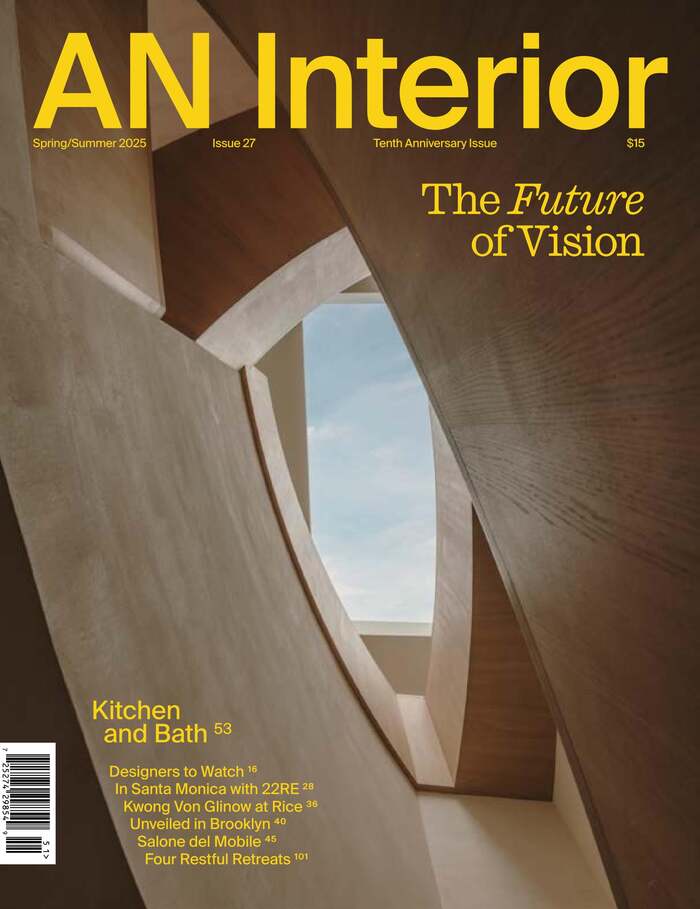
AN Interiormagazine, Tenth Anniversary Issue
This typography system channels curatorial-editorial confidence through its sophisticated layering of historical and contemporary forms. Caslon Ionic's transitional structure—with its moderate contrast and refined bracketed serifs—establishes scholarly authority while remaining approachable, perfectly suited for architectural discourse. The interplay between Caslon's warm calligraphic origins and Suisse Int'l's rational precision creates a brand energy that's both intellectually rigorous and visually contemporary.
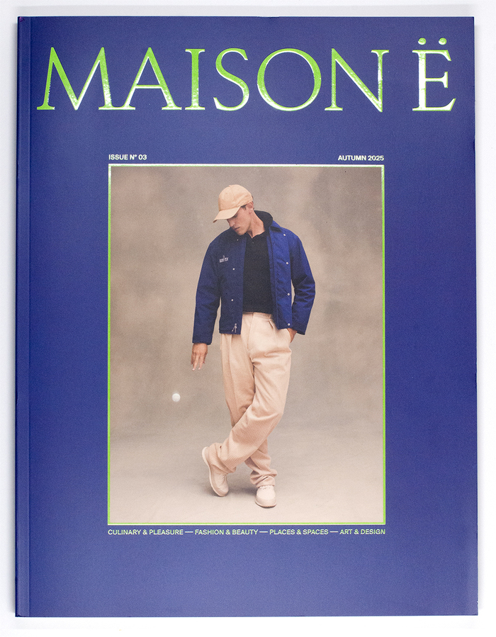
MAISON Ëmagazine
Rizoma's geometric construction and distinctive character forms create an intellectual-yet-playful editorial voice that signals curatorial confidence without academic stuffiness. The typeface's constructed letterforms and unconventional details communicate experimental sophistication, while the supporting cast of Chamberí's rational clarity and Suisse Int'l's swiss precision grounds the more expressive headline work in readable, authoritative text setting.
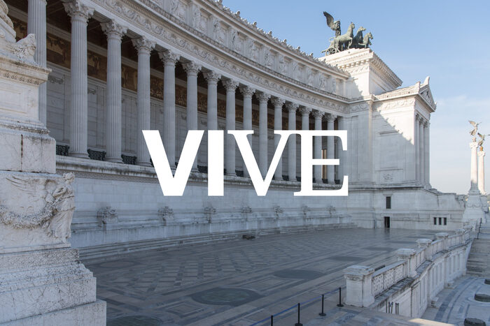
VIVE. Vittoriano e Palazzo Venezia
The Suisse family creates institutional gravitas through rational structural properties—closed apertures and vertical stress—while maintaining approachability through its slightly softened geometric construction. The combination of Suisse Int'l's systematic clarity with Suisse Works' editorial authority positions VIVE as both architecturally precise and culturally accessible, reflecting Rome's blend of monumental heritage and contemporary scholarship.
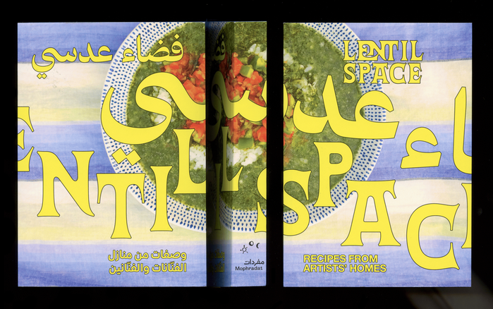
Lentil Space. Recipes from Artists’ Homes
This typography system embodies cultural intimacy with editorial sophistication, creating a warm yet scholarly presence that honors both Arab culinary heritage and contemporary art discourse. The combination of 29LT Azahar Text's humanist warmth with Alte Haas Grotesk's rational precision creates a bilingual voice that feels both accessible and authoritative—like intimate conversations between artists that happen to be expertly documented.