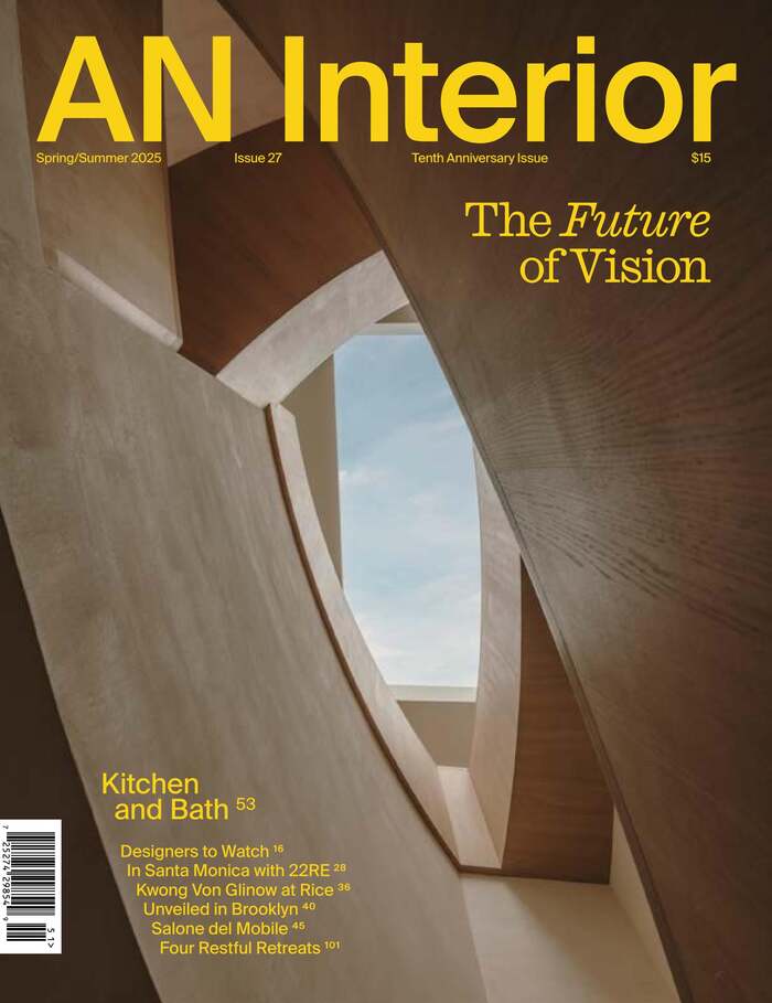
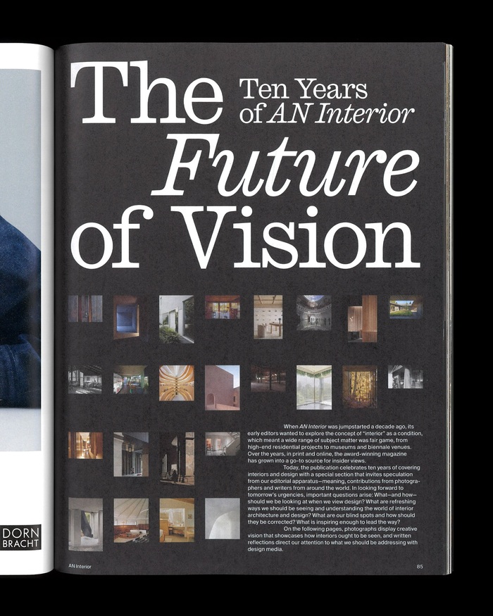
Studio LoutsisusedCaslon Ionicas one of the display typefaces for theTenth Anniversary issue ofAN Interior, and mainly for “The Future of Vision” feature. They use it large and for the text – together withSuisse Int’l– and mixing the upright with the italic. Other sections of the issue also feature other typefaces includingTerza DisplayandKTF Rublena. Caslon IonicandSuisse Int’lfor the section opening to “The Future of Vision” Terza Display for the title of an article on Kwong Von Glinow’s renovation ofMD Anderson Hall Terza Display for a feature on nightclub design byStudio MBM and Yakka Studio KTF Rublena with stacked letters for “Milano Magico” To view this video please enable JavaScript, and consider upgrading to a web browser thatsupports HTML5 video
This typography system channels curatorial-editorial confidence through its sophisticated layering of historical and contemporary forms. Caslon Ionic's transitional structure—with its moderate contrast and refined bracketed serifs—establishes scholarly authority while remaining approachable, perfectly suited for architectural discourse. The interplay between Caslon's warm calligraphic origins and Suisse Int'l's rational precision creates a brand energy that's both intellectually rigorous and visually contemporary.
The pairing leverages structural compatibility through shared vertical proportions while creating hierarchy through contrast differentiation. Caslon Ionic's transitional form model provides editorial gravitas with its moderate stroke contrast and open apertures, making it highly legible at both display and text sizes. Suisse Int'l's rational grotesk structure—closed apertures, minimal contrast—serves as the perfect typographic foil, sharing Caslon's vertical stress axis while stripping away ornamentation. This creates textural variety without sacrificing cohesion, essential for complex magazine layouts.
This is a textbook example of contrast-with-cohesion pairing. Caslon Ionic (dynamic/transitional) and Suisse Int'l (rational grotesk) share compatible proportions and vertical stress, following Kupferschmid's rule that different form models work when they share fundamental structural DNA. The addition of Terza Display and KTF Rublena creates a multi-layered system where each voice serves distinct editorial functions—Terza's geometric construction for contemporary projects, Rublena's expressive character for cultural features.