
Terza Display emerges from a rational construction model, with vertical stress and deliberately closed apertures that create a serious, authoritative presence on the page. Its contrast behavior follows the contemporary serif tradition—moderate thick-to-thin variation that creates texture without the extreme drama of classical Didones. The letterforms show disciplined geometry: consistent counter shapes, minimal aperture openings in characters like 'e' and 'a', and terminals that resolve with sharp, unadorned cuts rather than calligraphic flourishes. This places it squarely in the lineage of rational serifs like Times Roman and Swift, but with a distinctly contemporary sensibility that favors clarity over historical ornament. In practice, Terza Display excels at creating typographic authority—it commands attention without shouting, making it ideal for editorial headlines and corporate communications where gravitas matters. However, its closed forms and display-optimized details would likely become congested at text sizes, limiting its versatility. The personality it brings is one of confident modernism: professional, uncompromising, and built for impact rather than extended reading comfort.
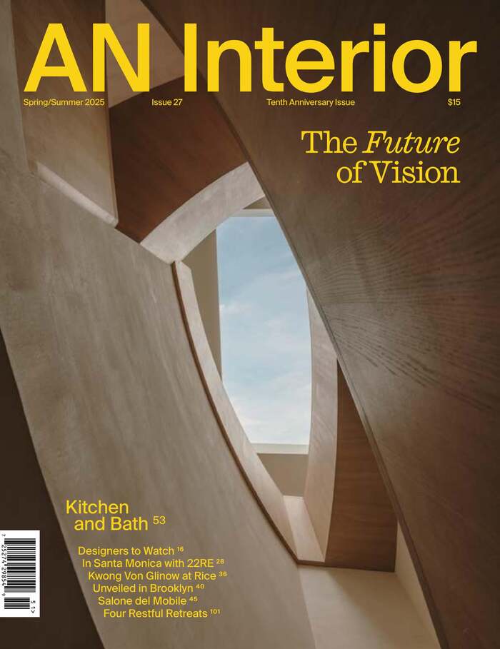
AN Interiormagazine, Tenth Anniversary Issue
This typography system channels curatorial-editorial confidence through its sophisticated layering of historical and contemporary forms. Caslon Ionic's transitional structure—with its moderate contrast and refined bracketed serifs—establishes scholarly authority while remaining approachable, perfectly suited for architectural discourse. The interplay between Caslon's warm calligraphic origins and Suisse Int'l's rational precision creates a brand energy that's both intellectually rigorous and visually contemporary.
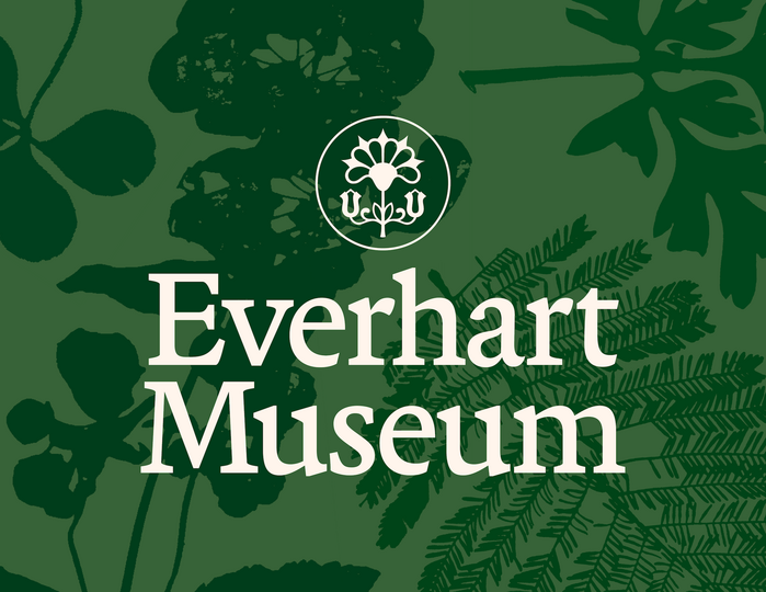
Everhart Museum
The typography system balances institutional gravitas with accessible warmth through its rational-to-dynamic progression. Martina Plantijn's high-contrast transitional forms anchor the brand in scholarly authority—its vertical stress and refined serif treatment echo the chiseled architectural lettering that inspired the logo, while its generous x-height maintains readability across applications. Rig Sans provides the dynamic counterpoint with its open apertures and humanist proportions, softening the formality without abandoning sophistication.