
Martina Plantijn belongs to the dynamic form model with diagonal stress and open apertures that trace back to Renaissance manuscript traditions, though it carries a more contemporary interpretation of old-style proportions. The letterforms show moderate contrast between thick and thin strokes, with the characteristic leftward lean of the stress axis visible in rounds like 'o' and 'e'. Its distinguishing features include generously open counters, bracketed serifs with subtle cupping, and a relatively modest x-height that maintains classical proportions against the cap height. This face clearly descends from the Venetian-French old-style lineage established by Jenson and refined by Garamond, but departs from strict historical revival through slightly more regularized character widths and cleaner, less calligraphic terminal treatments. In practice, this is a text-forward design that excels in sustained reading environments where its even color and comfortable rhythm support long-form content, though it may lose some personality impact in display applications where its restrained contrast and traditional proportions can appear understated against more dramatic contemporaries.
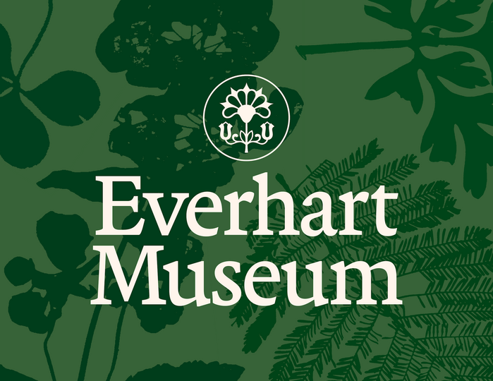
Everhart Museum
The typography system balances institutional gravitas with accessible warmth through its rational-to-dynamic progression. Martina Plantijn's high-contrast transitional forms anchor the brand in scholarly authority—its vertical stress and refined serif treatment echo the chiseled architectural lettering that inspired the logo, while its generous x-height maintains readability across applications. Rig Sans provides the dynamic counterpoint with its open apertures and humanist proportions, softening the formality without abandoning sophistication.
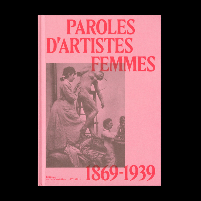
Paroles d’artistes femmes. 1869–1939
This typography pairing creates an intellectual femininity that balances scholarly gravitas with intimate vulnerability. The condensed display serif carries Belle Époque editorial authority through its high-contrast transitional forms and tight apertures, while the humanist text face introduces warmth and approachability through its dynamic stress and open counters. Together they evoke the tension between public artistic manifestos and private diary confessions that defines these women's voices.