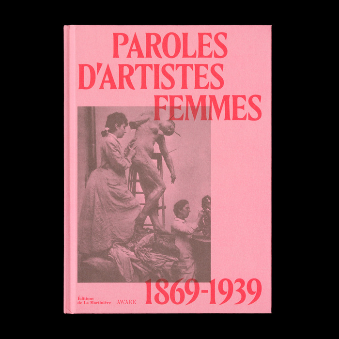
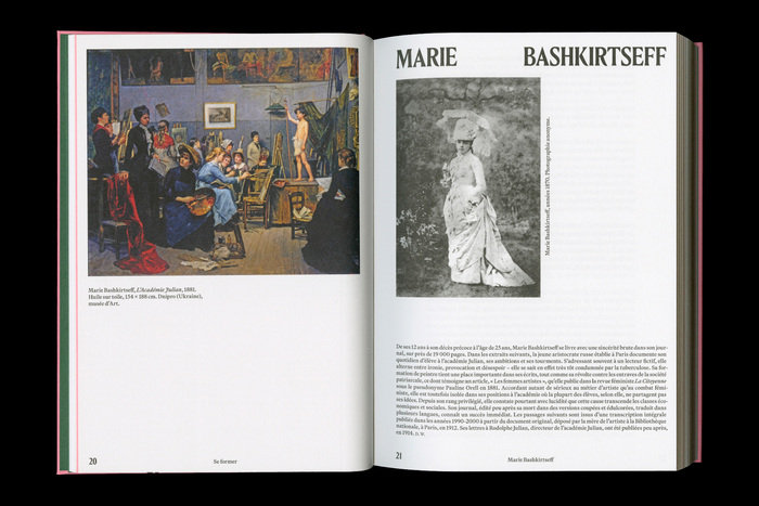
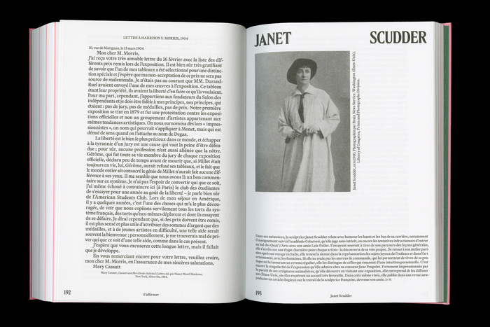
Published byÉditions de La Martinière, this book brings together a wide range of writings by women artists—letters, diaries, memoirs, interviews, manifestos, and theoretical essays. It features the voices of forty women active in a vibrant, cosmopolitan Paris from the Belle Époque to the eve of the Second World War, both famous and little-known, from Berthe Morisot and Camille Claudel to Sarah Bernhardt, Nina Hamnett, and Amrita Sher-Gil. Organized around the key stages of an artistic career—training, perseverance, self-organization, and self-assertion—the book sheds light on their individual paths, shaped by ambition, desire, struggle, hardship, and success. The texts were compiled and introduced by Lucia Pesapane and Delphine Wanes. The publication was overseen by Camille Morineau,AWARE, and Mathilde de Croix. The titles of this book, designed by the French graphic designerLisa Sturacci, are set inLouize Display Cond(Matthieu Cortat,205TF), while the body text is set inMartina Plantijn(Kris Sowersby,Klim Type Foundry).
This typography pairing creates an intellectual femininity that balances scholarly gravitas with intimate vulnerability. The condensed display serif carries Belle Époque editorial authority through its high-contrast transitional forms and tight apertures, while the humanist text face introduces warmth and approachability through its dynamic stress and open counters. Together they evoke the tension between public artistic manifestos and private diary confessions that defines these women's voices.
Louize Display's condensed proportions and vertical stress create the editorial authority essential for academic credibility, while its high contrast references the dramatic typography of Belle Époque Paris. Martina Plantijn's dynamic form model—with diagonal stress, open apertures, and calligraphic roots—provides the humanist warmth necessary for intimate personal writings. The pairing works through shared transitional DNA but different proportional systems, creating hierarchy through structural differentiation rather than mere size contrast.
This pairing follows Kupferschmid's harmony principle: both fonts share a transitional/dynamic form model but contrast through proportion and contrast levels. The display serif's vertical compression and high contrast create commanding presence for titles, while the text serif's generous proportions and moderate contrast ensure sustained readability for diary excerpts and manifestos. The shared calligraphic heritage creates subtle cohesion beneath the surface contrast.