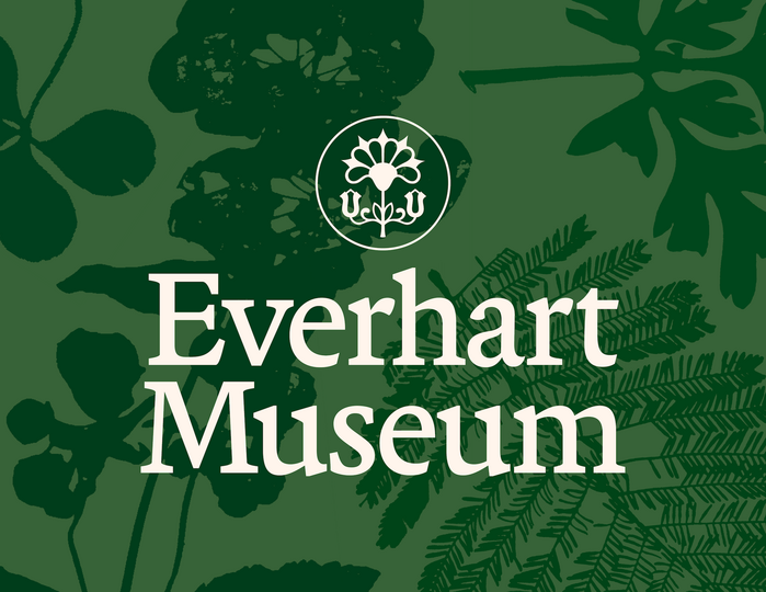
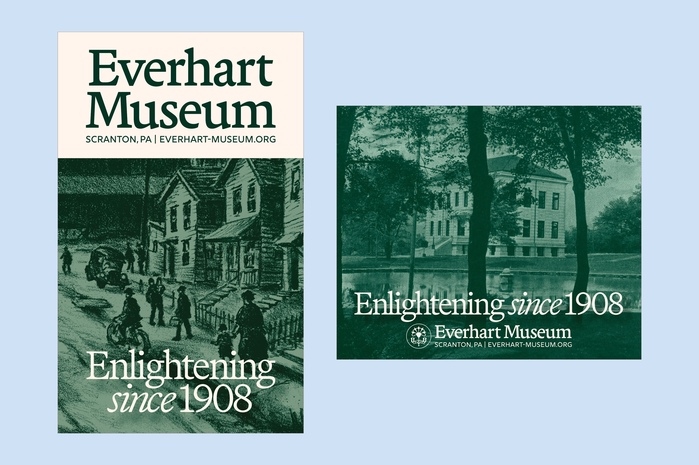
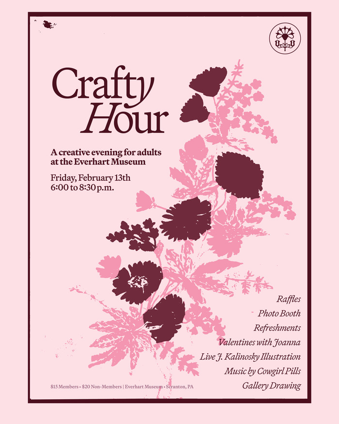
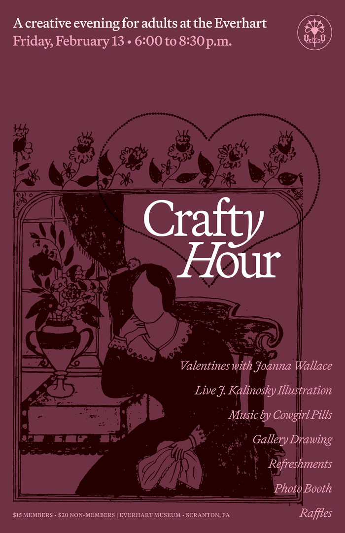
The museum's updated logo was inspired by their building's chiseled facade lettering and usesTerza DisplaybyCommercial Type. The emblem, inspired by their folk art flower logo from the 1950s and 60s, was custom drawn byAlex Tomlinson. The Everhart Museumis a non-profit museum founded in 1908 in Scranton, PA, which focuses on natural history, science, and art. It is one of the oldest public museums in Pennsylvania and was established by Dr. Isaiah F. Everhart (1840–1911), a Civil War medic, Scranton physician, and amateur ornithologist. With this rebrand, I sought to create a visual identity that pulled directly from the museum’s collection and building itself. The floral silhouettes are directly taken from Dr. Everhart’s pressed flower collection from his world travels and are usedthroughout the visual identityas patterns and motifs. The primary typeface of the museum isMartina PlantijnfromKlim Type Foundryand the secondary for web and supplemental type isRig SansbyJamie Clarke Type. These two digital ads were created for the NEPA Philharmonic and WVIA, featuring historic imagery from the collection. Poster for an upcoming event at the museum, with imagery taken from the museum's collection regarding folk art, floral paintings, and valentines.
The typography system balances institutional gravitas with accessible warmth through its rational-to-dynamic progression. Martina Plantijn's high-contrast transitional forms anchor the brand in scholarly authority—its vertical stress and refined serif treatment echo the chiseled architectural lettering that inspired the logo, while its generous x-height maintains readability across applications. Rig Sans provides the dynamic counterpoint with its open apertures and humanist proportions, softening the formality without abandoning sophistication.
This pairing demonstrates sophisticated structural logic by moving from rational (Plantijn's vertical stress, controlled apertures) to dynamic (Rig Sans's open forms, diagonal influence) while maintaining shared proportional DNA. Martina Plantijn's transitional character bridges historical authority with contemporary accessibility—essential for a 1908 institution seeking contemporary relevance. The serif's high contrast creates editorial weight for institutional communications, while Rig Sans's humanist warmth handles digital environments and supplemental content where approachability trumps gravitas.
The pairing follows Kupferschmid's contrast-with-cohesion principle by sharing similar x-height proportions and vertical emphasis while differing in serif treatment and contrast levels. Both typefaces maintain rational underpinnings (vertical stress, controlled character width) but Rig Sans introduces dynamic warmth through its open apertures and subtle diagonal stress. This creates hierarchy through structural differentiation rather than mere weight changes, allowing the serif to command authority while the sans provides accessible support across digital touchpoints.