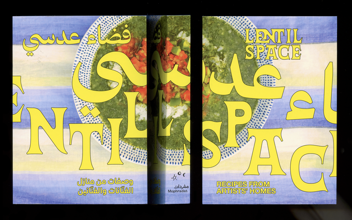
With contributions by Adam HajYahia and Haitham Haddad, Deena Abdelwahed, Laila Hida with Amine Lahrach, Mohamed Abdelkarim with Abla elBahrawy, Nadah El Shazly, amongst many others, this cookbook includes recipes chosen and prepared by the artists in an intimate setting, coupled with stories both personal and about their art practice.Adapted from its namesake online program produced by Mophradat from 2021 to 2023, this book is a celebration of the varied cuisine of the Arab world and its relationship with inherited food practices and the cultures of cooking and talking about food. The bilingual book (Arabic and English) was edited by Mai Abu ElDahab and Reem Shilleh who also wrote the texts. Yasmine Haj provided the translations. Jenifer Evans, Ahmed Wael, and Yasmine Haj were responsible for proofreading.Cecilia MurgiaandManuel RaederofStudio Manuel Raedertook care of the design. The publication is bound as soft cover with flaps. It has 288 pages and measures 125×175 mm. Lentil Space. Recipes from Artists’ Homeswas co-published byMophradatandBOM DIA BOA TARDE BOA NOITE. ISBN: 978–3–96436–084–7.
This typography system embodies cultural intimacy with editorial sophistication, creating a warm yet scholarly presence that honors both Arab culinary heritage and contemporary art discourse. The combination of 29LT Azahar Text's humanist warmth with Alte Haas Grotesk's rational precision creates a bilingual voice that feels both accessible and authoritative—like intimate conversations between artists that happen to be expertly documented.
29LT Azahar Text serves as the rational backbone with its closed apertures and vertical stress providing editorial credibility, while its moderate contrast maintains readability across the book's compact 125×175mm format. Alte Haas Grotesk's geometric construction offers clean hierarchy for metadata and navigation, its systematic character complementing the Arabic script's flowing forms without competing. The pairing creates necessary contrast between content (serif warmth) and wayfinding (sans precision) while maintaining shared proportional DNA for bilingual harmony.
This is a textbook example of contrast-with-cohesion pairing: the rational form model bridges both fonts while serif/sans surface treatment creates clear functional hierarchy. The serif's moderate contrast and the grotesk's systematic geometry share vertical stress patterns, ensuring the Arabic and Latin scripts feel structurally compatible rather than typographically divorced. The multiple Suisse variants add systematic flexibility without disrupting the core rational-humanist balance.