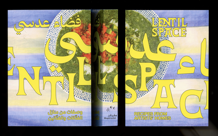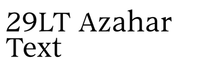
29LT Azahar Text operates from a dynamic form model with diagonal stress and open apertures that reveal its humanist DNA, yet it tempers this warmth with transitional restraint in its stroke contrast and vertical proportions. The lowercase shows generous counters and a moderate x-height that maintains excellent legibility, while terminals end in subtle bracketed serifs that avoid both the severity of modern cuts and the robustness of old-style faces. This typeface sits in the productive middle ground of serif evolution — more refined than Sabon, less mannered than Baskerville — drawing from the best of 16th-century letter proportions while addressing contemporary reading environments. Its character is serious but approachable, with enough personality to establish voice without overwhelming content. The lack of italics limits its hierarchical range, making it more suited to projects where a single authoritative voice suffices rather than complex editorial structures requiring multiple levels of emphasis.