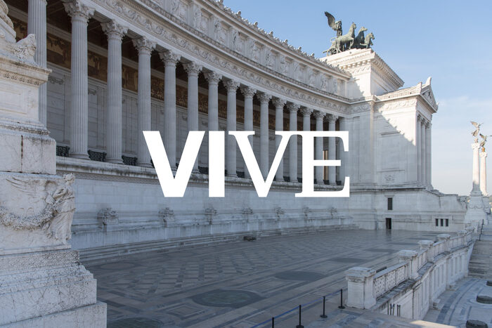
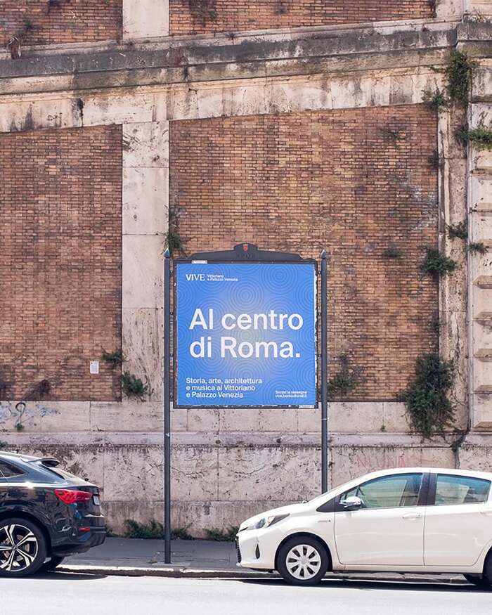
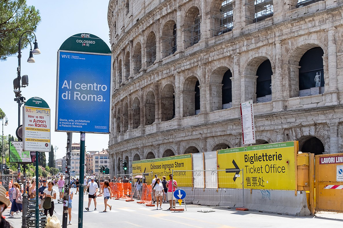
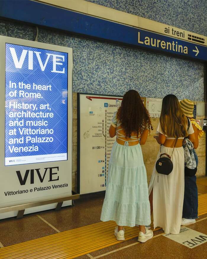
TheVIVE(Vittoriano e Palazzo Venezia) is a national museum institute in Rome, established in 2019 and active since 2020, under the Italian Ministry of Culture. It brings together two iconic landmarks in the heart of the city: the Vittoriano, also known as theAltare della Patria, and Palazzo Venezia, along with the Central Museum of the Risorgimento, the panoramic terrace, and the Library of Archaeology and Art History. Dedicated to preserving and showcasing architecture, artworks, and collections central to Italy’s history and identity, VIVE combines research, conservation, and public engagement through exhibitions and educational activities. From its establishment, VIVE has adopted a clear visual identity developed by the Trieste-based studioTassinariVetta. The logo and overall visual language favor a minimalist approach that evokes modernity and a sort of architectural precision. These values are reflected in the consistent use of theSuisse font family, beginning with the logotype, which combinesSuisse Int’lBold andSuisse NeueMedium. This typographic choice is extended across the monuments’ visual system. Suisse Int’l is used for signage, ephemera, and public-facing communication, both online and in the street. A notable example is the long-running lecture series “VIVE al Centro di Roma”, whose first posters and subway ads showcased the new identity throughout the city. On the website, designed by the agencyVergani&Gasco, Suisse Int’l is paired withSuisse Worksrather than Suisse Neue. While all three belong to the same family, the choice introduces a functional distinction: Suisse Neue remains tied to the identity mark, whereas Suisse Works serves as a dedicated text serif. The shift preserves typographic continuity while separating symbolic branding from editorial usability, allowing the digital content to prioritize clarity without altering the core visual language. The visual identity is here seen applied to the monuments' entrance tickets. Same typesetting, five different color codes for each of the five museums making up VIVE. Photo(s) by Cardboard America Collection on Flickr.
The Suisse family creates institutional gravitas through rational structural properties—closed apertures and vertical stress—while maintaining approachability through its slightly softened geometric construction. The combination of Suisse Int'l's systematic clarity with Suisse Works' editorial authority positions VIVE as both architecturally precise and culturally accessible, reflecting Rome's blend of monumental heritage and contemporary scholarship.
The Suisse family operates on a rational form model with closed apertures and vertical stress, creating the authoritative presence essential for a national cultural institution. The systematic weight range across Int'l, Neue, and Works allows functional hierarchy while maintaining structural DNA throughout the system. The serif Works variant introduces editorial contrast through stroke modulation while preserving the rational skeleton, enabling extended reading without abandoning the core geometric precision that signals institutional credibility.
This represents exemplary single-family expansion rather than traditional pairing—Suisse Int'l, Neue, and Works share identical rational form models with closed apertures and systematic construction. The contrast comes through surface treatment (sans vs. serif) and optical weight rather than structural incompatibility. This creates seamless brand coherence from logo (Neue) to wayfinding (Int'l) to editorial content (Works), demonstrating how a well-designed type family can provide all necessary contrast within unified structural logic.