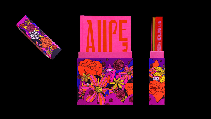


Jhambo Ink, a boutique publisher in London, brought out a limited edition in 1,000 hand-numbered copies of a double book bringing together Caroll’sAlice’s Adventures Under GroundandAlice In Wonderland.Ana SantiagoofIndexdesigned the two books joined by their spines in a dos-à-dos binding. The book is richly illustrated by Brazilian artistZansky. While the box containing the book is text-less, the covers are exclusively typographic, showcasingLe Murmurein a playful elongated and top-aligned layout. The font is used throughout the book in both its normal shape but also often vertically elongated (without distortions) or horizontally stretched (with distortions). It’s accompanied byViskjødoing a great job for inter-titles in all caps as well as for the text of the stories themselves.
This typography communicates whimsical literary authority with theatrical confidence. Le Murmure's dynamic form model—with its open apertures and organic construction—channels Alice's fantastical world through typographic play rather than literal illustration. The dramatic vertical extensions and intentional distortions create a sense of wonderland logic where normal rules bend, while Viksjø's rational, compressed forms provide grounding structure that keeps the fantasy anchored to readable narrative.
Le Murmure's dynamic construction with diagonal stress and open counters makes it naturally elastic and playful, perfectly suited for the theatrical manipulations (vertical stretching, horizontal distortion) that mirror Alice's size transformations. Its calligraphic DNA maintains readability even when distorted, while Viksjø's rational model provides necessary typographic contrast—its closed apertures and vertical stress create stable hierarchy for chapter openings and body text. The pairing leverages structural opposition (dynamic vs rational) to create typographic wonderland where Le Murmure can perform while Viksjø anchors.
This exemplifies masterful contrast-with-cohesion through opposing form models. Le Murmure's dynamic properties (open, warm, malleable) paired with Viksjø's rational character (closed, vertical, stable) creates deliberate structural tension that serves the narrative—the playful display font embodies Alice's transformative journey while the rational text face grounds the reader in Carroll's precise prose. The shared serif sensibility maintains visual coherence despite their structural differences, following Kupferschmid's principle that different form models can work when unified by surface treatment.