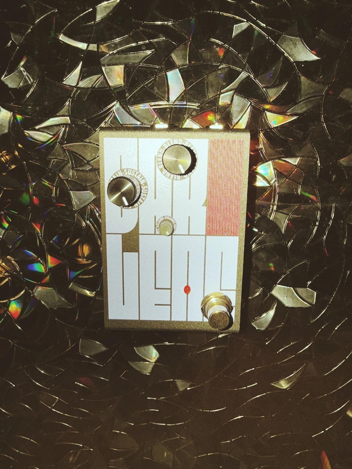
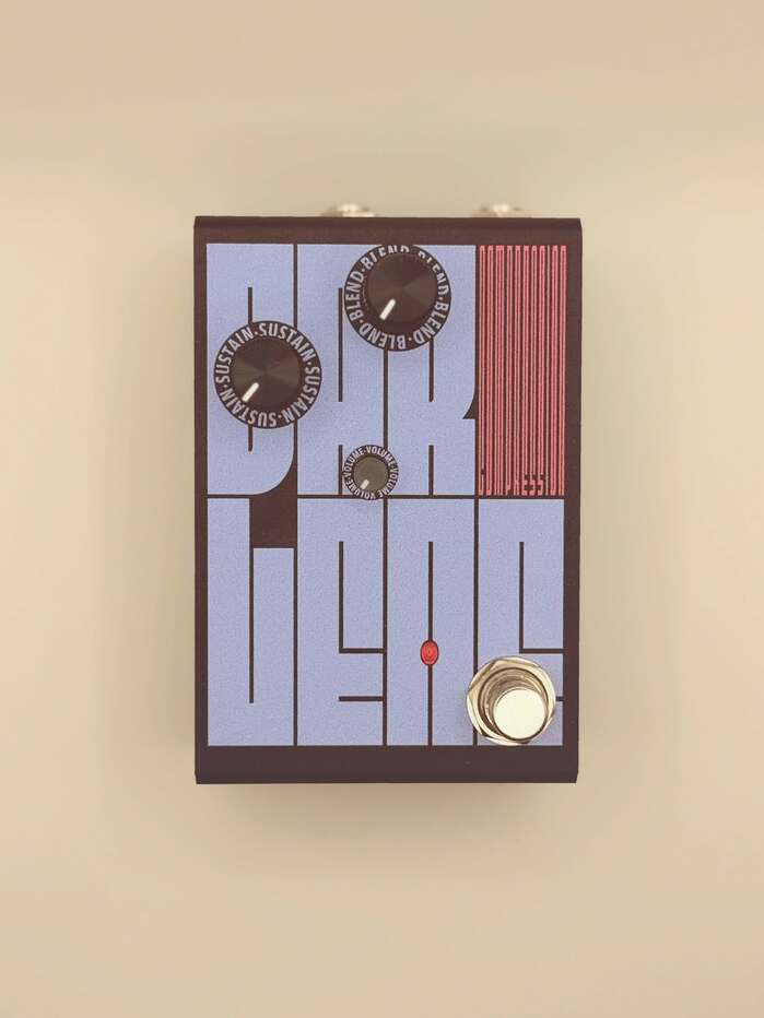
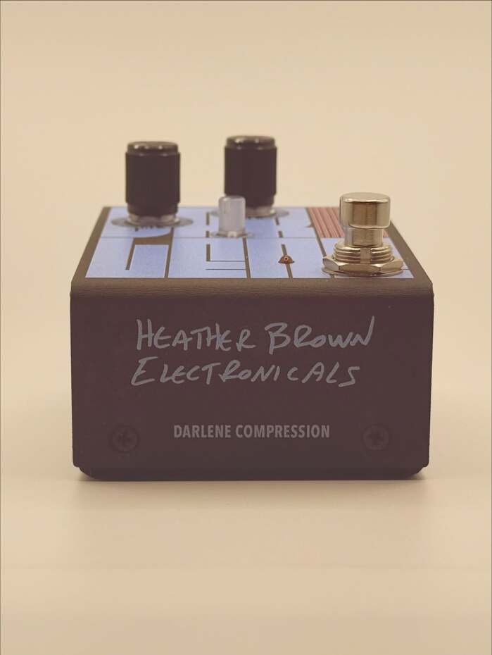
Darleneis a new effects pedal created byHeather Brown Electronicals. Brown describes its voicing as “intentionally neutral. No color, no smear. Just preserved dynamics with rich sustain, natural attack, and silent operation.” Designed byGraham McClanahan, this pedal goes all-in on typography. Nearly the entire face (!) of the pedal is occupied by the pedal’s name, typeset inFit. The letters are arranged in a 4×2 grid, with “DARLENE” set in Fit’s Normal width and “COMPRESSION” squeezed into the upper right cell, stretching the typeface to its narrowest, least-readable limit! The pedal’s dials have labels seton a circleinAvenir Next Condensed. Supplemental information on the side is Heather’s handwriting, digitized! I was actually scrolling Adobe fonts a while back and FIT stood out immediately, so I saved it and played around with it but didn’t really have an application. When I worked with Heather a few months later, we tried a lot of different artwork iterations and nothing really seemed right and then I stumbled upon FIT again. It was my first time using a variable typeface in print so it was a lot trial and error and fun. True to its name it just fits anywhere and has so many possibilities (I probably did over 50 different versions initially because it was so fun). Also this being a compression pedal FIT seemed natural here. Absolutely brilliantly crafted. Something that also worked so well is Heather was hoping to have someway to emphasize DAR on Darlene because of a family member’s nickname that inspired the theme/name of the pedal. This wasn’t really working with the other iterations we went through and we were ready to ditch it but with how flexible the layout possibilities are on FIT it was a huge win to incorporate that in the final. Most importantly David’s typeface carries the design so credit to his brilliance here and I’m excited to see more of what’s to come from him. As the font’s designer, I couldn’t be more thrilled with this application of Fit… this is the kind of thing it was born to do!
This typography communicates precision-meets-playfulness through extreme spatial efficiency and variable flexibility. The rational geometric construction of Fit creates technical credibility while its elastic width variations introduce a dynamic, almost performative quality that mirrors the pedal's compression function—literally squeezing type to its limits while maintaining legibility and impact.
Fit's geometric form model with its constructed letterforms and wide variable width range perfectly serves this compression pedal's functional metaphor. The typeface's ability to compress from normal to ultra-condensed without losing structural integrity directly parallels the pedal's audio compression capabilities. Avenir Next's humanist geometry provides stable, readable contrast for the interface elements, sharing Fit's geometric DNA while offering the necessary restraint for functional labeling.
This pairing works through shared geometric form models with strategic contrast in application scale and variability. Both fonts derive from constructed geometric principles, creating structural cohesion, while Fit's extreme variable width range provides dramatic typographic compression against Avenir Next's static stability. The pairing creates contrast-with-cohesion—shared geometric rationality but vastly different expressive potential.