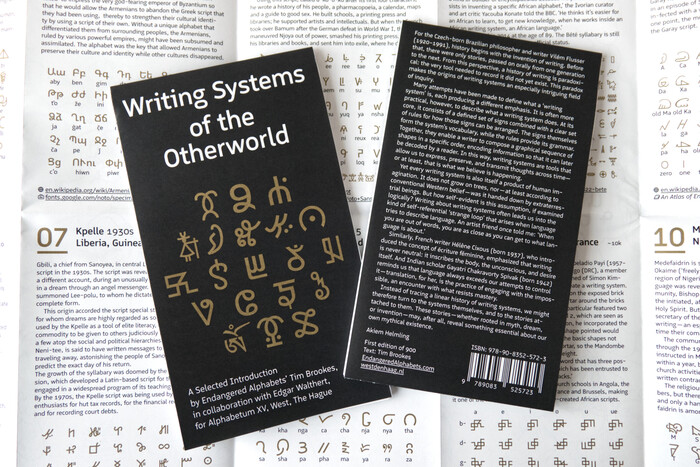
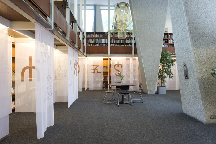
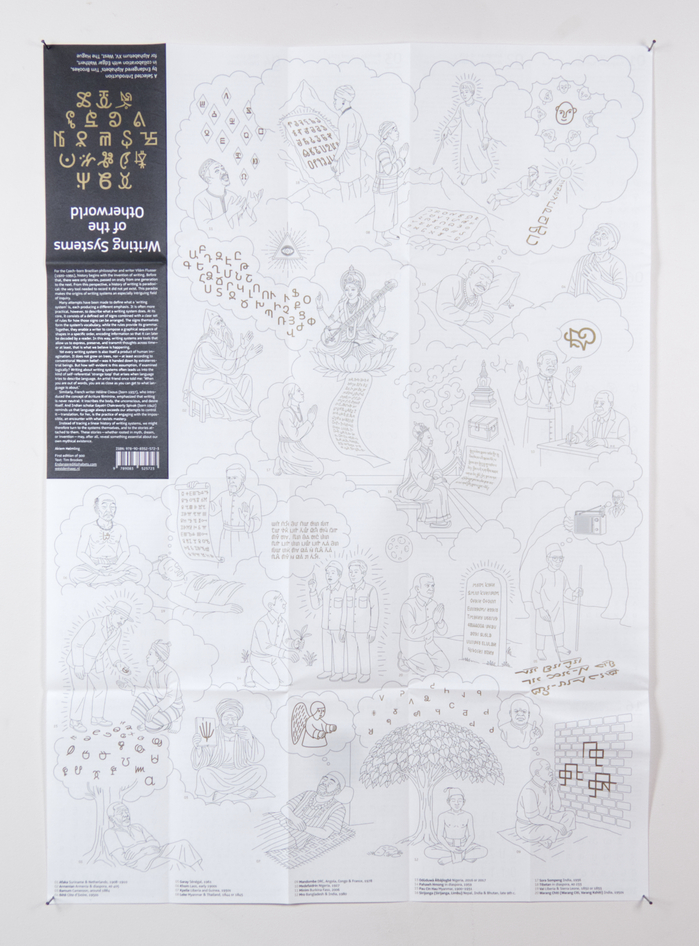
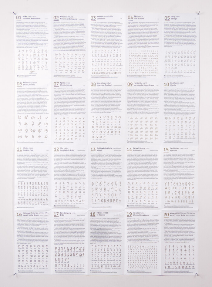
The fifth poster in this ever-extending series, which began withThe Annex of Universal Languages, was initiated byAkiem Helmling, the curator ofAlphabetumin The Hague. This poster was created in collaboration with Tim Brookes fromEndangered Alphabets, who researched and wrote the 20 dream-stories presented in this publication. From September 6, 2025 to January 25, 2026, Alphabetum hosted anexhibitionof the same name, where the illustrations, writing systems, and their creation myths were presented. The translucent flags created a dreamscape that invited the audience to browse through and become immersed in the work.In creating this poster, I prioritizedNoto SansandSerifversions of the writing systems where available, secondly looked to existing Unicode proposals, and as a last resort, quickly digitized blurry images. Eleven of the 20 alphabets and syllabaries have already been added to the Noto type family, while others had Unicode proposals clean enough to use. In the case ofBété, I reached out to ANRT alumnusAdam Yeo, who provided me with his digital interpretation ofFrédéric Bruly Bouabré’s handwritten script. The poster has been offset printed – locally in the Netherlands – with Pantone Gold and Black and was mechanically folded by a bookbinder in Haarlem. Like the other parts of the series, this edition also uses my typefaceLogicalwhich, thanks to its inclusion of icons that can be transformed from words, initiated this whole adventure. Handing a specimen of Logical toRichard Niessenin 2018 caused him to invite me to participate in hisPalace of Typographic Masonryby adding a newroom. Logical has been released byBold Mondayand combines the warmth and legibility of humanist typefaces with the technical look of typefaces likeDINandIsonorm. Its markdown-inspired syntax to transform words into icons via OpenType features makes them easily accessible even in software without a glyphs palette. The underline feature, which ensures that descenders are not cut off, also gets heavy use in the referenced links below each panel. The view when entering Alphabetum in The Hague. The publicly accessible library invites visitors to read books, have a coffee, or discuss language with others. Its brutalist yet warm architecture makes every visit to Alphabetum an enriching experience. The poster side of the panel illustrates 20 out of 22 visions displayed in the exhibition. Each of the 20 panels describes an origin story of the writing system presented below. The small number in the top right indicates the number of active users. Another view of the exhibition in Alphabetum with the beautiful Foscarini Allegro Assai suspension lamp. Behind the flags, each writing system is featured on two black A3 panels. On the left, the text and information provided by Tim Brookes; on the right, an example or the full set of glyphs.
This typography system embodies scholarly inclusivity and systematic documentation, creating an authoritative yet accessible academic voice. Logical's humanist warmth tempers its technical precision, while the Noto family's pan-Unicode coverage demonstrates methodical comprehensiveness. The rational form model of both systems—with their vertical stress and measured apertures—establishes credible institutional authority while remaining approachable enough for public education about endangered writing systems.
Logical serves as the perfect foundational typeface here because its rational-humanist hybrid combines DIN-like technical authority with warmer, more legible humanist proportions—essential for an educational project bridging academic research and public engagement. The Noto family's systematic approach to Unicode coverage makes it the logical (pun intended) choice for authentic representation of diverse scripts, ensuring typographic consistency across vastly different writing systems. Both families share rational form models with consistent vertical stress and moderate contrast, creating visual cohesion despite the vast script diversity.
This isn't traditional pairing but rather systematic layering—Logical provides the Latin infrastructure while Noto handles script-specific authenticity. Both families share rational form models with similar stroke proportions and vertical emphasis, creating seamless visual integration despite serving completely different functions. The shared systematic approach (Logical's technical precision, Noto's comprehensive Unicode methodology) ensures that the diverse scripts feel unified within a single typographic ecosystem rather than fighting for attention.